- ABOUT
- JUDGING
- ATTEND THE EVENT
- CONTACT
- MORE
- 2024 Entries
- Installations 2024
- Past Winners
- Subscribe
- [d]arc directory
- arc magazine
- darc magazine
White Hart Lane Station, UK
ProjectWhite Hart Lane StationLighting DesignLux Populi, UKArchitectFereday Pollard, UKAdditional DesignFourway; Landolt BrownClientTransport for London and Taylor WoodrowLighting SuppliersMeyer, Designplan, Thorlux, Ewo, Optelma, Schreder
Tottenham in North London was originally an area of fields, a market garden for the growing population of London. The Great Eastern Railway opened its station at White Hart Lane in 1872 bringing cheap workers trains to London and thus the spread of housing.
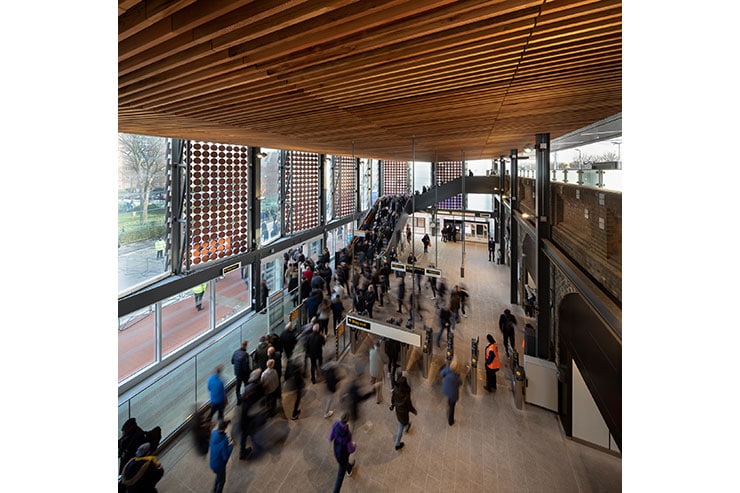
Move forward 140 years and Tottenham was planning for regeneration, seeing a new landmark station at White Hart Lane as a key part of its ambitious masterplan. The new station was tasked with delivering increased passenger flows, including the capability of handling match day crowds from the nearby Tottenham Hotspurs’ White Hart Lane stadium.
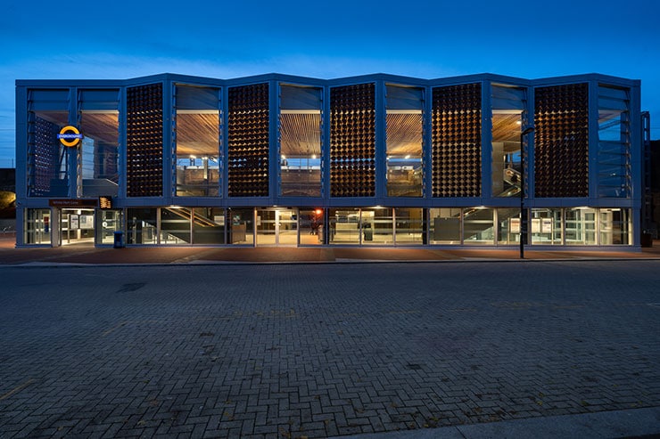
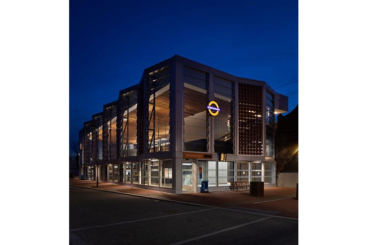
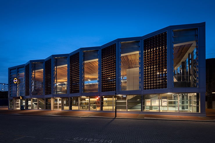
The unique façade took its inspiration from the area’s market gardening, clay flower pots were manufactured nearby and a key element of the lighting scheme is how the zig zag vertical arrays of ‘pots’ in the rain screen are clearly revealed as silhouettes against the lit concourse interior by night.
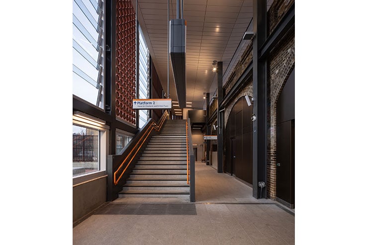
Each lighting design brings its own challenges, at White Hart Lane the low budget was not unique, but the geometry of the concourse buildings made it particularly hard to hit all the uniformity and glare criteria demanded of a station project. An early building design decision prevented any luminaires from being mounted in the ceiling or floor, the ceiling whilst beautiful was of low reflectance as were the glass or ‘pot’ walls, and the ground floors were obstructed by major staircases. Mounting locations were very limited indeed.
By building a unified and very detailed lighting model of the whole station, including the platforms and public realm, each area borrowed light from adjacent areas maximising the utilisation and value of each and every fitting. The fittings was made to work hard, for example the concourse uplights not only reduce glare from the main projectors lighting the floor, but also uplight, in warm white light the cedar soffit. Great care was taken to minimise bright luminaires in view, this promoted views through the station, allowing is surfaces, structure and wayfinding to be easily read.
The lit station has been described as a lantern, providing a beacon for the traveller, where the lighting helps reveal the distinctive multi layered building envelope. The visual journey through the station is both beautiful and visually comfortable.
Lighting designers will recognise the near impossibility of replicating ‘universal glow’ commonly used in graphics to convince planners. At White Hart Lane one of the Tottenham Hotspur staff members commented that it was refreshing to see a building that looks so like the planning visuals.
All projects are a team effort of creativity, communication and collaboration, a mark of a successful design is how your fellow team regard you after hand over. We can only quote Chris McCarthy of Fereday Pollard Architects “Yes very pleased with White Hart Lane Station and really enjoyed working with you, we often end up on transport and infrastructure projects with very limited lighting opportunity so it was great working with you and your team who proposed really good solutions, even with a challenging budget!”
