- ABOUT
- JUDGING
- ATTEND THE EVENT
- CONTACT
- MORE
- 2024 Entries
- Installations 2024
- Past Winners
- Subscribe
- [d]arc directory
- arc magazine
- darc magazine
Titan Zoya, India
ProjectTitan ZoyaLocationBangalore, IndiaLighting DesignLighting Spaces, IndiaArchitectDeepak Prem, IndiaInterior DesignDeepak Prem, IndiaClientTitan CompanyLighting SuppliersTargetti, GOJIS Lifestyle
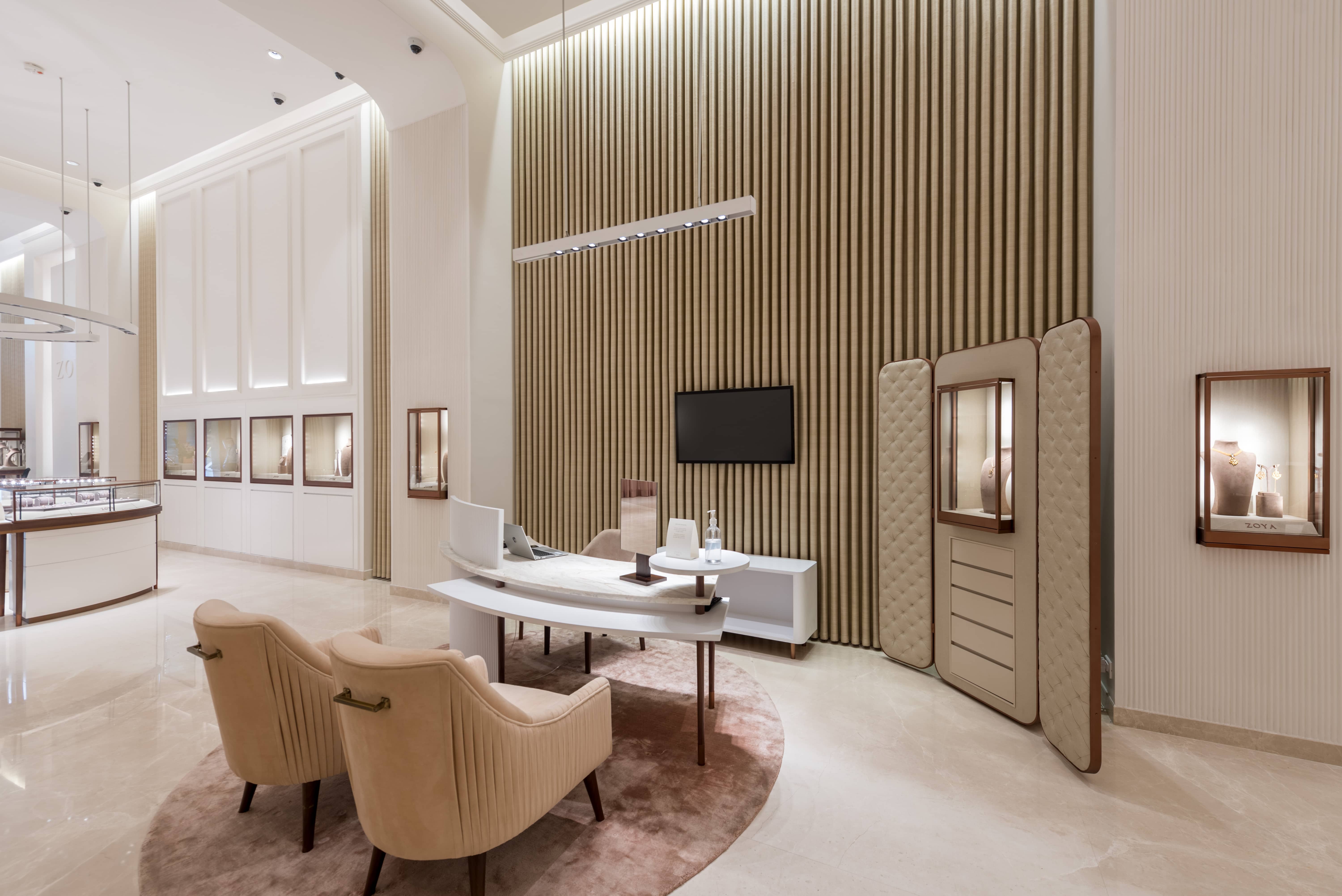
Titan’s high end diamond jewellery store Zoya represents both elegance and reflection of the artistry and craftmanship where the merchandise takes the theatrical centre stage. Diamond is symbolism for luxury and sparkle being its visual definition, requires carefully curated ambience that hierarchically showcases it in an elegant encompassing space. In retail lighting, understanding the visual merchandise and the kinds of display shelving and visual sightline of the clients along with that of the salesmen is very important. Visual comfort is very important where the contrast between the merchandise lighting and the ambient lighting is very high to get the required visual punch. The concept was to flawlessly integrate lighting in such a way that it is being felt at target and is not obviously seen.
The design strategies revolved around solving the combination for lighting of visual merchandise and the ambient fill for visual contrast. The glass casing of the display cases create veiling reflection distracting the shoppers and this can be solved by glare control and fixture positioning.
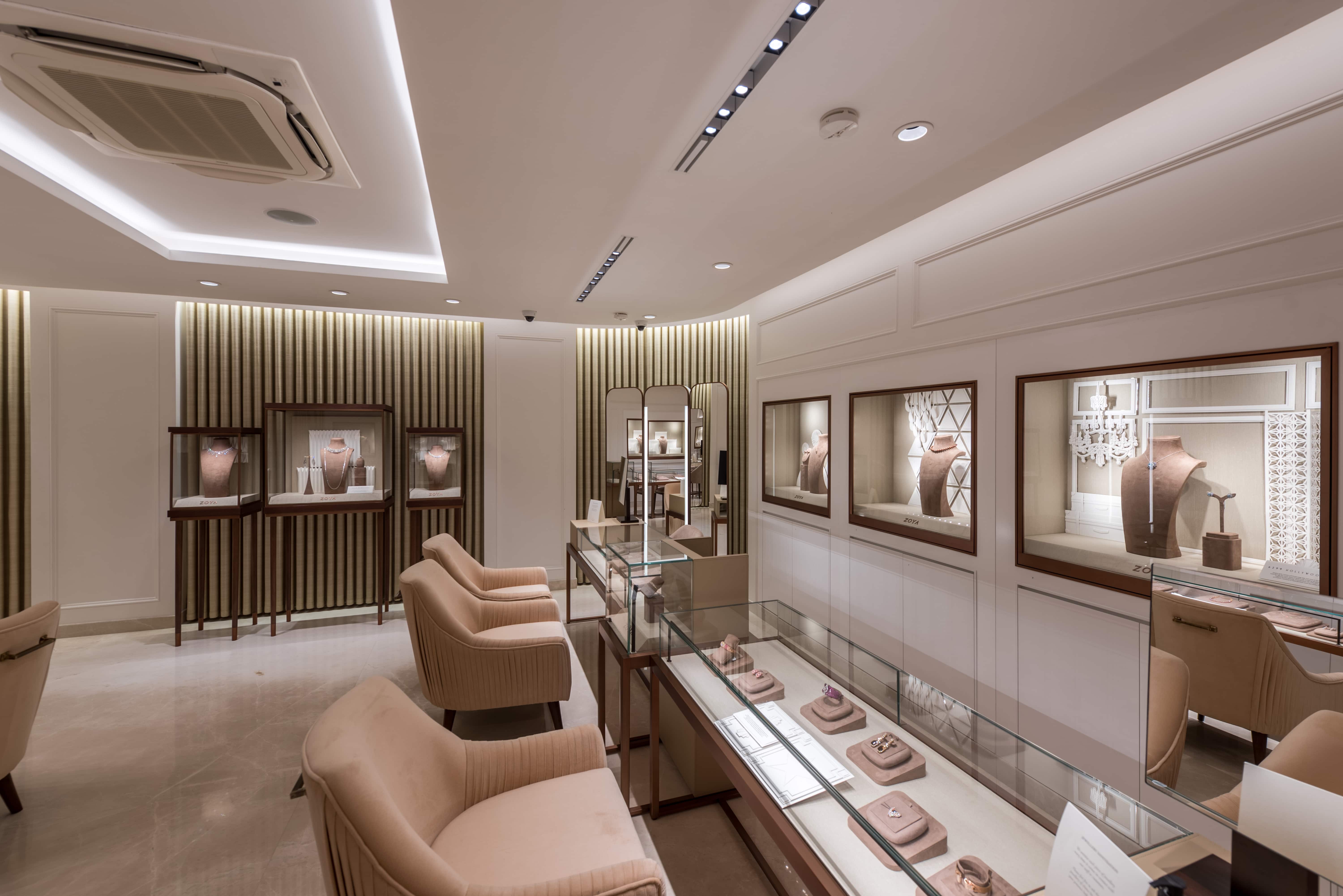
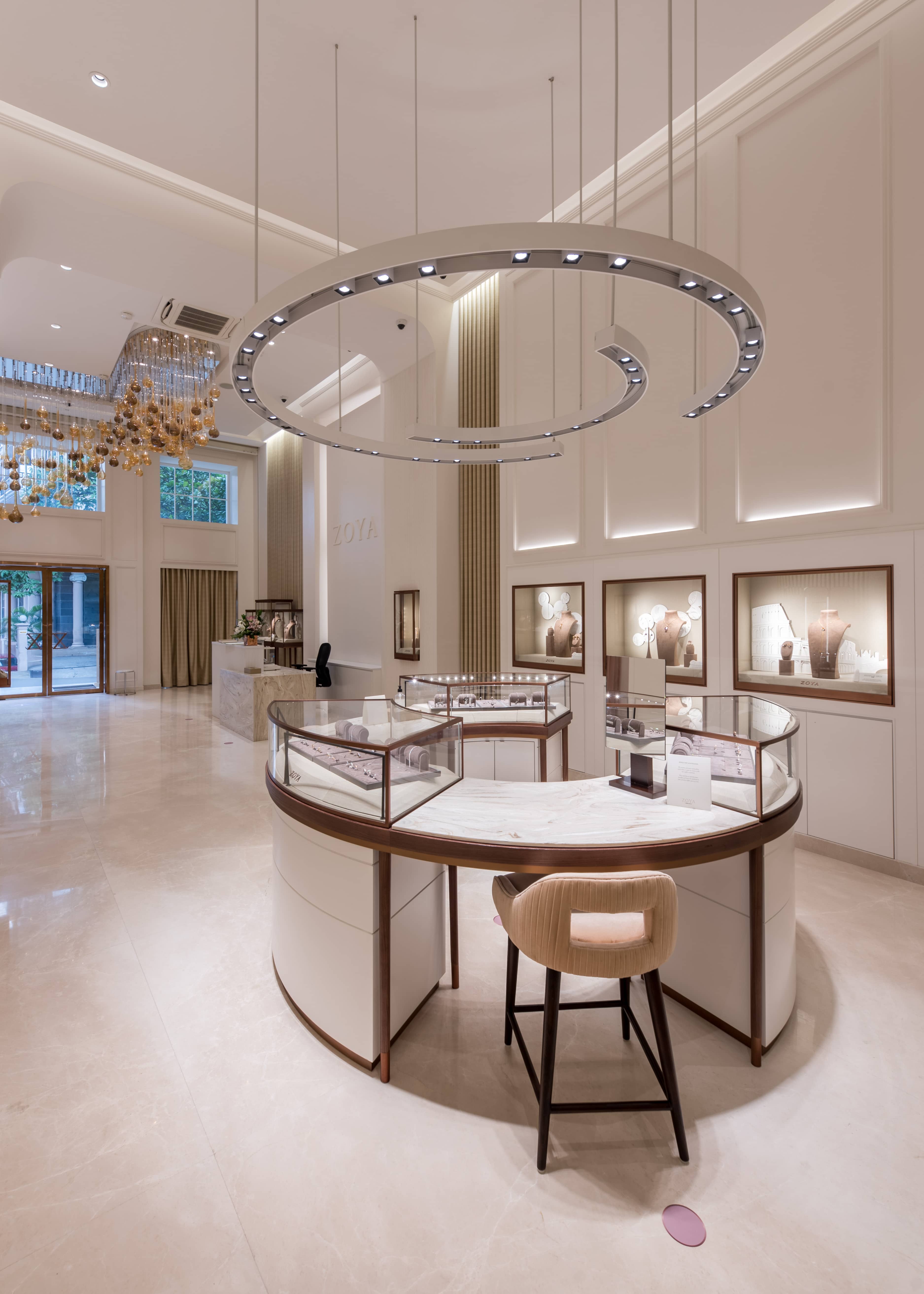
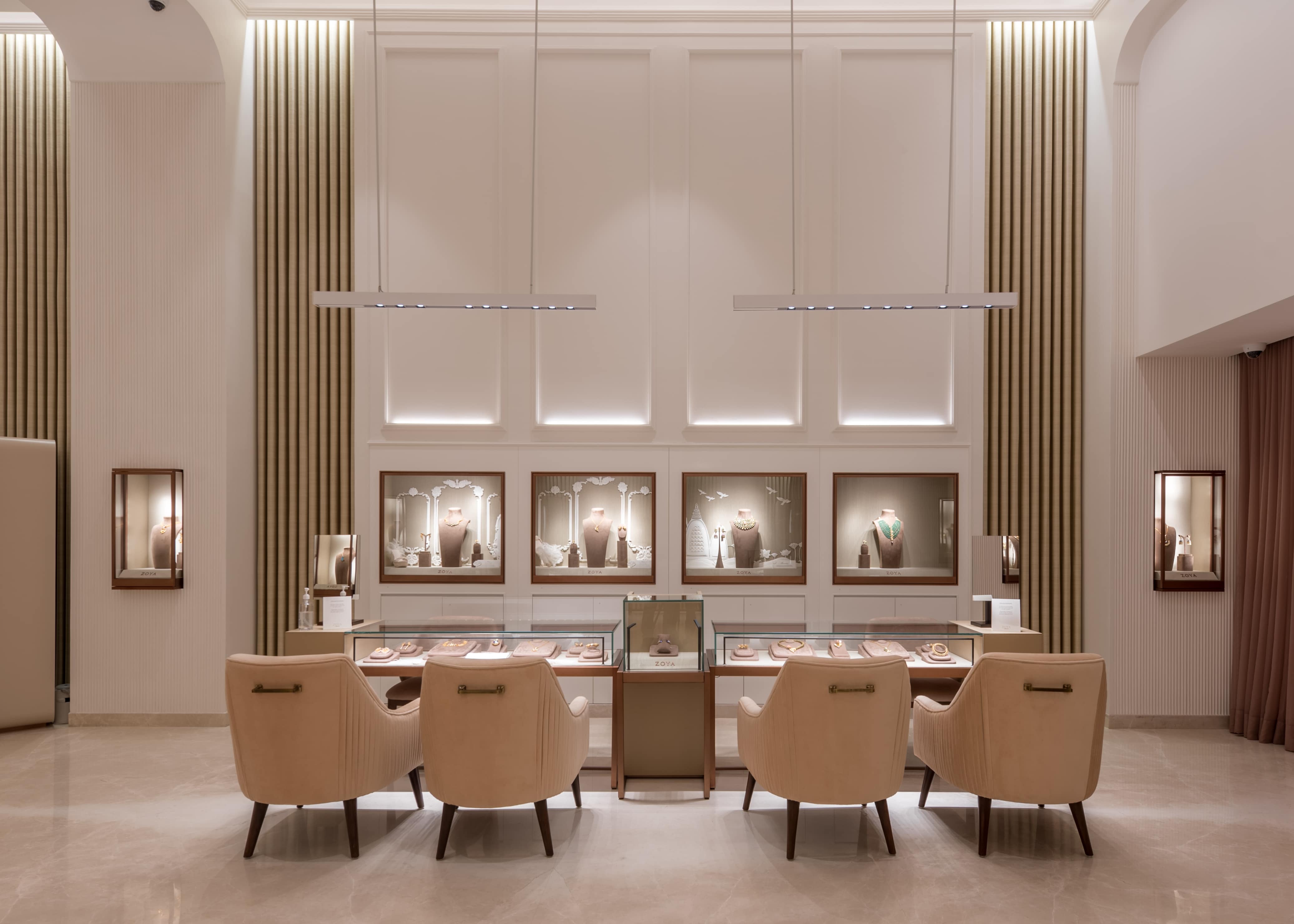
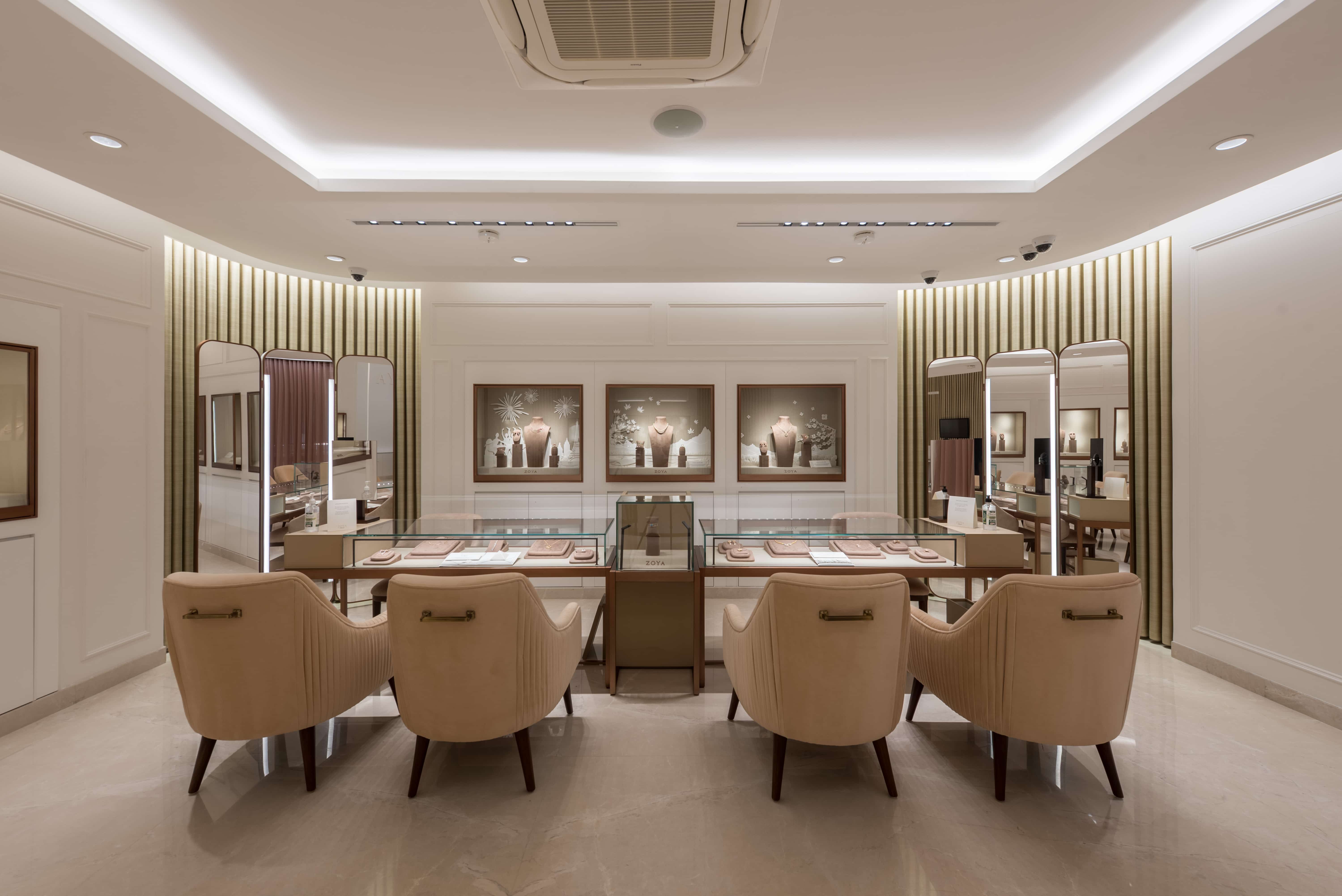
For the flat beds, the lighting mockups revealed that the centreline of the fixtures to be along the edge of flat bed that faces the customer. This helps to avoid the veiling reflection images of the fixture on the glass. In addition to this localised display case lighting provided the required visual pop. The thought was that instead of one large sized fixture, it can be split to three small sized fixtures that achieve the same thing. Smaller sized fixtures ensures discreet integration into recessed slots or profiles.
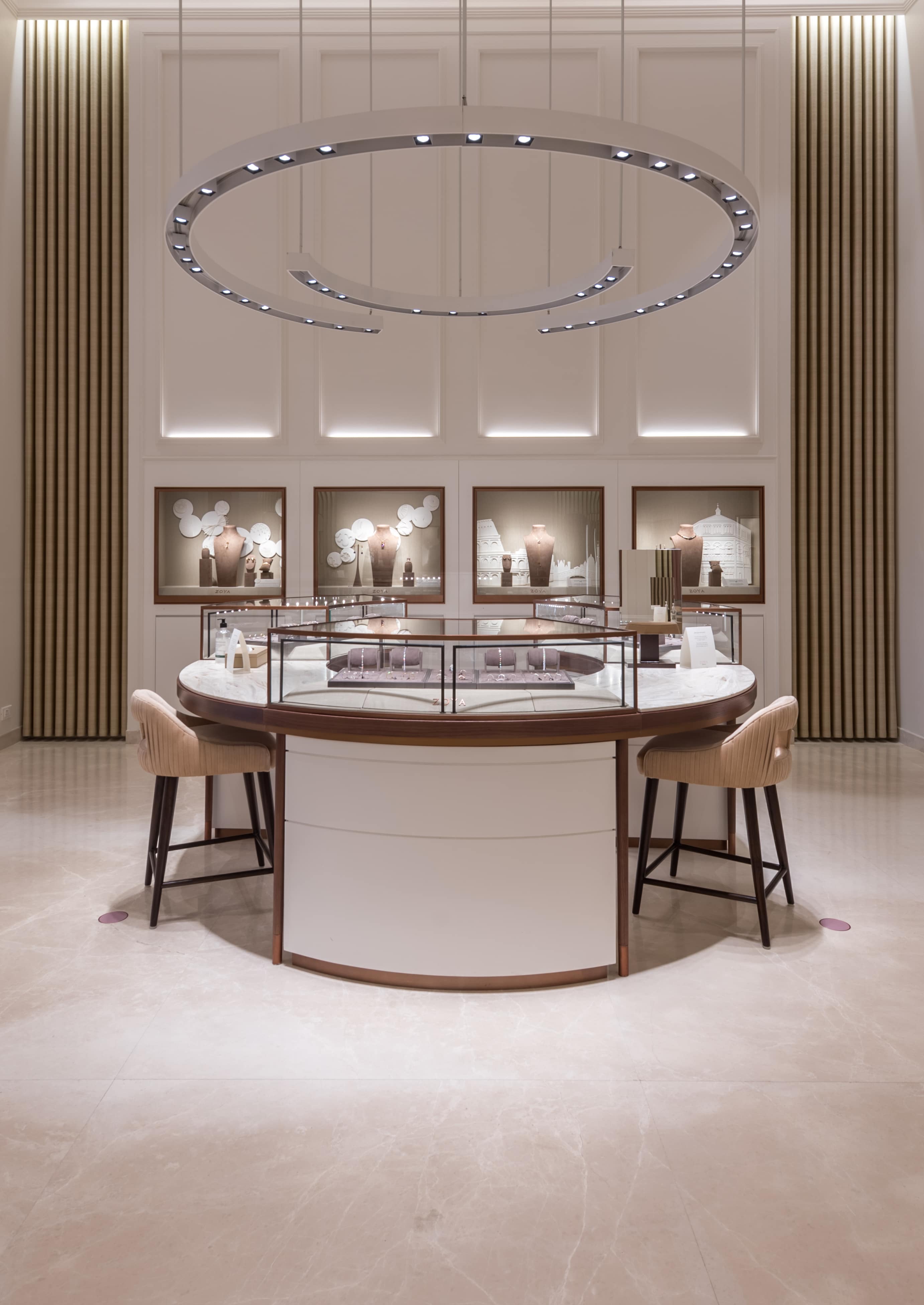
On both the wall niches and plinth displays, two techniques of side wash combined with spot accenting provided focal glow.
Architecturally, the store has two different volumes and to maintain lighting consistency, the 9ft high space the fixtures were mounted on recessed profile and in the 17ft high space, the fixtures were mounted inside custom made channel dropped down to the same 9ft height above finished floor level.
The circular flat bed display in the center of the store has custom made pendant mounted semi circular profiles with integrated spots in an offset style for visual interest. The center lines were carefully detailed for these pendants for appropriate merchandise highlight and avoid glare.
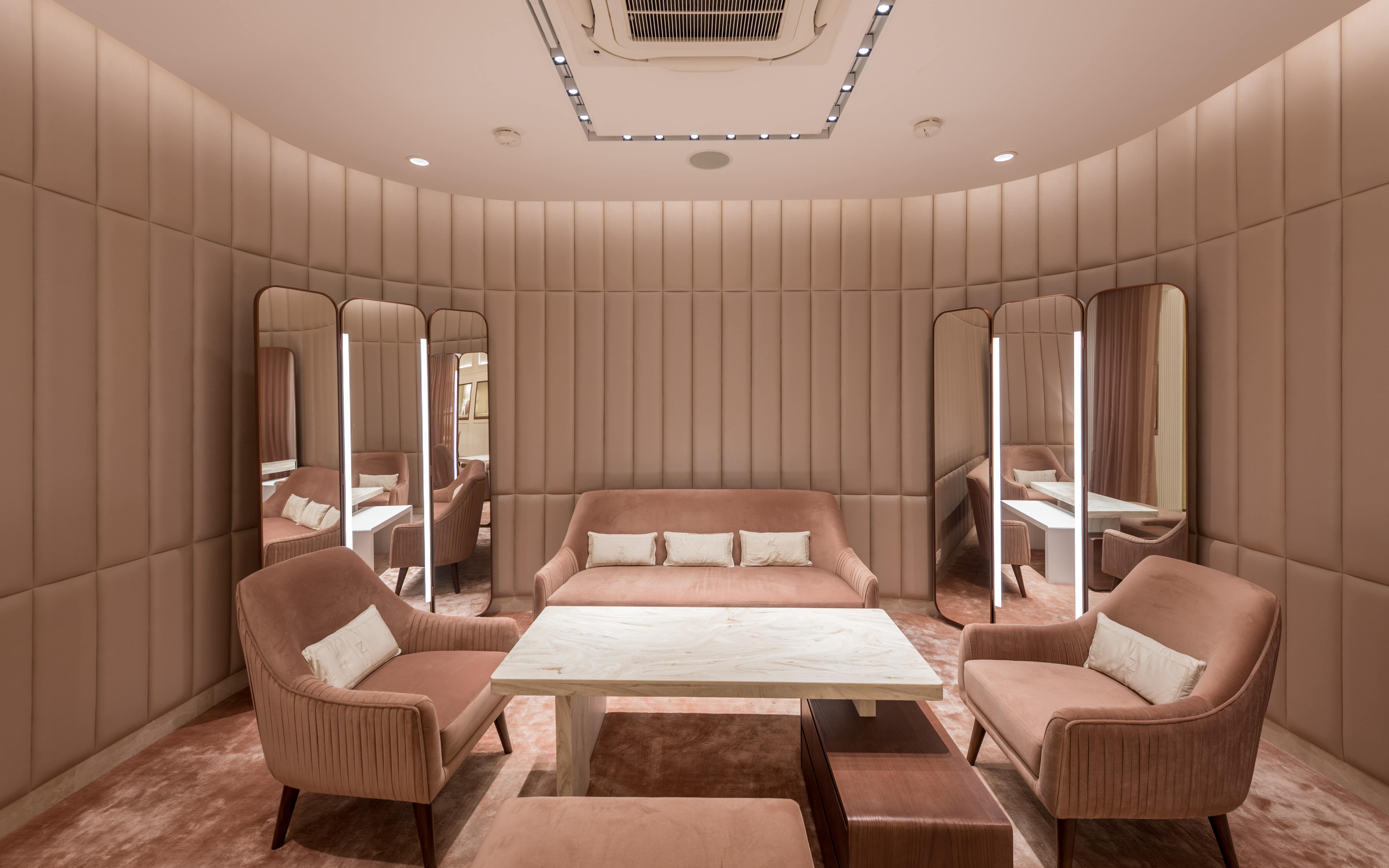
Lighting also needs to ensure enough face lighting for the clients to see themselves in the mirror.
Having set the tone for Merchandise highlight as the prime lighting layer, the spatial highlights with the indirect lighting provides a rounded visual experience. Ceiling coves and peripheral curtain highlights provide the soft indirect fill light. Wall moulding in the double height space has a soft hidden linear uplight that quietly accentuate the volume. There are full height mirrors that has lighting incorporated within and along with one downlight from ceiling.
The colour temperature that worked well for diamond jewellery was 3500K that helped provide visual pop highlight to coloured precious stones in them. Hence general lighting was also specified in the same colour temperature for consistency.
