- ABOUT
- JUDGING
- ATTEND THE EVENT
- CONTACT
- MORE
- 2024 Entries
- Installations 2024
- Past Winners
- Subscribe
- [d]arc directory
- arc magazine
- darc magazine
T-Mobile Headquarters, USA
ProjectT-Mobile HeadquartersLocationWashington, USALighting DesignDark Light Design, USAInterior DesignGensler, USAClientT-MobileLighting SuppliersAllied Maker, AND, Andrew Neyer, Barnlight, Bega, Boca Flasher, Contech, DCW, Ecosense, El Torrent, Finelite, Flos, Gotham, iGuzzini, Insight, Intense, Kelvix, Luceplan, Lucifer, Lumenwerx, Luminii, Marset, OCL, Oxygen, Pablo, Pinnacle, Rich Brilliant Willing, Sonneman, Tech, USAI, Vode, ZumtobelPhotographyHeywood Chan, YE-H Photography
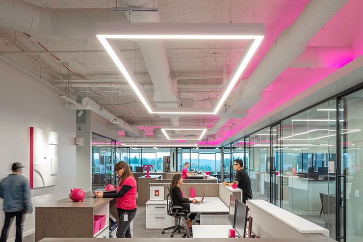
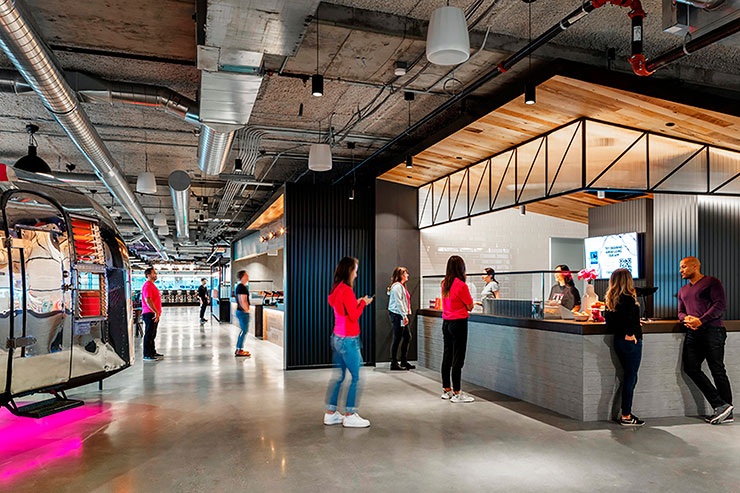
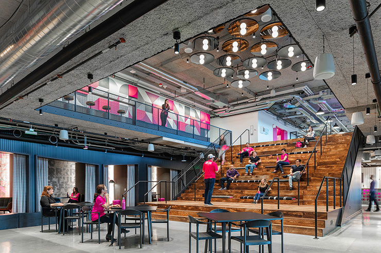
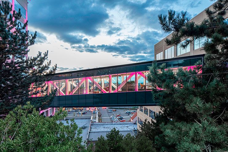
The renovation of T-Mobile’s corporate headquarters reimagines the company’s workspaces and amenities to promote innovation and collaboration while incorporating their unique brand and culture. The workspace balances team and focus spaces through architectural geometries, reinforced by light. Collaboration and innovation opportunities are enhanced in new amenity and gathering zones, creating a variety of environments where employees can eat, meet, and gather. New bridges provide links between buildings to create a more connected campus.
Lighting is a key component in the workplace – supporting open and enclosed offices, meeting rooms, and collaboration zones by highlighting materials, textures, and vertical surfaces to provide visual interest throughout the day. Creating a cohesive design language over 1,000,000 square feet in a multi-phased project, while also providing meaningful differentiation, was a key design challenge. The pattern language – bold geometric shapes at a large scale, balanced by accents of smaller luminous fixtures, work in harmonious cooperation to provide meaningful space differentiation.
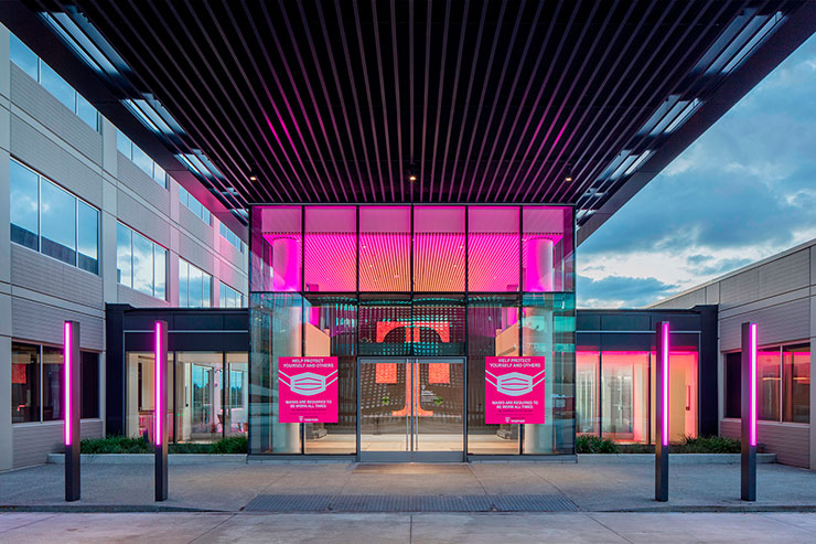
Lighting also plays a fundamental role in integrating the company brand by incorporating T-Mobile’s signature magenta throughout.
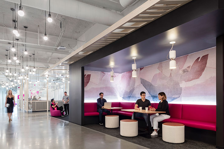
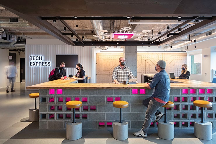
Synthesizing this brand element in varied and meaningful ways throughout the project was a central design challenge. The lighting design team worked in close collaboration with the branding, architecture, and interior design teams to affect the right balance of illuminated “magenta moments” throughout using a variety of means: interaction with translucent materials, direct view light sources, and indirect illumination were used as appropriate throughout.
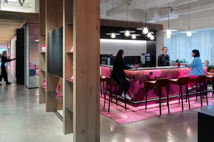
Amenity zones in multiple scales and moods create a variety of gathering and meeting spaces for employees to enjoy lunch, a quick coffee, an after-work drink, or a casual conversation. Light supports each of these spaces through variations in illumination level and contrast, layered material highlights, and use of visual scaling elements ranging from low-level accents to large-scale graphic washes.
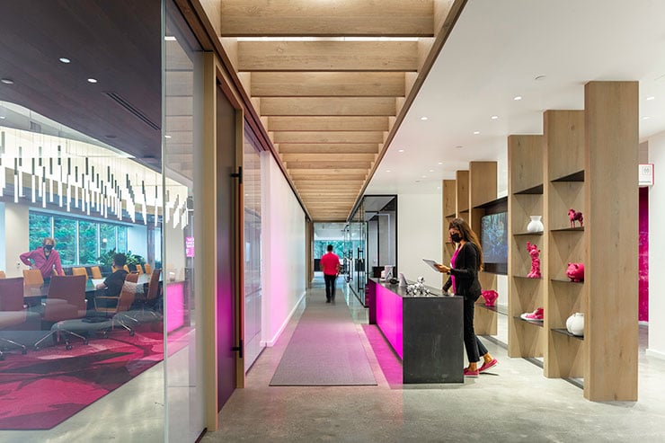
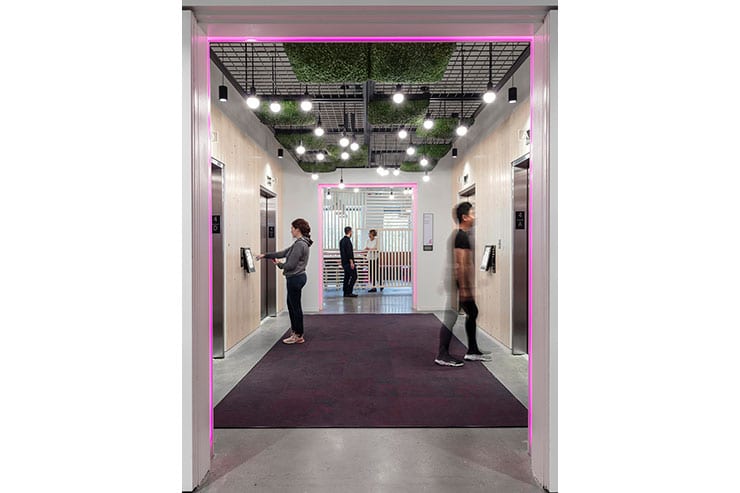
Lighting addresses the wayfinding challenges by creating connections through multiple buildings and sky bridges. Unique lighting strategies in each building’s elevator lobbies, along with luminous multi-height globes at key navigation transition points and intersecting pathways, provide consistent and legible wayfinding reinforcement throughout the campus.
The design meets these numerous project challenges using only 0.47 w/sf, including the magenta branding elements. This was achieved through discussions with the design and ownership team to ensure careful targeting of light levels and placement of light only where needed to avoid overlighting. The project incorporates the stringent control requirements of the Washington State Energy Code, ensuring daylight integration and flexible user control.
The integration of brand, wayfinding, and lighting, interwoven seamlessly throughout the design, is a testament to the collaborative effort of the entire project team. The lighting design across the T-Mobile Campus supports work, collaboration, and wayfinding – integrated into a headquarters that supports innovation and growth.
