- ABOUT
- JUDGING
- CONTACT
- MORE
- 2024 Entries
- Installations 2024
- Past Winners
- Subscribe
- [d]arc directory
- arc magazine
- darc magazine
Stockholm Central Station, Sweden
ProjectStockholm Central StationLocationStockholm, SwedenLighting DesignLight Bureau, SwedenAdditional DesignBuilding antiquarian: Johan Rittsél, AIX Architects, Electrical consultant: MSIB, Electrical contractor: CaverionClientJernhusenLighting SuppliersiGuzzini, Lumenpulse, Ledlab, Örsjö, Lutron, PharosPhotographyKai Piippo
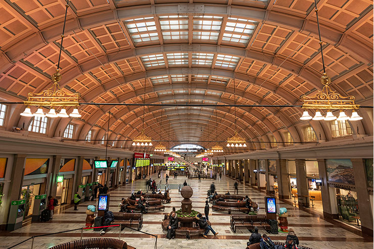
Stockholm Central Station is listed as “building of national interest”, the highest grade of listing. But it is also an entrance to Stockholm, a commuter hub and a public space most locals will have some emotional attachment to. Over time the functions of the station have changed, from that of travelling to also incorporate the functions of the mall as the revenue of the space have increased in importance. Therefore the new lighting design has to balance respect for the original architecture with commercial requirements and those of passengers passing through.
The assignment begun with extensive surveys of visual conditions, historical lighting and building appearance, existing lighting installations and existing functions in the hall. The result can be summarized in the following main points.
• Architecture, commercial interests and passengers need to co-exist.
• The space was dark (65 lx mean value at night) with little contrast or accents.
• Discoloured ambient lighting due to fixtures installed above greenish skylight.
• Lighting controls were in parts manual and only on-off which often resulted in mistakes and misaligned fixtures due to manual handling.
• A few times a year advertising covers the ceiling.
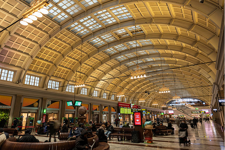
The ambition to stay respectful to the historical values while accommodating the need for advertising and commercial activities resulted in a seemingly simple design with three main light components.
SPACE
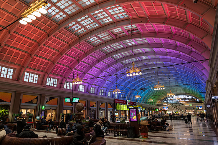
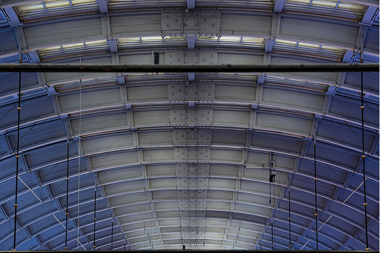
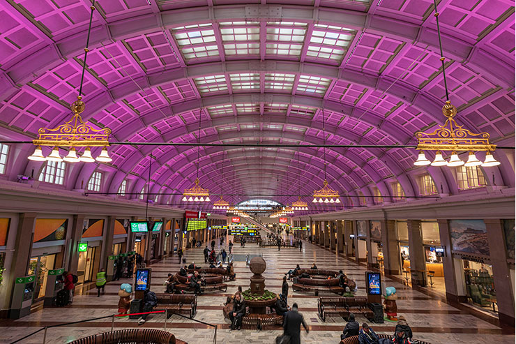
The project managed to convince Jernhusen to integrate the large advertising canvases between the ceiling beams for a more respectful and integrated appearance. This allowed for the space enhancing uplights to also light the ad-canvases when needed. DMX controlled linear RGB and White uplights were mounted on the ledge to light the ceiling. The installation was programmed to let the ceiling architecture shine with everyday static or slowly dynamic scenes and reserving the eye-catching feature lighting to special occasions.
AMBIENT
New ambient lighting was installed along both sides of the skylight. The aim of minimal visual and physical disturbance of the ceiling was achieved with small fixtures with sharp cut-off. A combination of medium and narrow beam luminaires with DALI control allows for more varied contrast and light distribution as well as the ability to highlight the three event areas.
SPARKLE
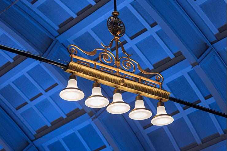
The original suspended lanterns were cleaned and refitted with E27 sockets to accommodate LED light sources. More important was the addition of a warm uplight to show their golden detailing and reinstate a sense of sparkle to the space.
TECHNICAL
Control system with graphical floorplan for simple use and maintenance. The use of daylight control and dimming reduced the used effect from approximately 10W/sqm to 6,5W/sqm despite achieving three times higher lux levels on floor level.

