- ABOUT
- JUDGING
- ATTEND THE EVENT
- CONTACT
- MORE
- 2024 Entries
- Installations 2024
- Past Winners
- Subscribe
- [d]arc directory
- arc magazine
- darc magazine
Sant Domenech, Spain
ProjectSant DomenechLocationBarcelona, SpainLighting DesignAnoche, SpainArchitectFernando Agustí Domínguez, SpainInterior DesignInés Agustí, SpainClientPrivateLighting SuppliersLeds C4
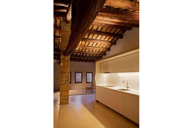
In one of the oldest streets of Sant Cugat, a building of medieval origin collects in its stones a whole historical story of architectural evolution. Nowadays, the building is used for apartments that are perfectly adapted to modern life. It has been the challenge of the Architect Fernando Agustí, with the interior designer Inés Agustí, to give great importance to lighting, and with collaboration of Anoche Iluminación studio.
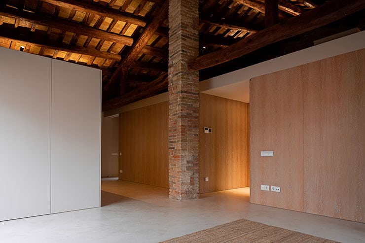
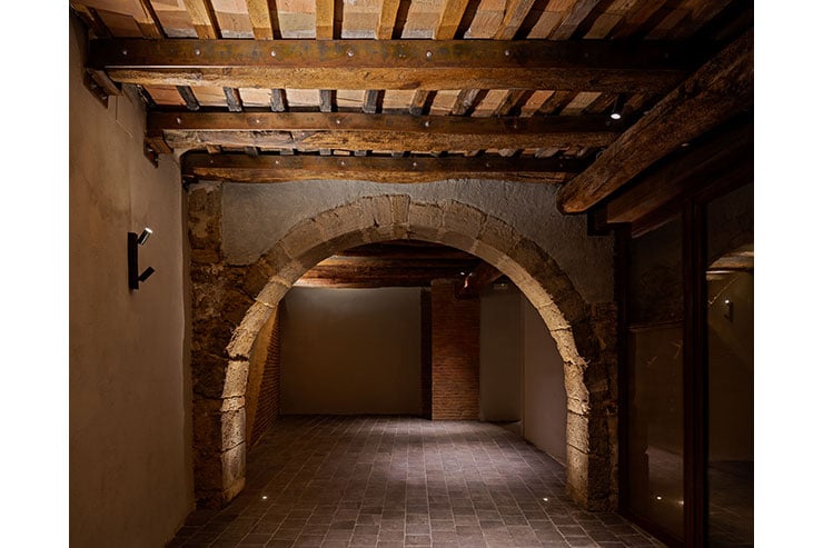
The rehabilitation project’s idea was based on keeping the building’s structure, leaving a history layout as a background, enhancing materials such as stone, brick and natural wood, the original materials of the structure.
The order, the quality, the tonality variate between warm and cold, and the versability in spaces are the result of a project that stands out for his brilliant in the simple details.
The lighting performance was faithful to these design features, aiming to accentuate the integration between the history values and the subtlety of modern details.
This is how contrast, warmth and invisibility are the clear design bases with which lighting plays a fundamental role in the development of this residential building.
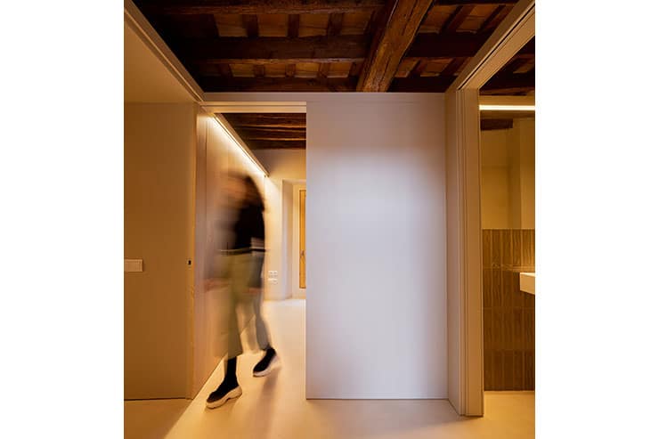
The contrast, the projection, and the directionality of the light that we find intentionally, from the entrance of the building to each of the apartments, it gives us that intense contrast, which lets us see during the tour the originality of the materials such as stone and timber. In each one of the spaces, a constant interest was always sought to show those forms and materials of the building and at the same time achieve a good functionality that a living space requires.
Warmth is the soul of the project. The choice of gray tones for the walls, the warm wood, and the gray veins of the furniture, together with the building’s own stone and wood, make the lighting play an exciting role. The light highlights these warm tones and by contrast accentuates the cold ones, creating a welcoming and inspiring space.
Invisibility, through direct and indirect light; The definition of rectilinear shapes with which each of the spaces are resolved in a versatile way, has been another of the important premises for lighting design. The vertical planes and fine details make the lighting follow the same idea, creating continuous and discontinuous lines of light that draw that modern intervention within an old structure. Indirect lights show us constant respect for the structure of the building, creating highlights and accents on the wooden beams, a ceiling that has been left intact and that seems to float in space.
The simplicity and genius in the solutions adopted make this space a place that tells us of its historical value in fusion with modernity and elegance.


