Radisson RED, UK
In 2022 Entries

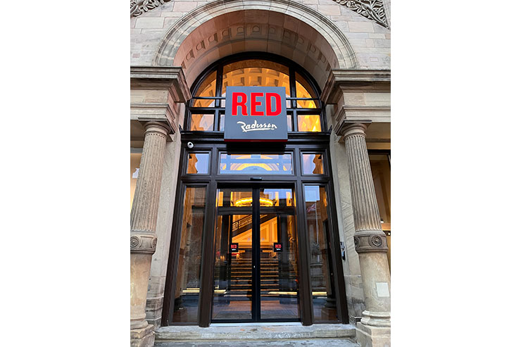


The first Radisson RED hotel in the North of England has arrived in Liverpool. Located in a thoughtfully renovated Grade II-listed property that first opened as one of the original British railway hotels in the 1800s, Radisson RED Liverpool blends history, legacy, and eclectic design.
Much of the design involved restoration to former glory – the C19th stained glass windows, exterior turrets, grand staircase and so on.
Lighting design is a delicate proposition in a building like this. It has to simultaneously stay in character with the listed interiors, whilst also enhancing the vibrant aesthetic of the new RED brand. Squaring this circle required a multi-pronged approach:
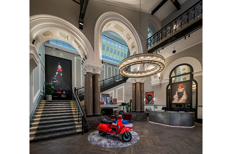
– Decorative lighting was bold, with large statement pieces in the main areas. These reinforced the listed grandeur of the space and especially in the reception area these items created an impactful statement.
Similarly, although differently, the three large white internally lit boxes in the restaurant / bar area make a statement about modern vs classical, setting you up for a dining experience that is at once reassuringly familiar and yet interestingly modern.
– Lighting in non-historic areas could be entirely new and modern, purely responding to the brand identity. For example:
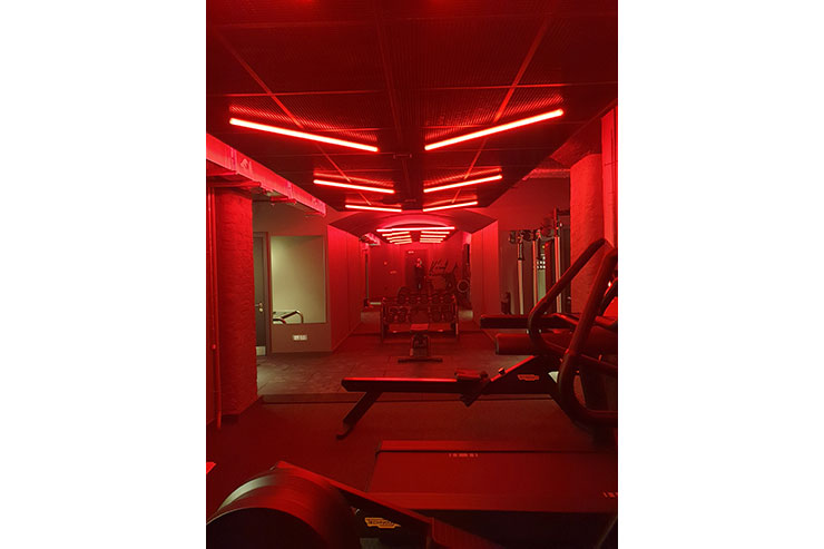
The gym has on-brand lighting, with the space being filled with red linear lights (and at the same time, hiding your exertions and sweat!)
The meeting room prefunction area has lighting integrated in joinery pieces, this is matched with the classic look of decorative items that compliments the chesterfield sofa and crittall windows.
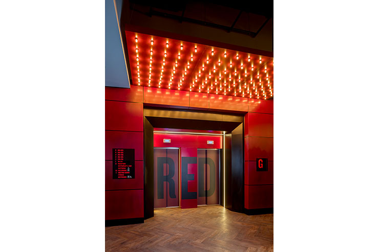
The lift lobby on the ground floor has a bold light raft with over 100 individual filament lamps. The selected low colour temperature and high R9 values of these lamps pick up the bold red colour or the raft, a bright intervention to the classical lobby.
– We opted to use accent spots, sometimes hidden, sometimes exposed, to pick up on details. For example listed historic arches are accentuated with a wash of light and create a stunning arrivals area. New artworks are similarly highlighted and, in the restaurant, of course we put spots to every individual table.
– In other areas we added single point decorative items which were entirely modern – circular profile pendants in circulation areas for example, reinforcing the new part of the scheme.
– A key part of the RED brand identity is the artwork – bold, quirky, always with red elements. A key feature of the interior design, it had to stand out and we had to use lighting not only with excellent colour rendering, but crucially high R9 values. Elements such as the red model submarine and Vespa, were brilliantly accented.
The result is a subtle and elegant blending of old and new. A design that is both classical and modern, a hotel that is historic and new and a project that is a triumph.