- ABOUT
- JUDGING
- ATTEND THE EVENT
- CONTACT
- MORE
- 2024 Entries
- Installations 2024
- Past Winners
- Subscribe
- [d]arc directory
- arc magazine
- darc magazine
Heron Quays Pavilion, UK
ProjectHeron Quays PavilionLocationLondon, UKLighting DesignMBLD, UKArchitectJun Aoki & Associates, JapanAdditional DesignMTT Consultants (Engineering)ClientCanary Wharf GroupLighting SuppliersRadiant Architectural LIghting, Erco Lighting, Lumino Lighting, Orluna
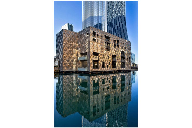
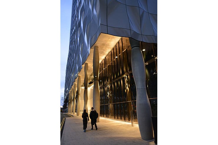
The mixed-use pavilion designed by Jun Aoki, sits on the edge of the dock waters in Canary Wharf. It is defined by its sculptural quality instead of its scale when compared to the other buildings in the wharf. The building architecture has a strong connection to the water, which is expressed in a clam and understated manner to create an emotion and atmosphere within its surrounding. The inspiration for the architecture was to interpret the fluidity of the surface of the water onto the surface of the building. The use of reflective metal panels; shaped as wavelets, appear like the surface of the water that transforms constantly; it is changing with time and when viewed from different angles.
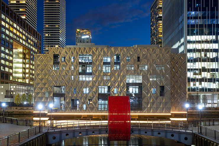
Lighting design narrative follows the architectural narrative, and underscores the bond of the building with water and its reflective quality.
A strong linear wash to the base of the building is a minimalistic expression, that emphasises how the building hovers above the water. The reflections from the lighting detail and the architecture in the water changes with the movement in the water and the angle of view. The main body of the building with its reflective metal panel is left unlit, to let the building merge into its surrounding. Having a dark façade allows the interior lighting to shine through stronger, transforming the building into a lantern placed on the edge of the water.
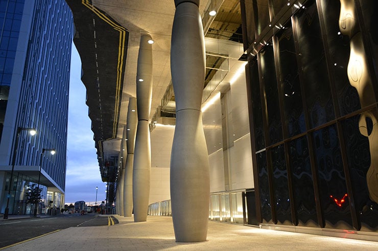
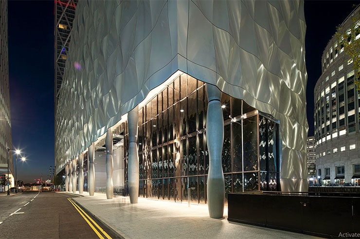
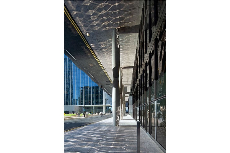
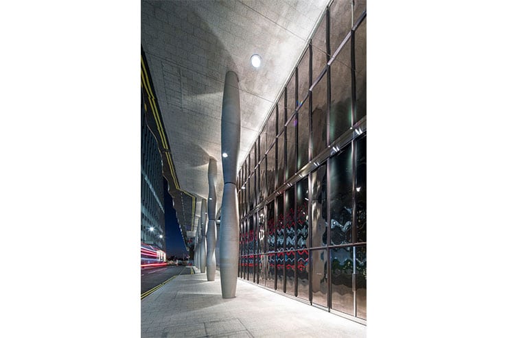
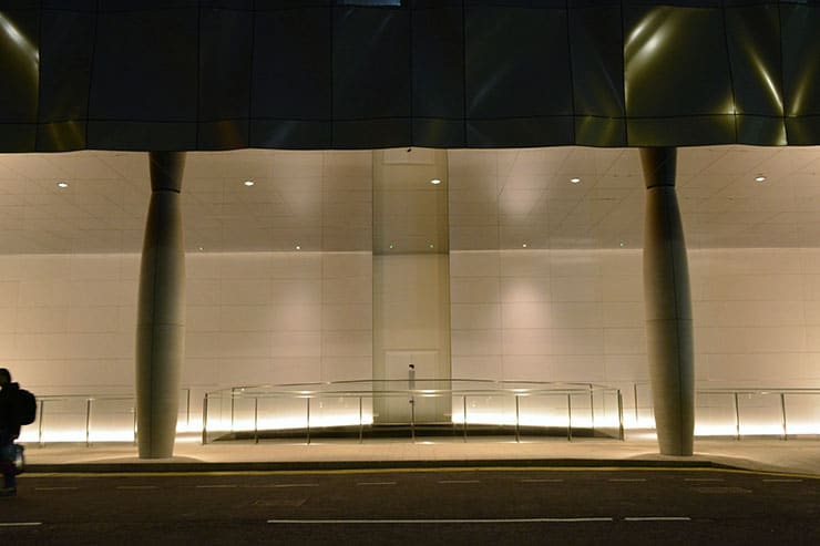
The building along the roadside has a huge overhang, that covers the pedestrian walkway leading to the main entrance. Minimalistic approach to lighting is continued here with strong accents to sculptural elements like the columns and the white walls flanking the main entrance.
Our design carefully considers the highly specular materials in the architecture such as chrome ceiling and mirror façade, where a small lighting gestures get multiplied to create a strong dramatic effect.
The metal fins placed along a dark mirror façade along the walkway, are lit from a discreet trough detail in a chrome ceiling. The sculptural columns modelled using directional downlights from the ceiling, are reflected in the mirror façade.
The strong linear was to the white stone walls of the main entrance emphasises the entrance and creates a striking backdrop to walk along the foot bridge to the entrance.
All the downlights are chrome finished to blend into the chrome ceiling. MBLD developed a special linear luminaire for the project, which is IP67 and lit end to end without any visible end caps to achieve a continuous lit effect.
For the lighting to the Heron Quays Pavilion, we have attempted to achieve simplicity in the way we have used light, in a minimalistic way, to create a play of shadows and reflections that are true to the architecture.
