- ABOUT
- JUDGING
- ATTEND THE EVENT
- CONTACT
- MORE
- 2024 Entries
- Installations 2024
- Past Winners
- Subscribe
- [d]arc directory
- arc magazine
- darc magazine
Palazzo Tirso MGallery Hotel Collection, Italy
ProjectPalazzo Tirso MGallery Hotel CollectionLocationCagliari, ItalyLighting Designessequadro | p ingegneria architettura, ItalyClientGruppo Puddu CostruzioniLighting SuppliersiGuzzini, SimesPhotographyStudio Vetroblu
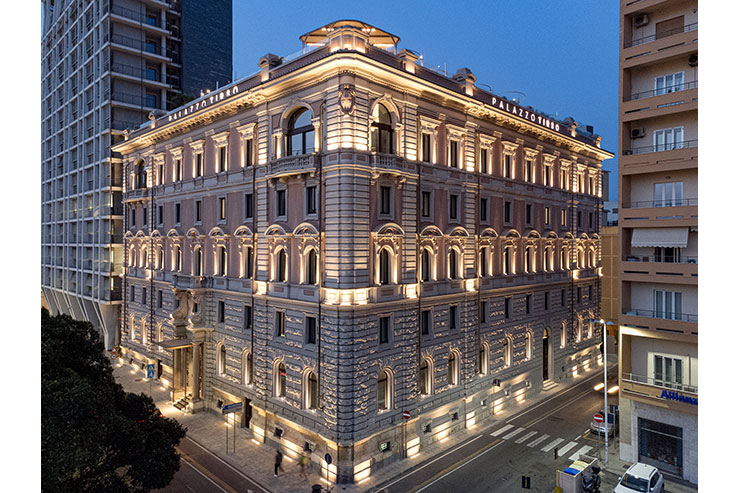
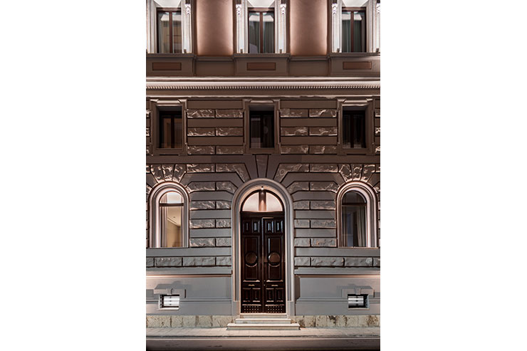
Starting from the assumption that lighting design is above all an architectural project, where the primary objective remains linked to the perception of places and in this case to the ability to excite through the skilful calibration of light and shadows, we wanted to highlight the monumental facade of the Palazzo Tirso marking the load-bearing and decorative architectural elements present. The building has a history that begins from the year of its construction, 1926, designed by the Cagliari architect Flavio Scano and is one of the first examples of neoclassical architecture in reinforced concrete in Sardinia. It is called Palazzo Tirso as it was built by the “Società Elettrica Sarda” (an electricity company) which controlled the Tirso dam in Sardinia. Over the years it then passed to an important banking group until it was purchased by the Puddu Costruzioni Group (one of the most important building groups in Sardinia).
From the outset, the project was developed with the intention of creating a welcoming and refined environment, in harmony with interior design. Light is architecture and as such shapes and improves spaces, giving them a specific atmosphere which in this case had to be in line with the standard of a 5-star hotel. By means of grazing and accents, the result obtained causes the facade to become a visual point of attraction, giving greater importance and value to the entire building as it is also visible from the tourist port.
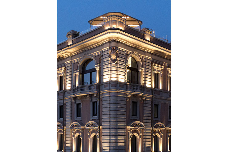
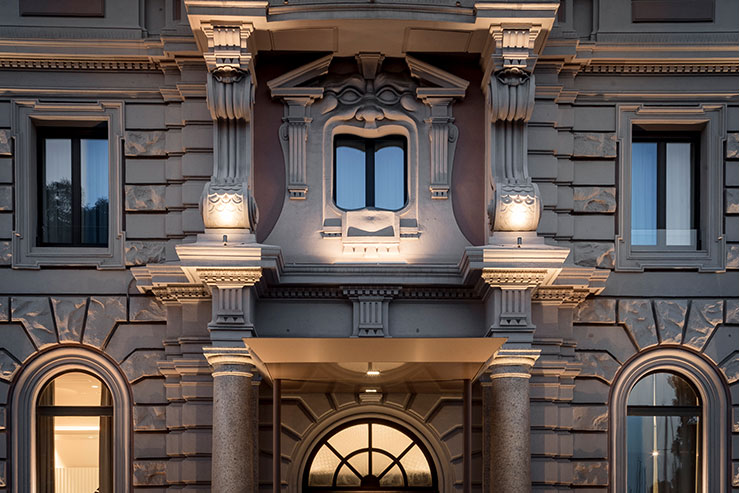
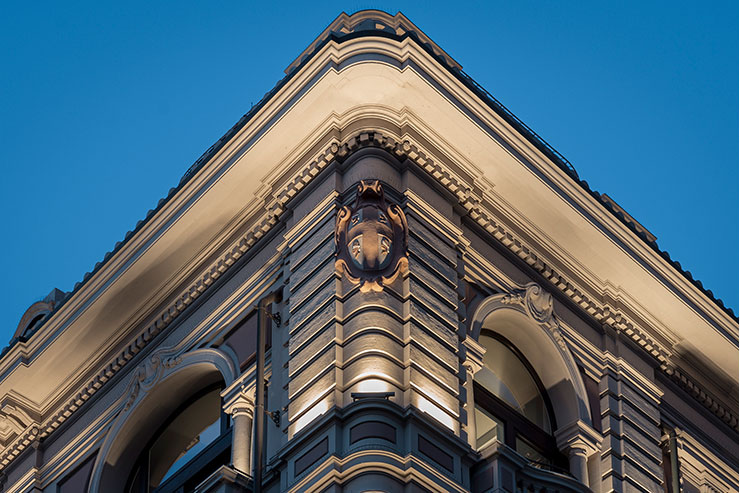
Thanks to the vibrato due to the grazes on the ashlar and to the lighting of elements such as the columns of the entrance, the stairs and the mascaron above the canopy, as well as that of the coat of arms of the four Moors (symbol of the region of Sardinia) in the corner of the building, it is possible to admire the facade in all its complexity and elegance. In this way, even the single decorations that are not very visible during the night are made more evident.
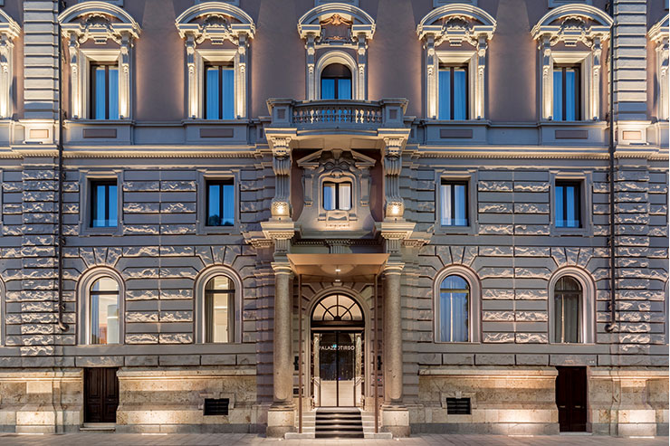
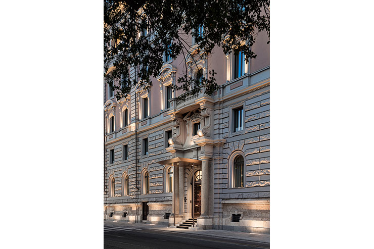
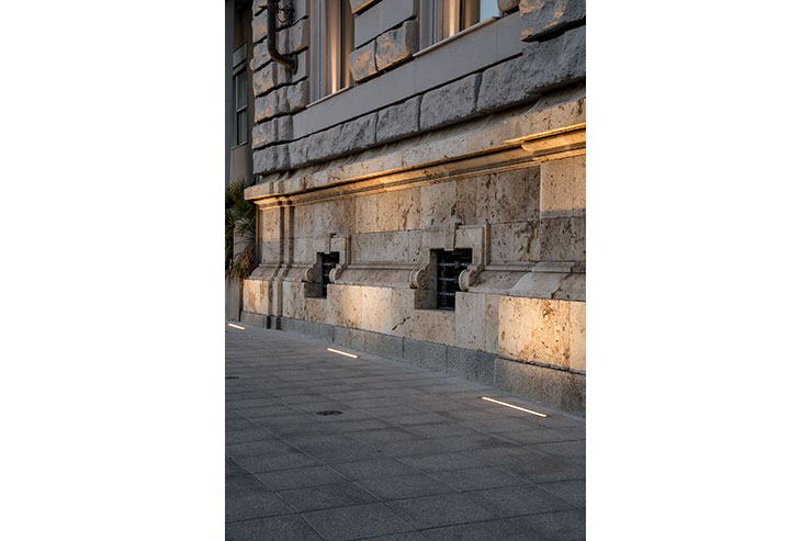
The project began with the historical and architectural analysis of the building. Its history, its characteristics, its peculiarities and its important points have been studied. All this information was used to better interpret the articulated facade and to be able to better tell the story of the building during the night. It was therefore decided to highlight the decorated windows present in both main elevations, with the insertion of small lighting fixtures with very controlled optics and spots. The goal in this case was twofold. Highlight the window frames without creating excessive shadows and without creating light pollution inside the hotel rooms. In addition to the windows and to be able to give a complete reading of the upper part of the building (from the base up) it was decided to insert linear lighting fixtures on the cornice. In this case we have studied an optic capable of being able to push the flow upwards as much as possible, in such a way as to illuminate each pilaster well and at the same time mark the various cornices. This ensured an elegant, sober and at the same time precise reading of the whole upper part of the facade. As regards the large base of the ground floor and the arched windows, the choice was to give a strong contrast between light and shadow generated by the irregular fake ashlar and at the same time give a harmonic scansion of the facade, through the lighting of the ‘window jambs. Each shadow present has been deliberately studied to give the right contrast and the correct materiality to the building. The main entrance was instead highlighted through a choice of architectural and decorative elements that were highlighted.
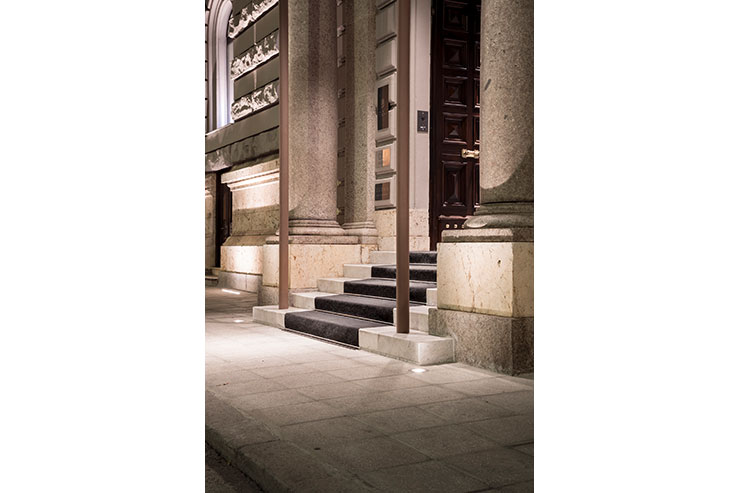
Starting from the marble columns, illuminated from below and then to the capitals and the decorated entablature, up to the mascaron that frames the window above the canopy. The Art Nouveau mascaron was illuminated with a dramatic light from below, but at the same time soft. This effect has allowed its highlighting without accentuating the shadows too much, giving it a strong three-dimensionality and making it a central decorative element to be observed at night. The main entrance was illuminated with spot optics, calculated to be able to illuminate only the staircase and not create dispersion of the flux and glare. The lighting then continues inwards according to a specific hierarchy, which makes it possible to correctly highlight the internal writing “Palazzo Tirso” applied on a mirrored wall.
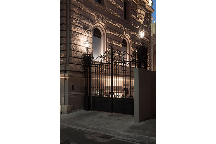
The secondary entrance, on the other hand, was treated following the lighting criterion of the main entrance, but given the absence of the canopy, the lighting body was inserted directly on the facade, giving a nice contrast of light and shadow to the imposing wooden door and marking the entrance with a soft and elegant light. A different approach was taken for the large and decorated wrought iron gate. Returning to the original design of the gate, dating back to the 1920s, we realized that two lanterns with glass were planned. It was therefore decided, in agreement with the owners, to restore these lanterns by converting them to LED technology. Following a major restoration of the gate and the restoration of the lanterns, the result was in line with expectations. A soft, dim but elegant light seems to send people back in time as they pass by and stop to admire the gate and the beautiful facade. In conclusion, the monumental lighting of the façade of the new Palazzo Tirso Cagliari – MGallery Hotel Collection 5* required two months of study, a strong architectural and lighting sensitivity, capable of producing a result in line with the hotel’s standards, creating an elegant, sober and at the same time imposing lighting which highlights, during the night hours, one of the most beautiful buildings in the capital of Sardinia.
