- ABOUT
- JUDGING
- ATTEND THE EVENT
- CONTACT
- MORE
- 2024 Entries
- Installations 2024
- Past Winners
- Subscribe
- [d]arc directory
- arc magazine
- darc magazine
Opal Shopping Center, Iran
ProjectOpal Shopping CenterLocationTehran, IranLighting DesignRGE Lighting Design, IranArchitectOmid Gholampur, IranClientAmani/FarahzadiLighting SuppliersHighlight, YD
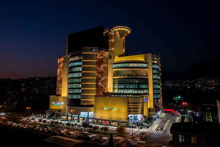
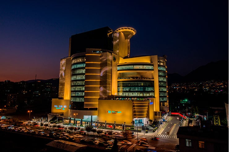
This commercial Center is located at the beginning of Kouhestan Boulevard in District 2 of Tehran.
The concept within the overall design in OPAL commercial and office building, has been tried to corresponds to the main theme, along with the harmony and solidarity of elements to be evident in all aspects of the façade from different views, and in order to attract the public audience and encourage people to step into the building, the lower floors are mostly arranged with closed spaces without show-windows. This is meant to attract the shoppers to explore inside the building. The entrance is designed in such a way that takes the shoppers into the building and also shows the performance and functionality of the building too. The choice of colour as well as the colour combination for the facade is considered homogeneous and corresponding to the urban area. It also provides ambient lighting and visibility for office floors by using all-round full size panes in the middle floors of the building. The design of helipad area is accentuated to provide VIP services for special customers, and the bridge within the facade is intended to create a pleasant memory for the consumers of the commercial complex.
Lighting:
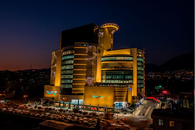
The purpose of the facade illumination is to create a warm and pleasant atmosphere that could have a pleasant impact on the environment at nights.
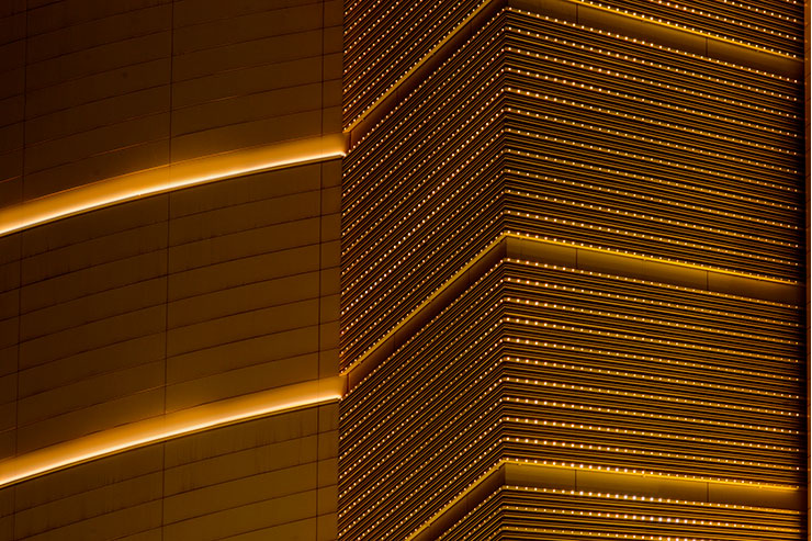
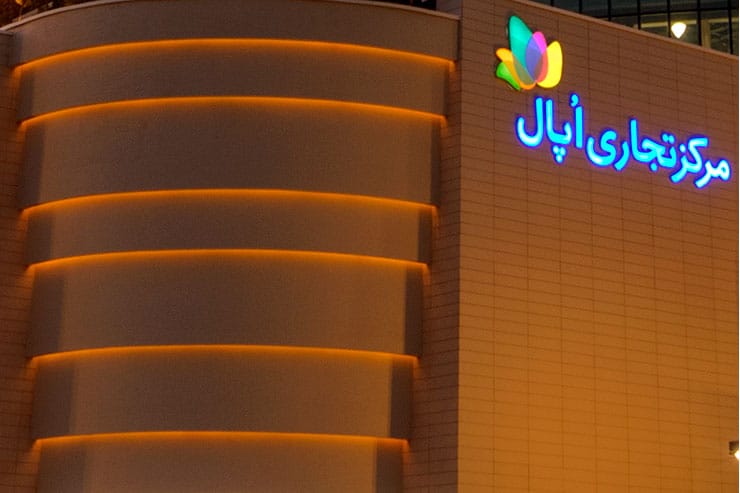
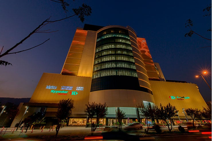
The overall shell of the facade is covered with up-light lighting sources as well as indirect linear CCT 3000K sidelights in order to induce a sense of temptation to attract the audience with the language of light.
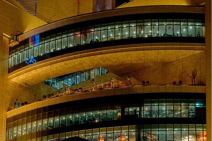
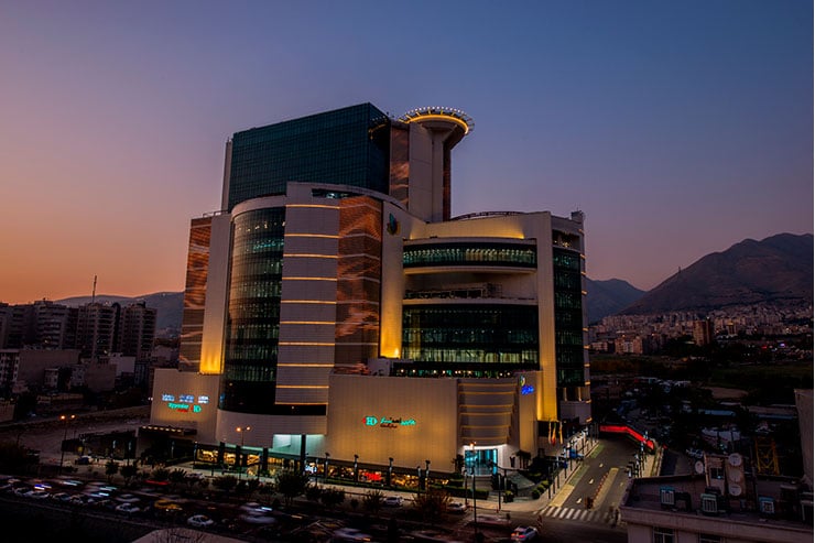
The curved layers above the entrance are all-over illuminated and fairly observable with indirect linear sidelights. Also, the entire structure of helipad is illuminated to be seen like a shining crown that is pleasantly visible from miles away. Spot light sources with 150 degree light gleams, along with linear sidelights with indirect CCT 3000k gleams have also created a very fascinating combination.
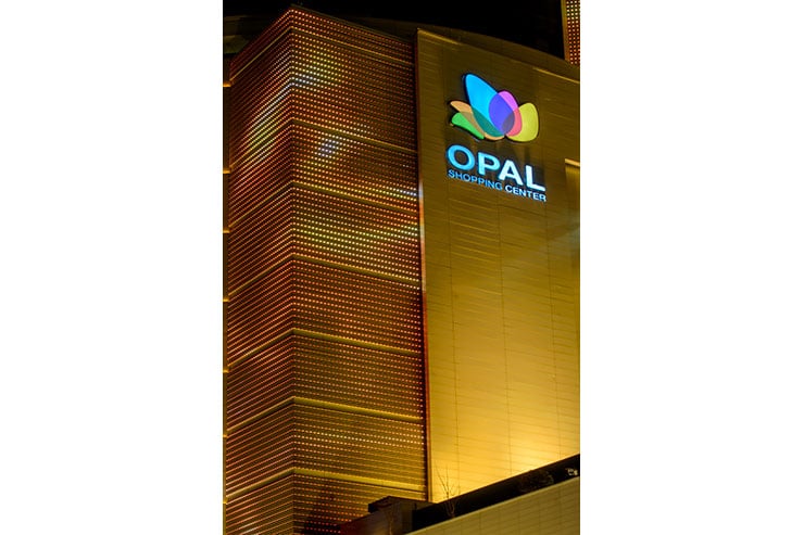
The two side walls of the facade, as well as the lower part of helipad, low-resolution Media Facade are applied to display the almost monochrome graphic arrangements in a very smooth motion that is in harmony with the architecture and warm lighting of the shell. The position of this live vivid shell has a double impact on the architectural beauty of this building at nights and implies the crystallization of life and vitality in the inside.
Visual elements and motifs are designed exclusively for this façade.
On the surface below the curved bridge, the reflection of light glow on the water is portrayed in the most natural way possible, so that not only the ground observers, but also those who from the open restaurant, which is located right below the bridge, can enjoy a romantic atmosphere while having their dinners.
