- ABOUT
- JUDGING
- CONTACT
- MORE
- 2024 Entries
- Installations 2024
- Past Winners
- Subscribe
- [d]arc directory
- arc magazine
- darc magazine
NFL Los Angeles, USA
ProjectNFL Los AngelesLocationLos Angeles, USALighting DesignKGM Architectural Lighting, USAArchitectGensler, USAAdditional DesignMEP Consultant: AMA Consulting EngineersLighting SuppliersLumenwerx, Lithonia, Fluxwerx, Zumtobel, Luminii, Moda Light, Lumenture, Flos, LED Linear, Bitro GroupPhotographyBenny Chan / Fotoworks
The design of this 230,000 sq. ft. interior office and production studio is intended to elevate the organization’s fast growing media business while providing an iconic, timeless environment. One of the major challenges was to maintain design coherency while enduring various pandemic related construction phases and health-required revisions. The finish palette is overwhelmingly dark, so easily controllable lighting is used as to support the overall architectural design vision while adding its own thematic character. Various lighting patterns were used to create visual interest, to break up large spaces and to create a direct tie-in to the media organization’s main purpose.
IMAGE NARRATIVE:
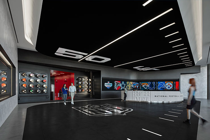
Image 1: Inspired by football field yard lines, a black finish dropped ceiling inside reception with controllable recessed linear is designed to mimic football field yard lines while drawing visitors into the space. The project is illuminated with 4000k CCT sources throughout to support the crisp contrast of primarily black and white finishes.
Image 2: The vibrant red elevator vestibule draws visitors in with contrasting finishes and a pattern of linear recessed fixtures consistent with the theme. Team helmet displays are dramatically illuminated using an array of controllable spotlights to mimic the flash and intensity of camera lights.
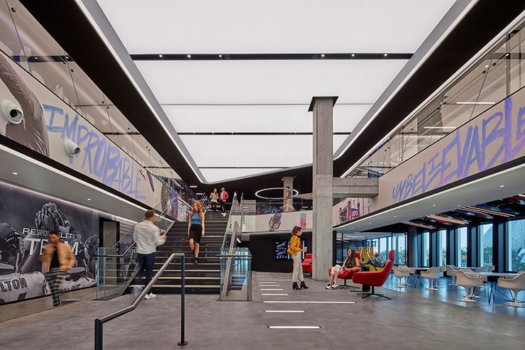
Image 3: At the heart of the project, a central stair connects floors underneath a massive, dramatic backlit ceiling. Intermittent slots seamlessly hide air returns, sensors and track fixtures. Light coves separate the opening from the lower ceilings, highlighting circulation.
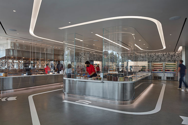
Image 4: The commissary was redesigned during the pandemic to meet the CDC guidelines of reduced contact with staff. The ceiling cove mirrors a painted strip within the concrete, guiding guests in a single-file direction. Toe-kick lighting breaks up the heavy stainless steel millwork. Perimeter grazers at the rear highlight drink options.
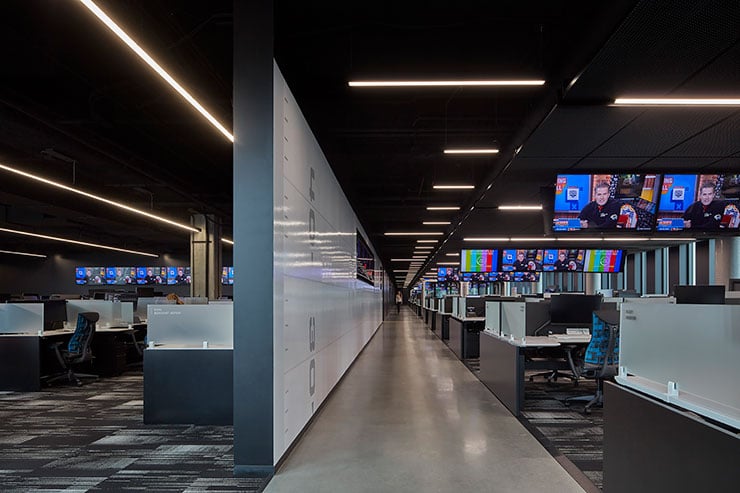
Image 5: Due to the dark finishes it was important to create unique light patterns to break up the space and still make the office space feel welcoming. Open office work areas are efficiently lit with standard linear pendants placed 15’ apart in gaps between metal mesh ceilings. The spacing not only works with the furniture layout to illuminate work surfaces but also aligns with building columns to create a natural rhythm.
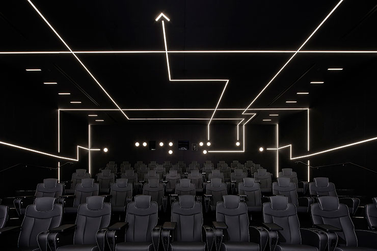
Image 6: The screening room is playfully lit with a combination of recessed fixtures that symbolize a page out of a coaches playbook. Fixtures are carefully zoned so that various scenes can be recalled, creating environments for presentations, group celebrations or video screening.
