- ABOUT
- JUDGING
- ATTEND THE EVENT
- CONTACT
- MORE
- 2024 Entries
- Installations 2024
- Past Winners
- Subscribe
- [d]arc directory
- arc magazine
- darc magazine
Maggie's, UK
ProjectMaggie'sLocationLeeds, UKLighting DesignLight Bureau, UKArchitectHeatherwick Studio, UKInterior DesignHeatherwick Studio, UKAdditional DesignLandscape Architect: Balston Agius; MEP Consultant: Max Fordham; Consulting Structural Engineer: AKT II; Construction Manager: Sir Robert McAlpineClientMaggie’sLighting SuppliersStoane Lighting, Architectural FX / LED Linear, Light Graphix, acdc, XAL, iGuzzini, LedFlex, Rako Controls
Maggie’s is a charitable initiative co-founded in 1995 by garden designer Maggie and her husband, architecture critic Charles Jencks. Their vision was to create a cancer care centre, a safe and warm space where people could access emotional and psychological support surrounded by good architecture and uplifting landscape.
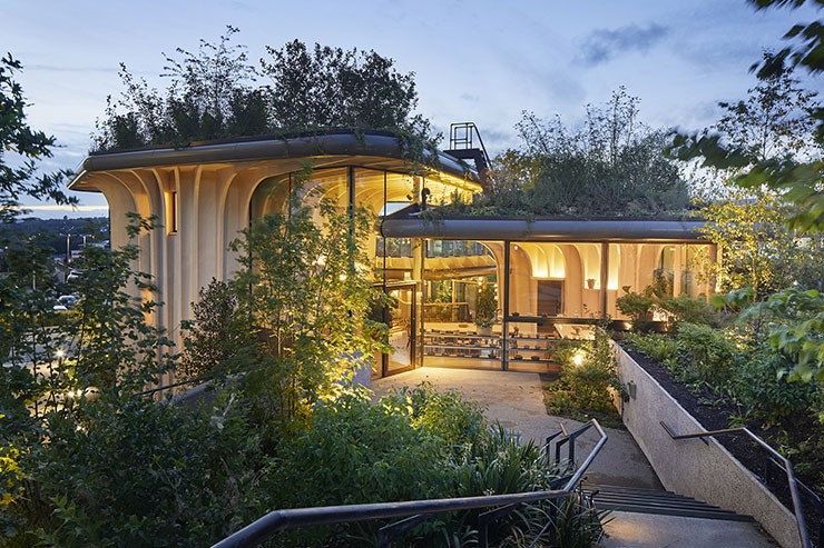
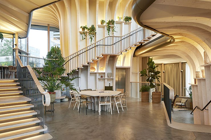
Heatherwick’s inspiration was bath-tubs found in his grandmother’s garden which over-flowed with plants. The building is organized around three of these bath-tub inspired elements, they act as structural cores. These overscaled plant-pots have branching roofs delimited with continuous perimeter glazing. Private counsel rooms can be found inside the cores, while social spaces are staggered at different heights in the open space, the kitchen being the heart of the centre.
In her book “A View From The Front Line” Maggie talked about the need for “thoughtful lighting, a view out to trees, birds and sky” and a design that goes beyond corridors with “overhead neon lighting, interior spaces with no views out and miserable seating”. Following these principles and Heatherwick Studio’s guidance Light Bureau aimed to create kinder spaces for the user as well as being emphatic with the architecture, plants, art and materials.
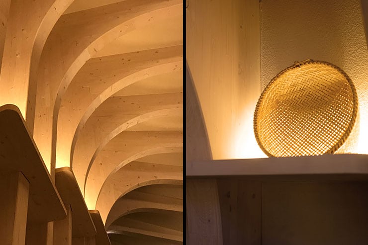
Light Bureau’s approach was to emphasise the tranquil atmosphere by placing warm lighting in niches which hold plants, pictures, books and other household things – making them rather than the lighting the priority. Elsewhere, simple uplights illuminate the soffits.
Light Bureau always want to ensure that the lighting they design for a space is high quality, so that it creates the best effect and it lasts. But a restricted budget can place pressure on those choices. In line with their core philosophy, every luminaire justifies its presence by serving multiple purposes. Simple but good quality column mounted spotlights provide indirect lighting to the high soffits and serve as emergency luminaires. Anti-glare cowls avoid reflections on the glazing. Shelf lighting accentuates objects and art, introduces vertical luminance and elevates the roof eaves. As a result of thinking lean, Light Bureau were able to reduce the quantity of luminaires in favour of diluting the budget on lower-quality fixtures.
Light Bureau worked closely with the architects in the lighting integration strategy. For the team, avoiding fussy over-integrated lighting details was essential to create a homely feeling. Not every shelf needs lighting and not every linear run of LED must go end to end.
Night time transforms the building’s appearance making the branched pots perfectly legible against the higher hospital buildings around the site. With a fully glazed perimeter, ensuring a seamless transition from the inside out was key. From the inside, the main objective was to avoid specular reflections, maintain clear views out, and an appreciation of the garden for the viewer. Façade lighting was consciously avoided – building lighting would have been inappropriate here. Instead, externally Light Bureau maintained legibility and achieved lighting to soffit overhangs by placing sources carefully to light the soft landscape and give benefit to the building.


