- ABOUT
- JUDGING
- ATTEND THE EVENT
- CONTACT
- MORE
- 2024 Entries
- Installations 2024
- Past Winners
- Subscribe
- [d]arc directory
- arc magazine
- darc magazine
Maggie's Centre - Royal Marsden Hospital, UK
ProjectMaggie's Centre - Royal Marsden HospitalLocationSurrey, UKLighting Designstudio ZNA (in collaboration with Ab Rogers Design), UKInterior DesignAb Rogers Design, UKAdditional DesignHand and Eye Studio (bespoke terracotta pendants)ClientThe Maggie Keswick Jencks Cancer Caring Centres TrustLighting SuppliersLightworks, iGuzzini, Precision Lighting, Atmospheric Zone, Wastberg, Muuto, Flos, Reggiani, Jasper Morrison
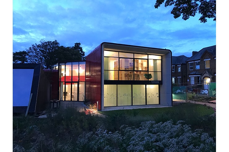
Ab Rogers Design were commissioned to design a new centre for Maggie’s, the charity that provides free practical, emotional and social support to people with cancer and their family and friends. The design was conceived to complement the excellent services of the hospital, providing a calm oasis set in a peaceful garden – somewhere to escape to and take strength from.
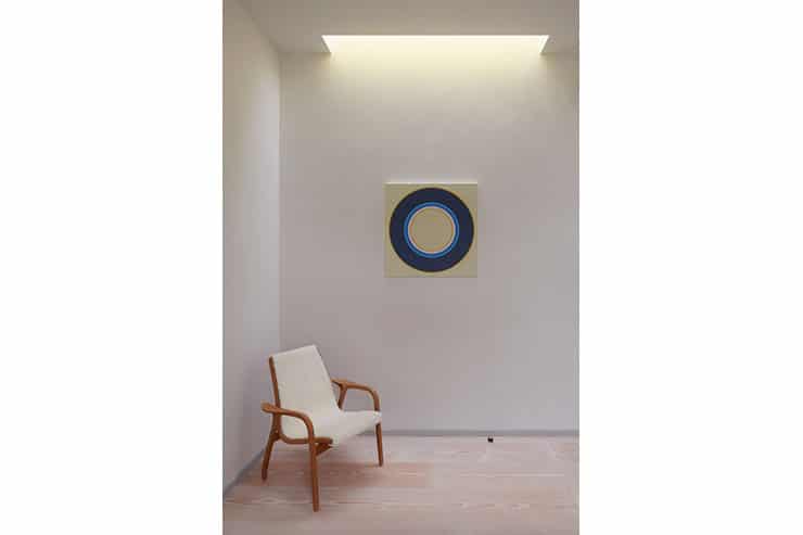
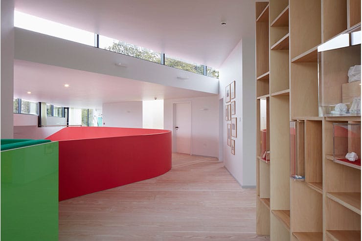
ARD designed from the inside out, its shell dictated by the functions and activities contained within. Its mission is to offer a place of respite for those in need, a range of comfortable, private spaces for quiet reflection nestled alongside welcoming communal areas that help visitors seeking connection and support. “The building itself has been designed with light in mind,” says Rogers, “We wanted to bathe visitors in light and warmth.” Throughout the day, and indeed the year, the building “follows the path of natural light”.
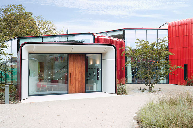
The building is formed of five escalating volumes – clad in terracotta and glazed in graduating shades of red from deep carmine to translucent coral – that wrap around a central courtyard. ARD asked studio ZNA to collaborate on the lighting design to create simple light filled spaces to compliment the daylight design with an elegant and subtle lighting scheme. We began with extensive daylight and sunlight studies to understand the penetration and movement of light through the spaces, both seasonal and temporal. We the used these studies to sketch where artificial light would be best placed to supplement this natural distribution.
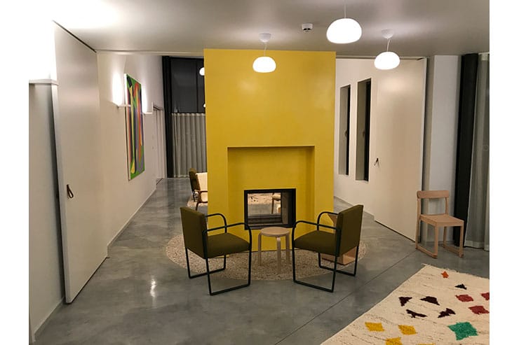
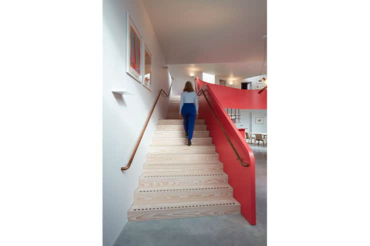
Although the building is clearly a contemporary, design conscious space it was felt that the lighting should appear quite modest and functional, rather than decorative or too slick. With this in mind we designed a lighting scheme where the principal main source of light is indirect from simple architectural wall lights which allows the light to play off the materials and colours. These were situated on walls parallel to window openings to mimic a diffused light and using the architecture of the white ceilings as a natural reflector. Their design was consciously minimal and non decorative to leave the calming lines of the architecture and views uninterrupted and under the mezzanine low glare downlights were placed to create an inviting glow around the all-important tea making island in the communal open plan kitchen.
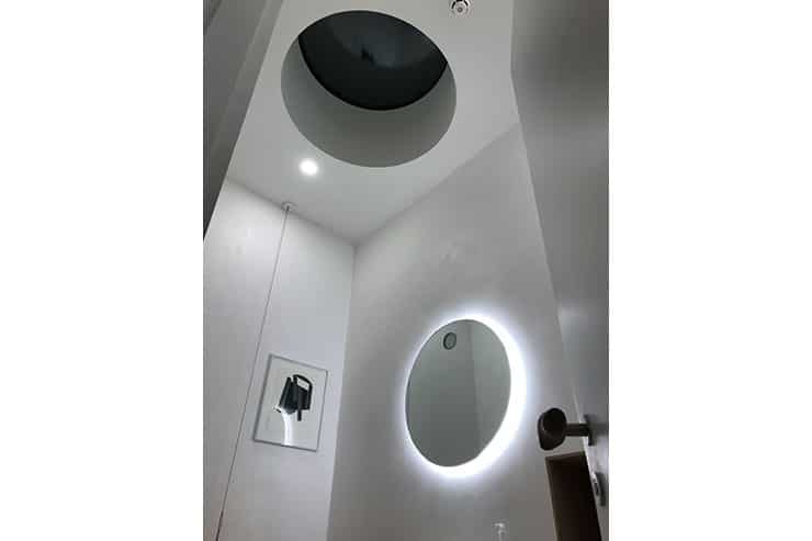
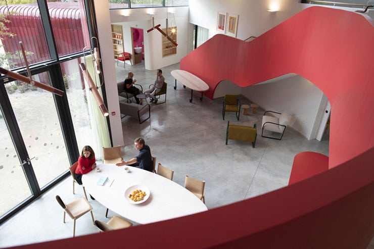
Suspended lights are used to create informal, more domestic zones to help support the safe and friendly atmosphere. Bespoke terracotta pendants were made by Hand Eye Studio to create a dialogue with the rich red terracotta exterior cladding. In the WCs, again reflected light was specified to create warm soft intimate spaces. Offering privacy and comfort. Practical low-level floor and desk lamps were allocated in the rooms for local user control, so that the occupant could tailor their environment to the task or mood. It is a building for and defined by its occupants needs.
Emergency lighting was largely integrated into the scheme to promote the domestic, non-institutional feel.

