- ABOUT
- JUDGING
- ATTEND THE EVENT
- CONTACT
- MORE
- 2024 Entries
- Installations 2024
- Past Winners
- Subscribe
- [d]arc directory
- arc magazine
- darc magazine
LDN:W, UK
ProjectLDN:WLocationLondon, UKLighting DesignBDP, UKInterior DesignBDP, UKClientMEAGLighting SuppliersXAL, ProlichtPhotographyPhilip Vile
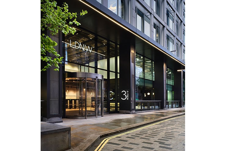
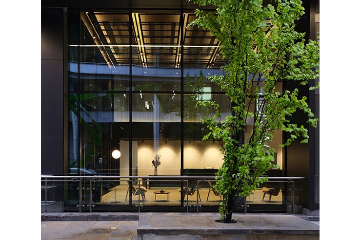
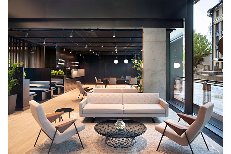
LDN:W is a newly refurbished office building in the City of London comprising 12 floors of Cat A accommodation, a reconfigured semi-public ground floor with innovative structural glazing, a new façade at street level and a rooftop terrace with fantastic views. A project of such striking significance required a lighting design to match, with an emphasis on form, function, and flexibility.
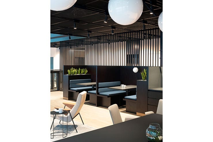
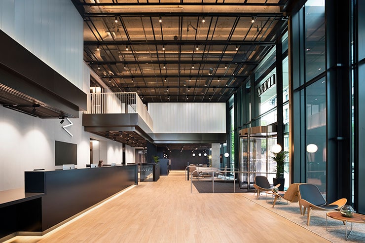
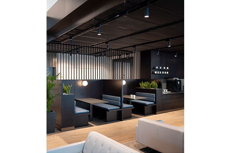
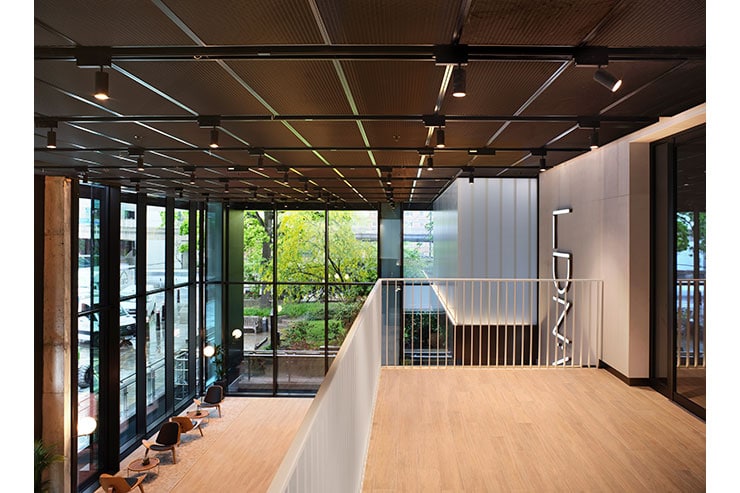
The unique palette of black with black, with even more black throughout, meant that standard lighting could not be used. Any light projected onto a black finish reveals only scratches and dust, so the design intentionally angles the light upwards to the threshold of perceived tolerance in order to narrow the viewer’s iris to render the black finishes rich and dark in lustre by using contrast instead of light. The backlighting to the ceiling produces a warm upward glow to the fine finished concrete behind the mesh. This produces a high-level wash; a bright daylit ceiling yet retaining the presence of black as a translucent layer.
This technique works when neighbouring materials – ceiling and wall finishes – are carefully coordinated so that any area has at least one matt, warm pale material to act as a diffuse reflector to the rest of the space. The end result is a lit interior without glare or spill light to effect the quality of blackness. The room may appear black, yet is well enough lit to read or see your companions clearly anywhere throughout the space.
The main entrance canopy is highlighted by a continuous diffuse line of light, with LED luminaires on each rain screen façade to give prominence at night. Timing occupants as they enter the foyer was essential to the success of the scheme. At peak summer occupants can quickly step into the building from 20,000Lx or more, the intentionally dark verticals speedily aiding adjustment of the eye to the lower levels of the interior. Once inside, the light concentrated on the pale wall finishes comfortably focuses the eyes to the lower level of light. This process can take up to two minutes; the reason why the vertical black walls facing daylight are actually five times brighter than the interior white walls.
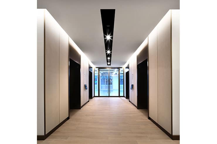
Colour perception and perceived contrast were specifically employed to make interior light-locked spaces appear much brighter than actual recorded light levels. Familiar occupants entered in a matter of 30 seconds; their direct route to the vertical walls brightly illuminated with a traditional wall wash before they reach the lift lobbies. Continuous, direct, diffuse LED lines of light run around the entire perimeter of the lift lobby and circulation space. Luminaires are either suspended or surface fixed flush recessed to the underside of black expanded mesh ceiling. Adjacent to the lift doors, deep recessed LED narrow beam downlights mounted within a black profile system create pools of accent light on the timber floor.
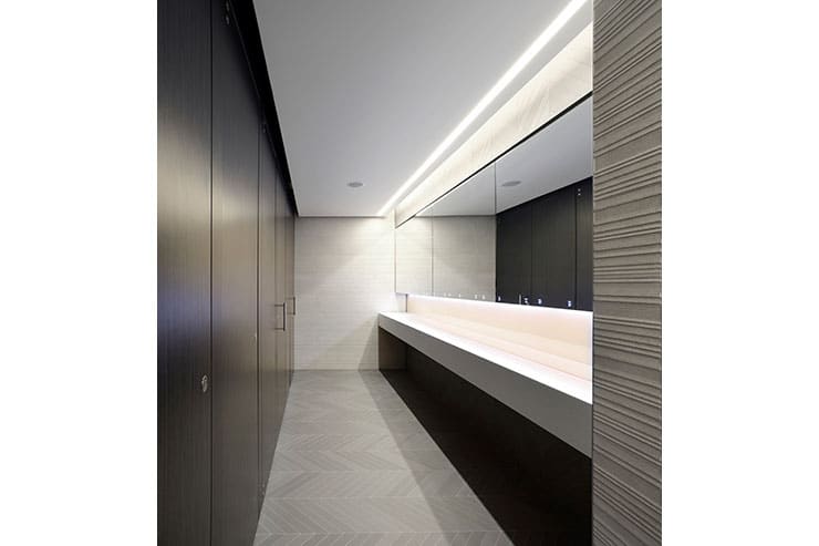
The balancing of contrast and focus to reflected light to any black finish continues through each landlord space into the toilet suites. Focused light for task uses diffuses reflection providing good facial modelling to mirror reflections.
All throughout our approach to lighting design was about achieving balance through the strategic placing of black or pale finishes. This strategy met required British Standards and BREEAM targets while the comfort and wellbeing of occupants always remained first priority.
