- ABOUT
- JUDGING
- ATTEND THE EVENT
- CONTACT
- MORE
- 2024 Entries
- Installations 2024
- Past Winners
- Subscribe
- [d]arc directory
- arc magazine
- darc magazine
Jewel Changi Airport, Singapore
ProjectJewel Changi AirportLocationSingapore, SingaporeLighting DesignLighting Planners Associates, SingaporeArchitectSafdie Architects, USA; RSP Architects Planners & Engineers, SingaporeInterior DesignBenoy, Hong Kong / Singapore Additional DesignPWP Landscape Architecture; ICN Design International; WETClientJewel Changi Airport TrusteeLighting SuppliersAlto, Tokistar, KKDC, Weef, LutronPhotographyBenoy (image 9)
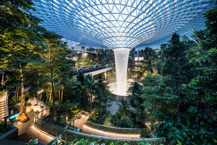
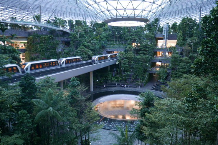
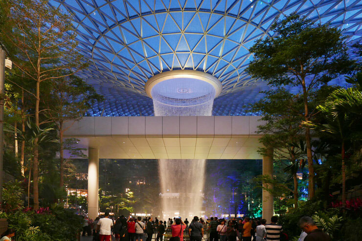
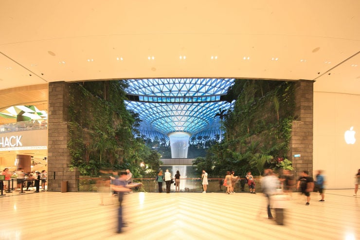
Jewel Changi Airport is a mixed-use development contains gardens, attractions, retail, dining, a hotel, and facilities for airport operations.
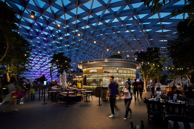
It’s iconic glass and steel dome, which covers a total gross floor area of 135,700 square meters, will see a balance of daylight and the use of artificial light throughout the entire complex.
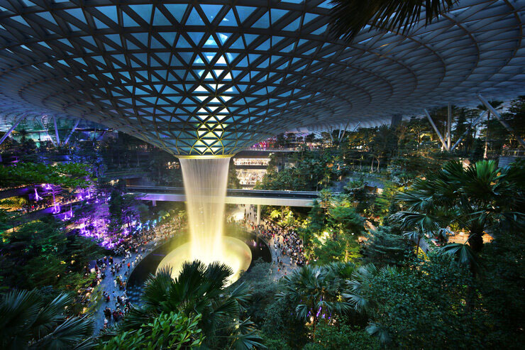
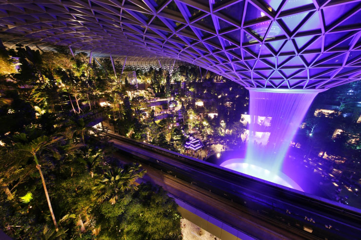
It is an ultimate comfort to be in a well-sheltered indoor space with feeling of full sun shower and lush greenery, experiencing ever changing natural light from dawn to dusk, and it turned into a magical spectacle at night.
The development achieved this ideal environment by application of the latest lighting and control technologies – especially the kind of environment is everyone ‘s dream in the tropics, when the scorching sun, extreme humidity, sudden showers, and mosquitoes spoilt pleasant outdoor strolls.
The lighting design concept was to create a 24-hour immersive visual experience in which the gentle and slow transition of natural light was also reflected in the artificial lighting and giving different lighting experiences throughout the entire day. As time passes, expressions of light gradually change, to reveal the full 24-hours of pre-set lighting operations using daylight and artificial lighting.
Lighting within the dome was treated as an outdoor environment due to dense landscaping and water features. Lighting fixtures mounted on the complex latticework structure was entirely avoided to prioritize a clean visual of the internal dome. Hence all lighting for the forest area were either mounted on the floor, wall, planter box, pole structure or integrated into the furniture.
Colour temperature tunable lighting was proposed for areas receiving daylight to provide seamless lighting colour temperature experience.
This erases the impression of being at interior space as interior lighting is constantly changing to blend with daylight colour.
We found that 4500K blends best as opposed to anything higher during the day.
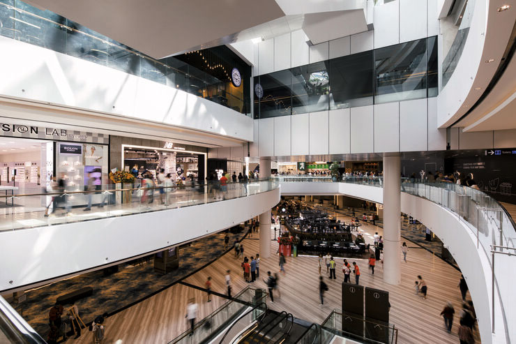
The retail area was clearly distinct from the garden area through differences in brightness levels.
The retail area frontage is brightest, and the light levels are concentrated towards the perimeters whereas in the garden space light levels for safety and circulation are intentionally kept low so that our eyes are able to wander into the magnificent views to make sure it does not disturb the ‘look’ of the forest.
Pockets of light are created instead of a homogenous lighting experience so that we can appreciate light as well as darkness – a sequential rhythm is created that allows us to appreciate light without using too much of it.
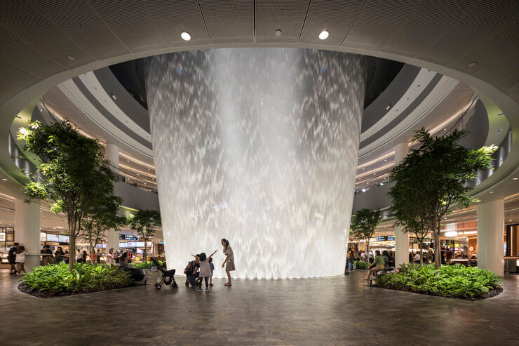
Rain Vortex at the centre stage of it all, is the feature of this project. All the lighting in the garden facing Rain Vortex, has an orchestrated lighting scheme that complements the lighting shows. Interfacing between architectural lighting and show lighting has been discussed and studied for a smooth lighting experience. Dimming levels and fading time had to be changed multiple times at site for the best experience and safety requirement.
