- ABOUT
- JUDGING
- CONTACT
- MORE
- 2024 Entries
- Installations 2024
- Past Winners
- Subscribe
- [d]arc directory
- arc magazine
- darc magazine
House of Wisdom, UAE
ProjectHouse of WisdomLocationSharjah, UAELighting DesignDelta Lighting Design, UAEInterior DesignFoster + Partners, UKAdditional DesignMEP: Aurecon, Contractor: McLaren GroupClientShurooqLighting SuppliersOsram, Lumina, Louis Poulsen, Koncept, Vice, Bega, Cooledge, iGuzzini, Vexica, Erco, L&L Luce&Light, Flos, LiniLed
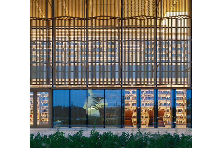
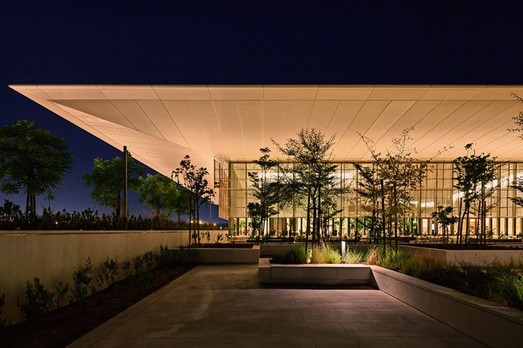
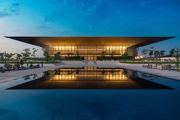
The House of Wisdom is already an icon in the architectural landscape of Sharjah, with its distinctive transparent shell, opaque core and ascending cantilevered roof.
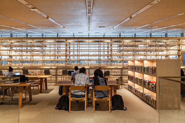
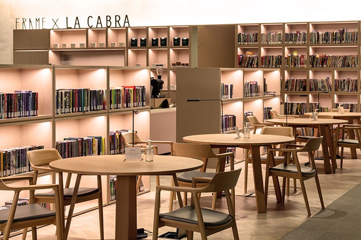
The lighting design approach was built upon the very nature of the function: illuminating a high-tech library, open until 11.00pm, well into the dark hours. This is a place for avid readers, that need high levels of uniform light, a nest for conversationalists, who debate ideas in the relaxed atmosphere of the open cafes, and a landmark for visitors and photographers, who enjoy the building as an independent architectural object to observe and experience.
Responding to these different sets of needs involved a constant shift from macro-image to micro-detail, to detach task areas from leisure areas, while controlling them in parallel, in terms of light levels, spatial distribution of brightness and legibility through contrast.
Thus, lighting is applied in layers.
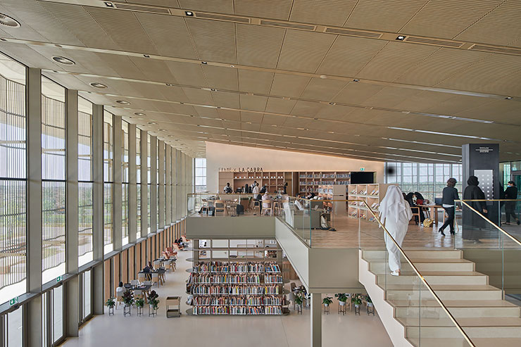
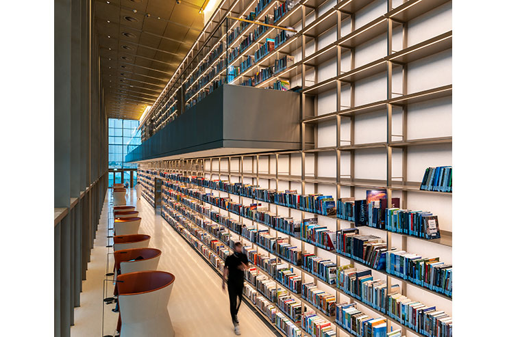
The dominant layer is the downwash of the 4 core pillars, accenting the impressive height of the interior and grounding the structure of the building to express its strength and stability. This wide gradient of light organizes the interior geometry, providing guests with visual structure, which is easy to read, understand and follow.
At floor level, the spill light around the 4 pillars is balanced by a second layer of light, washing the stone finish from ceiling recessed downlights. This vast, uniform pool of light creates an immersive effect, where guests seemingly float inside endless lightness.
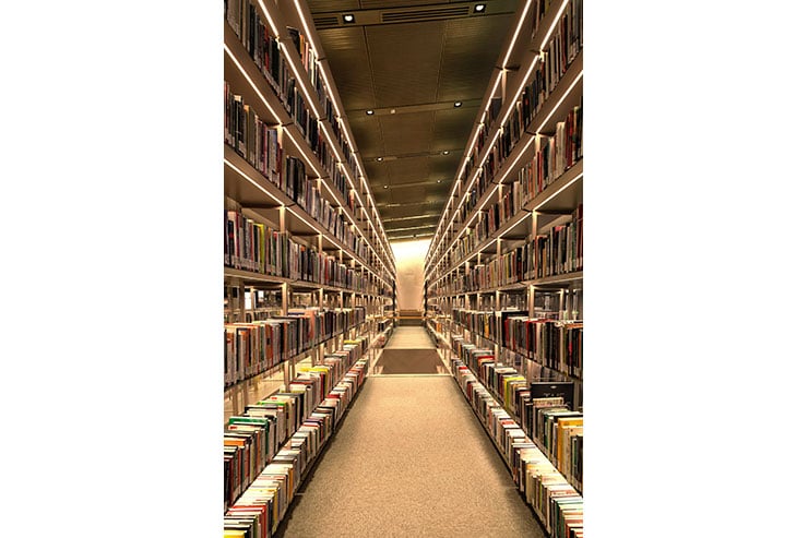
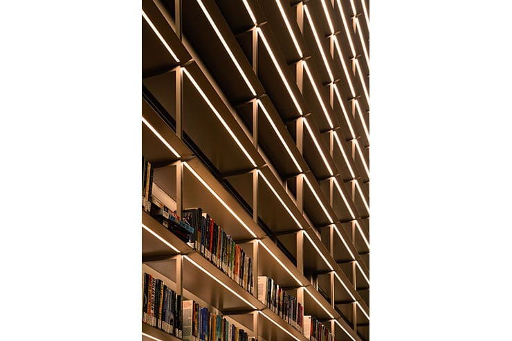
The books in the library have a strong visual presence, being exposed and organized in large scale stacks. A third layer of light is employed to complement the role of the books in the spatial experience of this place. The sense of perspective created by the stacks is heightened by long rows of linear light, concealed within the underside of the shelves. The perceived brighness of this detail draws attention and inspires visitors to look up and discover the impressive potential for knowledge stored in this library.
An additional layer of light is applied to the underside of the exterior roof to break the visual bounds between interior and exterior space in the dark hours. Inground linear light around the building creates a soft, golden wash on the ceiling, giving the impression of an uninterrupted surface. With this effect, the glass facade becomes transparent, allowing guests to have a far view of the landscape and the exterior areas.
And ultimately, to refine the experience, discrete local lights are placed at every reading post, to allow guests to manipulate their immediate surroundings and adjust the light levels according to their individual needs for reading.
The House of Wisdom is a place where guests feel comfortable and relaxed, yet focused when they need to dive into research. Lighting makes horizontal navigation feel intuitive, and vertical navigation feel safe. There are clear visual hierarchies, that rely on human phototropism, and multiple intensities of light are set to help visitors identify key areas within the library.
This project embodies a concept of humbleness, of total synergy between material and immaterial: architecture accepts the soft caress of light, while light sweeps the architectural surfaces to reveal their strength. They work together as a whole, to offer guests an authentic experience of, as Corbusier put it, the ‘magnificent play of volumes, brought together in light’.
