- ABOUT
- JUDGING
- ATTEND THE EVENT
- CONTACT
- MORE
- 2024 Entries
- Installations 2024
- Past Winners
- Subscribe
- [d]arc directory
- arc magazine
- darc magazine
Haukeland Station, Norway
ProjectHaukeland StationLocationBergen, NorwayLighting DesignLight Bureau, NorwayArchitect3RW Architects, NorwayEngineeringSweco, NorwayClientBybanen UtbyggingLighting SuppliersFagerhult, Signify, Color KineticsPhotographyHugo Lütcherath
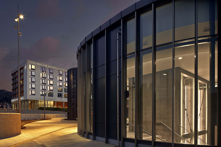
Haukeland station is part of Bergen Light Rail and the city’s first underground station, setting new standards and exploring possibilities for underground travelling in Bergen.
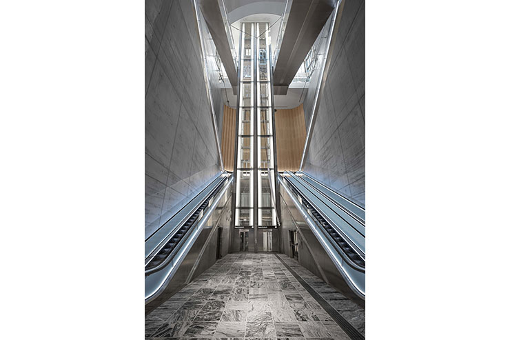
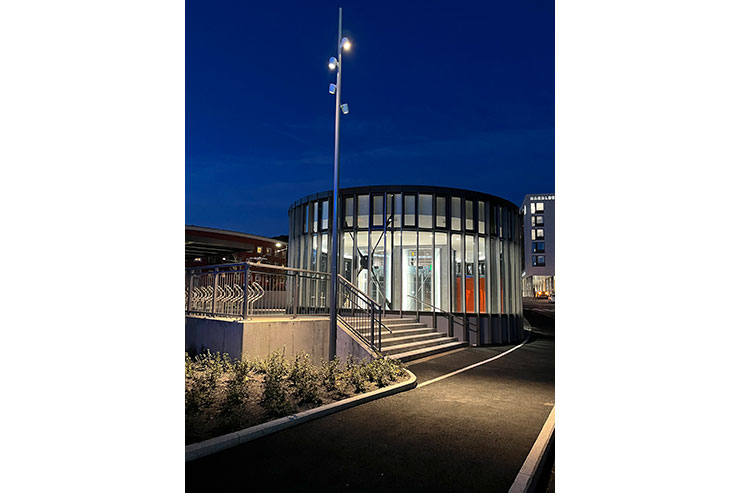
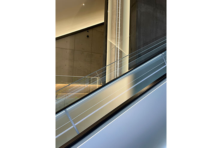
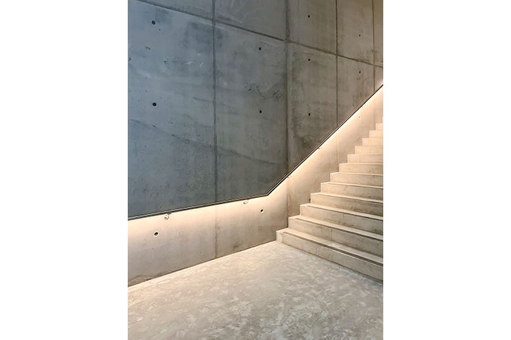
The station hall has two different entrance points; one is accessible through a 40-meter-deep shaft with escalators and lifts, while the other is accessible through a staircase and a 100-meter-long pedestrian tunnel. Therefore, it was crucial to use lighting actively as a tool to help enhance the feeling of safety and to design clear and inviting spaces underground.
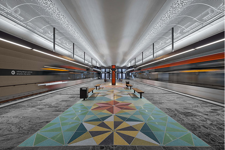
We set out to create a project where lighting and architecture work seamlessly towards a common goal of creating the right atmosphere and rhythm of the space. Our aim was to create the impression of moving towards a clearing and enhance the feeling of always moving towards a bright and safe area. The main consideration was to find the right balance between what surfaces to prioritize and emphasize. Because the station is designed in robust and simple materials we chose to emphasise and add high light levels to the materials and surfaces that define the room.
The lighting is used very actively as a wayfinding tool where the traveller moves towards well-lit surfaces by drawing the eye through a space towards the next destination. Our eyes will always be attracted by the brightest spots in a perspective. When the brightest spot is our destination or path, instead of a luminaire, this allows for a more natural orientation through a space.
A careful processing of all visual and technical qualities was carried out for all areas of the station. The lighting levels and colour temperatures have been adapted within all zones, to make sure the contrast between the areas is right. Both tunable white, RGBW and a variety of different Kelvin degrees have been used to make sure that all materials are enhanced the right way.
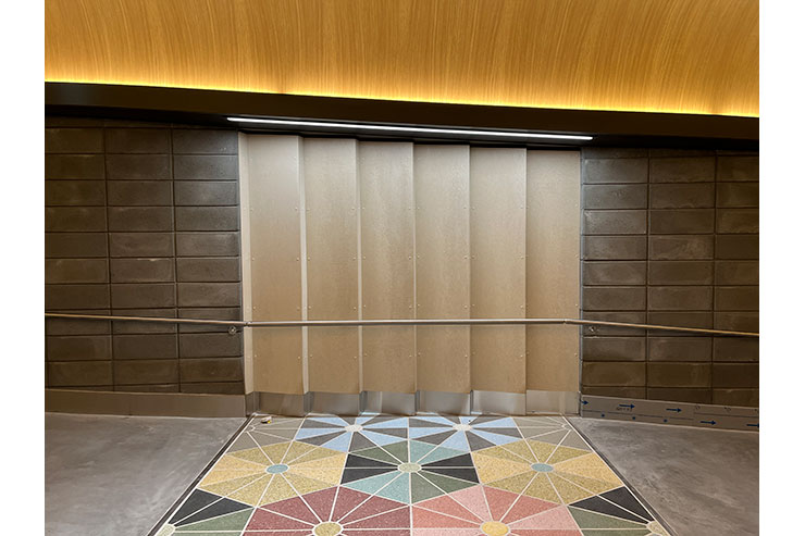
At the secondary entry point of the station, the traveller needs to pass through a 100-meter-long corridor before entering the platform area. In this area we deliberately designed unevenness in the lighting, to make it easier for the traveller to read the distance as they move through it. Just like the numbers and lines on a ruler, both the architecture and the lighting create a rhythm that helps the traveller to read the room intuitively. These indirect solutions allow us to emphasize the different surfaces and materials without the obstacle of glaring luminaires.
