- ABOUT
- JUDGING
- ATTEND THE EVENT
- CONTACT
- MORE
- 2024 Entries
- Installations 2024
- Past Winners
- Subscribe
- [d]arc directory
- arc magazine
- darc magazine
Harrods Technology, UK
ProjectHarrods TechnologyLocationLondon, UKLighting DesignLighting Design International, UKArchitectGensler, UKClientHarrodsLighting SuppliersFlos, LED Linear, Reggiani, LED Flex
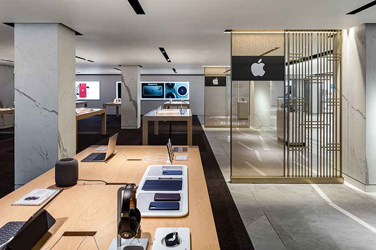
Harrods Technology covers 30,000 sq. ft and offers shoppers products from the best tech brands and interactive experiences.
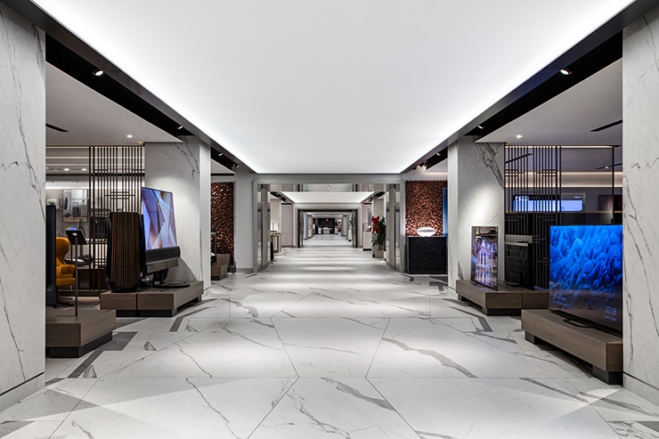
You enter the department through two dynamic portals, known as The Switch. Our overall concept was to create a bright, vibrant and consistent level of illumination along the central walkway. As you venture away, the space becomes softer and more relaxed as lighting levels diminish the further you walk into each room, allowing customers to have a more personal shopping experience.
As customers progress, the familiar environment of Harrods is left behind as they are transported into the new modern department. This transition allowed us to maximise the use of strong, high impact, contrasting lighting effects and controlled pixel linear LED to set the tone.
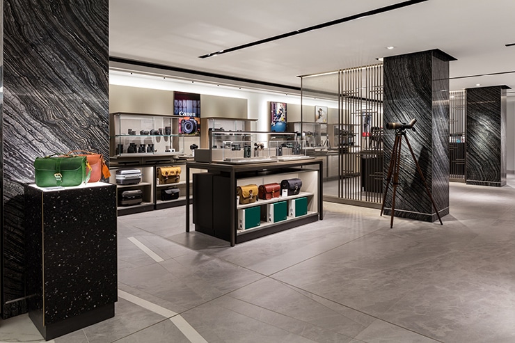
Once through one of the two zones, the customer arrives at the main 94 metres artery connecting each of the five categorised rooms. We were successful in achieving an average of 300lx along the catwalk by illuminating the stretched ceiling above with high-output linear LED. To avoid a flat effect, associated with uniform backlighting, we illuminated the fabric from either side, creating a wash that fades off towards the centre. We supplemented this effect with regular pools of light along the length of the walkway, from spotlights within the ceiling edge, which also helped accentuate the tiled marble floor. The majority of the department was illuminated from above by adjustable narrow beam LED spotlights on mains voltage track, concealed within discreet ceiling slots.
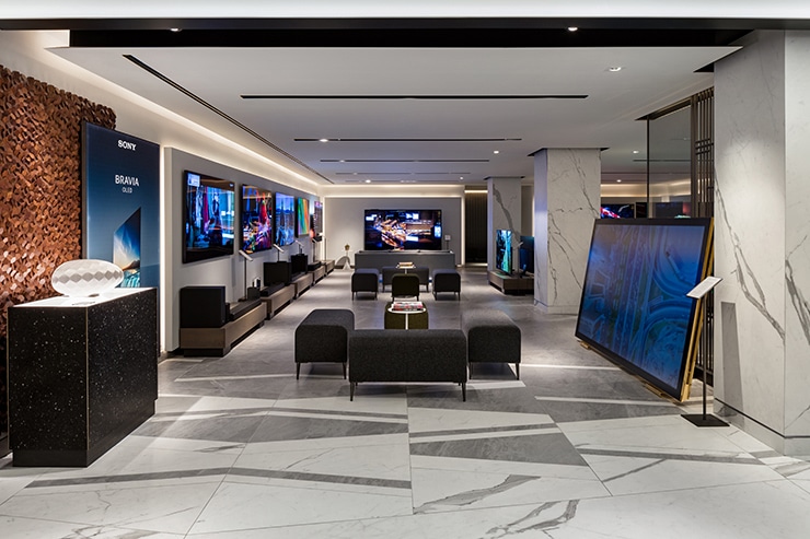
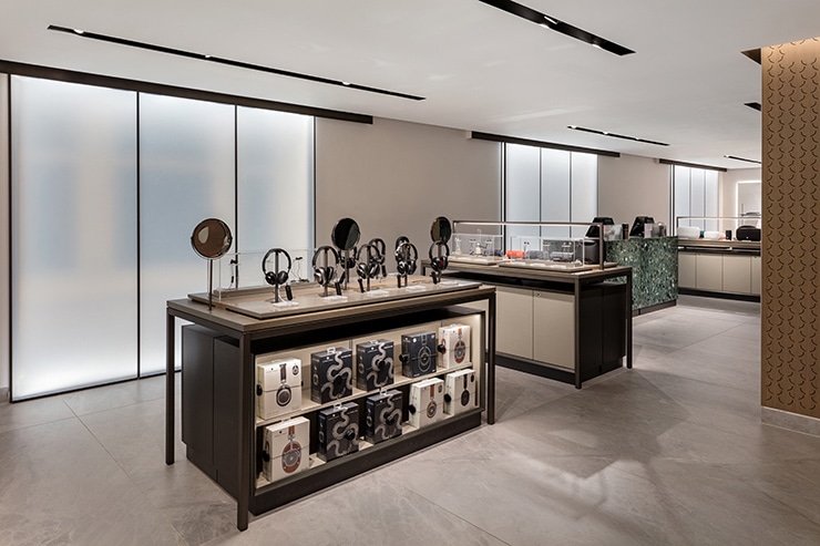
The light levels fall at the deepest areas of each room. This reduction and our desire to minimise general lighting to floor space helps to express the contrast between the general illumination and the direct light on products. Ensuring all products remained the most prominent element of each space.
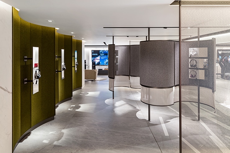
In addition, we utilised a variation in colour temperature to compliment the intended change in mood and experience as you depart the walkway. The stretched ceiling was illuminated by linear LED to maintain the feeling of an identifiable circulation route. Architectural features such as ceiling slots, washing walls and under-step lighting were detailed. This created an appropriate backdrop for products to be illuminated and ensuring excellent colour rendering and a clean appearance.
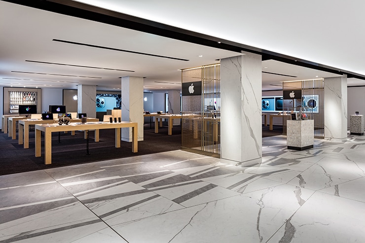
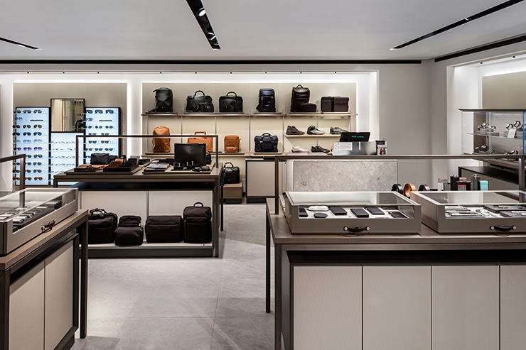
Products are displayed on a mixture of mid-floor tables and fixtures with perimeter displays on adjustable wall-mounted panels and shelving systems. All of which incorporated a variety of linear LED details.
One main challenge was ensuring the perimeter wall displays were sufficiently illuminated. Our opportunities in these areas was limited due to bulkheads carrying vital services. This prevented us lighting the perimeter walls from the ceiling. Therefore, we developed a 40mm shallow channel beneath the bulkhead. This housed a linear LED profile to wash the walls and small spotlights centred on each wall panel to provide direct illumination to shelves.
Whilst the products were the focus of our scheme, we wanted to compliment the subtle architectural features and draw customers into each room, for example the halo lighting to the perimeter wall panels.
