- ABOUT
- JUDGING
- ATTEND THE EVENT
- CONTACT
- MORE
- 2024 Entries
- Installations 2024
- Past Winners
- Subscribe
- [d]arc directory
- arc magazine
- darc magazine
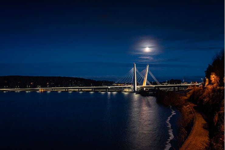
Farris Bridge, Norway
ProjectFarris BridgeLocationLarvik, NorwayLighting DesignRambøll, NorwayArchitectL2 Architects, NorwayClientStatens vegvesen Region SørLighting SuppliersStudio Due, SILL, GVA LIghting, Helvar
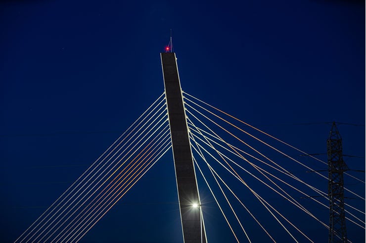
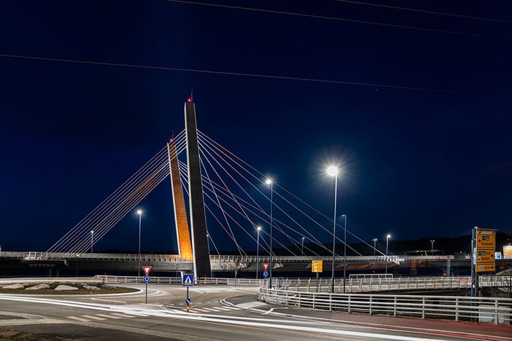
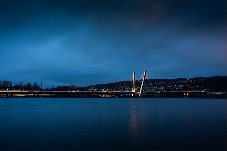
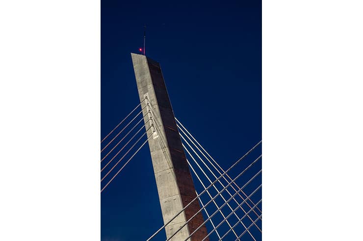
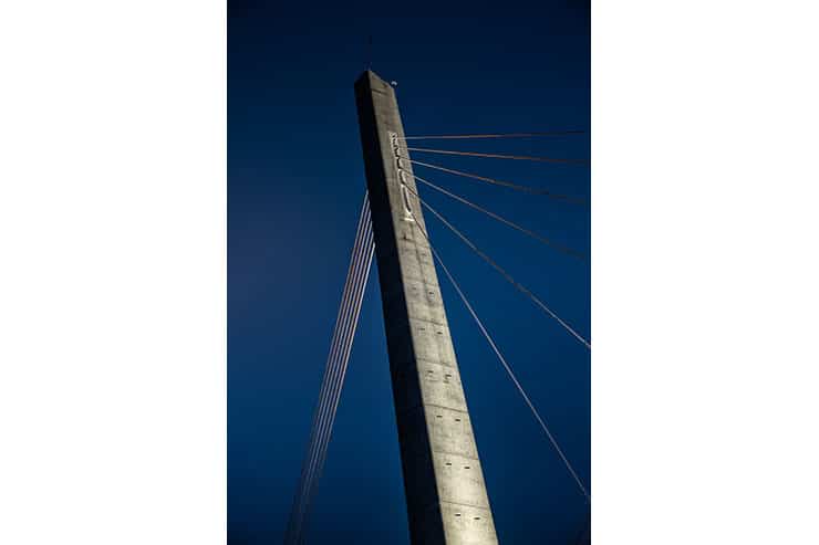
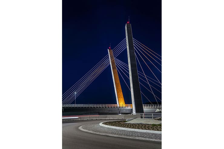
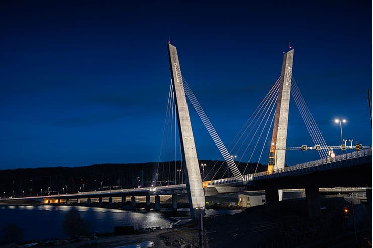
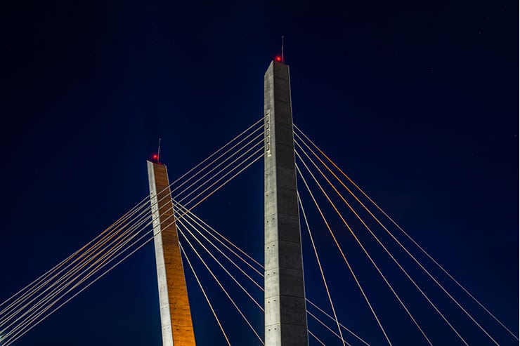
The 570m long Farris Bridge is part of the new 4-lane E18 from Bommestad to Sky, Norway. The bridge curves across the shores of Farris water and is the only sloping stay cable bridge in Norway with a curved road surface. The two 70m high concrete towers are tilted outwards and backwards in a V-shape. The bridge has become a landmark for Larvik city and a visual milestone for the drivers. The lighting concept highlights the two towers with its network of stay cables in a careful and gentle way, where the contrast between the towers’ outside and inside is emphasized. The design supports the architectural design of the bridge by emphasizing the vertical surfaces of the towers.
The lighting concept for Farris Bridge is from 3D to 2D. The bridge will be transformed gradually from a three-dimensional object during the day to a two-dimensional object when it gets dark. Farris Bridge will be experienced differently during day and night and gives Larvik and those who drive past lighting scenarios that depends on time of the day. The concept enhances the bridge architecture and transforms a massive, heavy concrete structure into a simpler and visually lighter experience in the evening and at night. It is based on a minimalist and stylish design that reinforces different combination of flat surfaces for the observer that moves around the scene.
The concept creates contrast between the outside and inside of the towers in a way that the bridge’s inner volume is emphasized. It was central to the design to create spaciousness and contrast. The design focuses on the effect of light/shadow, with a warm “core” as the centre of attention. The coloured light emphasizes the inside of the V-shape with a lower light distribution than lighting of the front of the towers, creating a visual dynamic between the structures. The outer side of the towers is not illuminated and thus becomes part of the visually untouched surroundings. It was important that the illuminated bridge should be experienced in a comfortable way both up close and from a distance. The bridge is placed right next to a residential area, and it was essential to create a visual balance in the area. Effect lighting should not seem dominant in relation to Farris water as a landscape space. Its location involves reflections of the bridge in the water, which can be experienced through the curved roadway.
The bridge is visually anchored to the terrain through lighting of the towers from the underside of the roadway, as well as at each end through lighting of the abutments. It is used the same coloured light as inside the towers, to visually connect the structure.
Only high-quality LEDs are used in the project, in order to handle harsh environment, precise light distribution, good light quality and the need for low maintenance costs. The luminaires are programmed in 6 groups which are programmed in 5 different scenarios, following the day and being controlled by an astronomical timer.
