- ABOUT
- JUDGING
- ATTEND THE EVENT
- CONTACT
- MORE
- 2024 Entries
- Installations 2024
- Past Winners
- Subscribe
- [d]arc directory
- arc magazine
- darc magazine
Corrugated House, Japan
ProjectCorrugated HouseLocationToyohashi, JapanLighting Designambiguous, SingaporeArchitectKenji Kawai, JapanInterior Designmonotram, JapanAdditional DesignProducer: ADDReCClientFood Forest Lighting SuppliersKoizumi
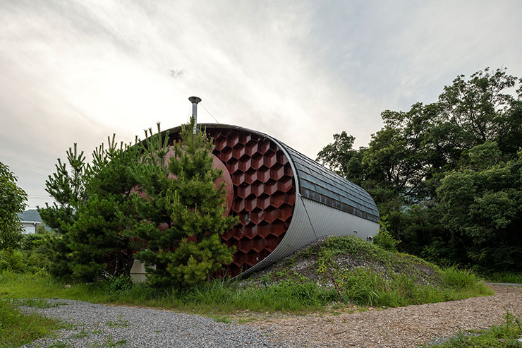
This project involved the renovation of a disused dwelling, which was to be transformed into accommodation. However, this dwelling had its unique characteristics. It was the residence of Kenji Kawai and his wife, remarkable engineers and facilities designers who had worked on many of Kenzo Tange’s architectural projects. They continued to explore the principles of architecture from an energy perspective. They constructed this residence using corrugated pipes, originally intended for civil engineering drainage, repurposing them as a building material to pursue a self-sufficient lifestyle. Prior to his career as a facilities designer, Kawai was an expert in heat engines and had been a researcher of the ‘total energy theory.’ Following the completion of the dwelling, he continued his unique research on energy at the site and formulated a proposal for an urban energy supply system. His theory is grounded in the idea that the energy cycle should not be self-contained but, instead, should be pre-connected to a broader environmental and social circulation. The Kenji Kawai Residence was designed as a minimal version of the self-sufficient lifestyle he advocated at that time.
Boldly set apart from the Earth, its shape evokes memories of the spaceships that once landed on this planet. It allows people to experience a life detached from the social ecosystem and disconnected from everyday life, embodying the concept of “disconnecting from Earth for a night.” This accommodation isn’t merely a place where comfortable living is guaranteed; it’s a space where one can immerse themselves in the natural beauty of the Earth’s four seasons, imparting vital lessons to those of us living in the modern world. The goal was to create a space where visitors could reflect on the nature of their own connection to society during their stay.
In line with the concept of such a regenerative project, the design of the lighting environment was initially dedicated to rediscovering and reinterpreting an essential building in the history of Japanese architecture, one that exudes strength both in concept and appearance.
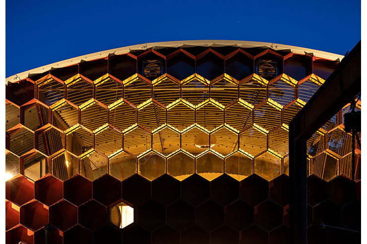
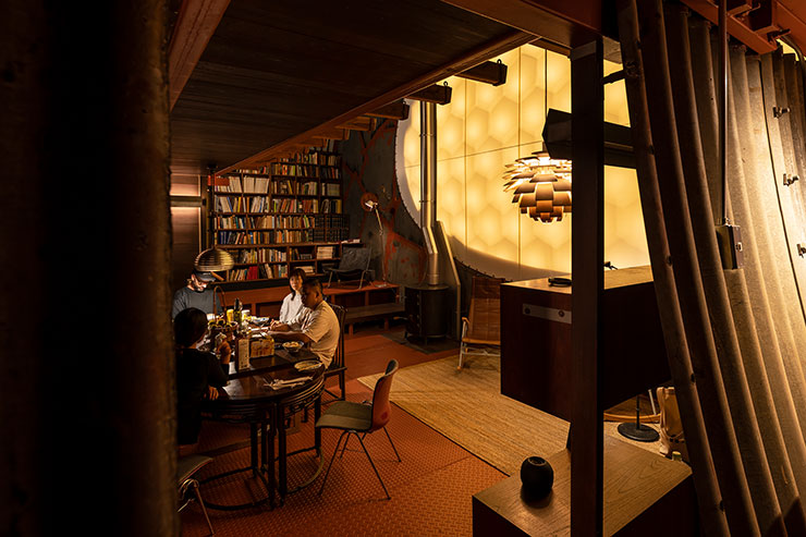
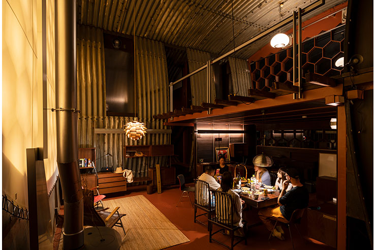
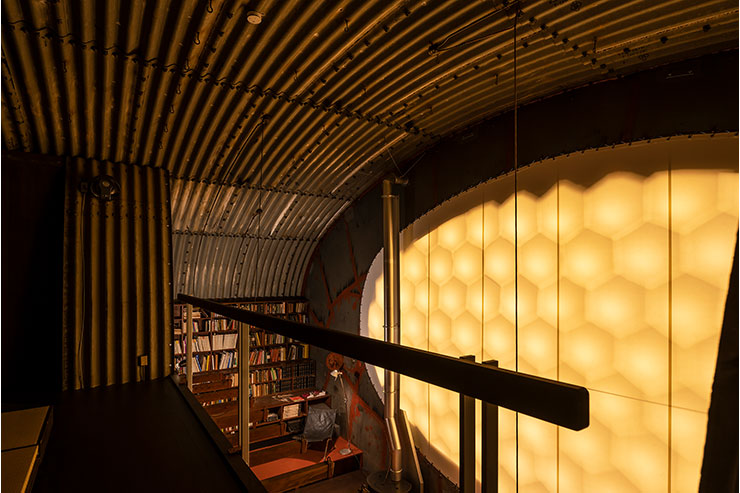
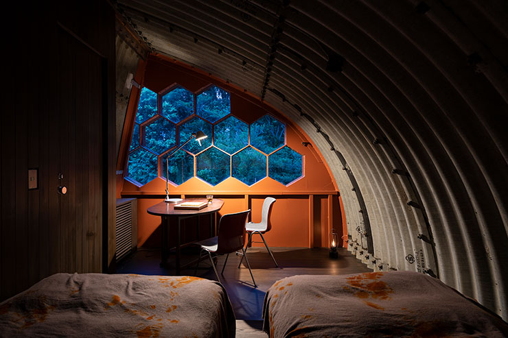
The Corrugated House is enclosed by corrugated panels, which cannot be called walls or a ceiling, and has a unique structure with two flat walls. Most of these walls consist of a honeycomb made of steel plates, and the honeycomb part is partially glazed with fitted windows for light. The dynamic exterior of the building, resembling a spaceship, imparts a strangely relaxing atmosphere inside. The entrance leads into a vaulted space. A large oval tent curtain is stretched over the honeycomb on the wall in front of the entrance. This tent curtain acts as an air layer and was installed to block the radiant heat from the steel plate on the south side.
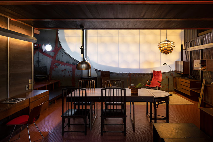
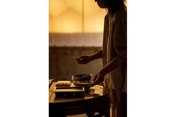
The large tent curtain was to be replaced by a new one during the renovation, with the intention of making it soft and luminous as a central feature of the interior space. A wood-burning stove was placed in front of the curtain, providing a cozy gathering space for people to relax, and the light emitted was intended to be soft and warm, reminiscent of the gentle glow through a shoji paper sliding door. Behind the curtain, LED bulbs were strategically placed within each 400 mm deep honeycomb. The color of the curtain was selected based on how the light would be perceived, and the distance between the curtain and the light source was carefully designed to produce the most beautiful shadows on the honeycomb. The luminescence of this tent curtain serves as a radiant light, filling the entire interior. The light emanating from one direction unveils the dynamic expression of the corrugated panels, creating a visually captivating effect.
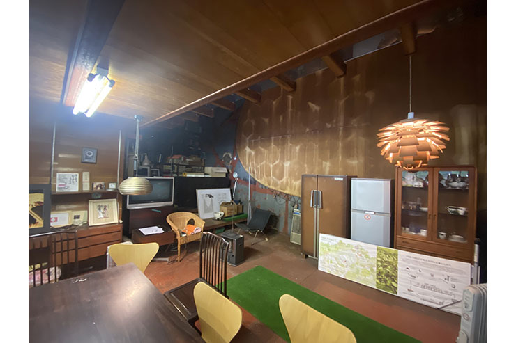
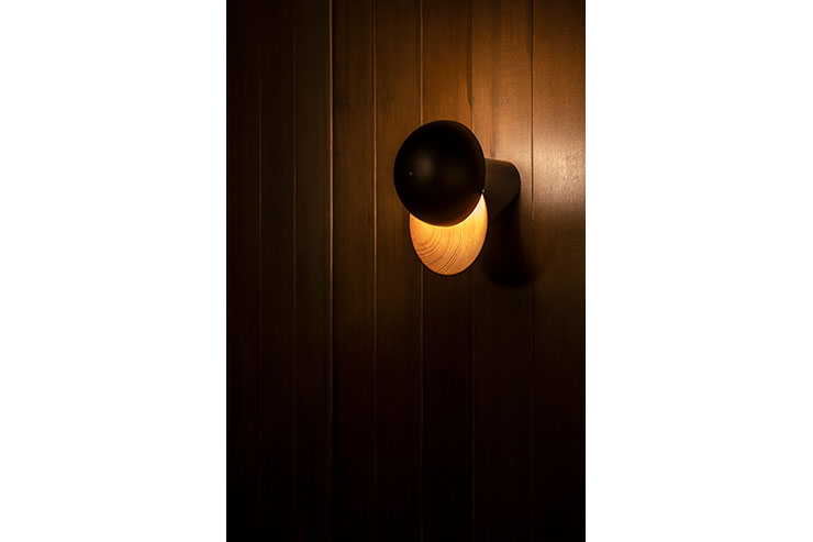
The reuse of lighting fixtures was also actively promoted. Many of the furniture lights originally owned by Kawai were masterpieces, so they were cleaned, the bulbs were replaced and reused in the appropriate places in the room. The teacups that remained in the house were upcycled and wall lighting was designed.
When we thought about what kind of light environment we would like visitors to spend their time in, to get away from their daily routines, we came up with the concept of making them aware of the light-saturated city and the too-bright society they live in, and to make them aware of darkness and the value of darkness. Most people who visit this place are first of all inconvenienced by its dimness. As their eyes become accustomed to the luminous curtain light, they realise the dynamic nature of this interior space and the details that are not found in ordinary architecture. The light needed for things like reading a book or enjoying a meal is provided by lights placed on the floor or suspended, which are switched on from time to time. In addition, I carry light with me wherever I move, with a hand-held lantern that can also be recharged by sunlight. When the light is no longer needed, it is switched off. Eventually, the dimness becomes a space that feels comfortable. We designed such a light experience. We were able to create a light environment that, despite being a dynamic space, is strangely soothing.
