- ABOUT
- JUDGING
- ATTEND THE EVENT
- CONTACT
- MORE
- 2024 Entries
- Installations 2024
- Past Winners
- Subscribe
- [d]arc directory
- arc magazine
- darc magazine
Copper Light Crystal, Russia
ProjectCopper Light CrystalLocationYekaterinburg, RussiaLighting DesignVasily Tarasenko / Natalya Koptseva / MTelectro, RussiaArtistJason Bruges StudioArchitectFoster + Partners, UKClientRussian Copper CompanyPhotographyIlya Kolehavov, Nikolay Kovalevsky, RCC
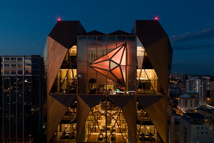
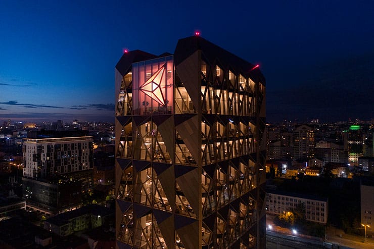
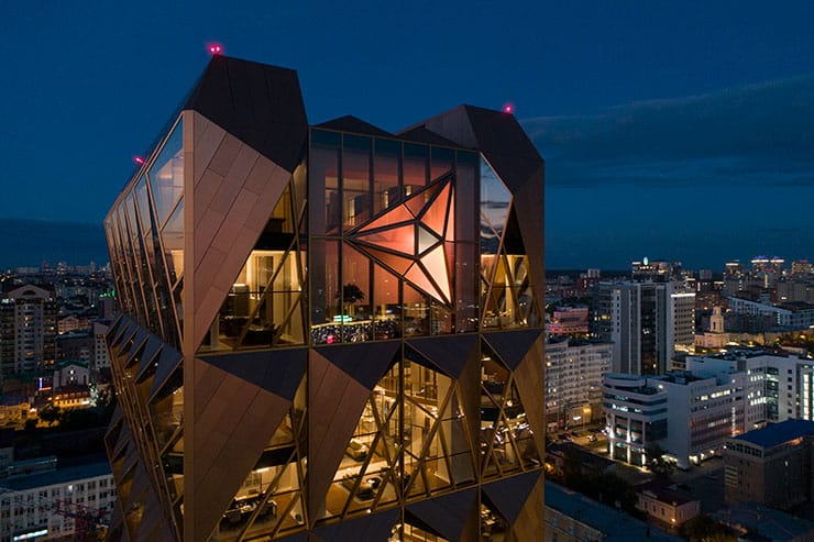
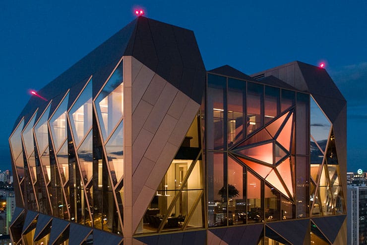
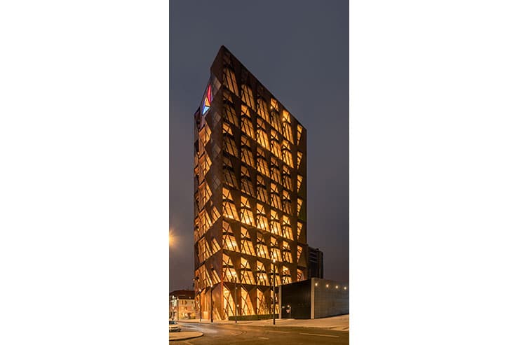
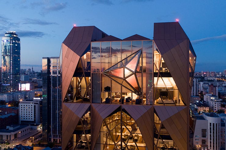
It is for the first in Russia to have a building designed by world famous Foster + Partners. We’d like to note that the RCC headquarters in question is a unique and outstanding construction for Russia, both technologically and in terms of design solutions. We had to pay a special attention to the evening shape of the site, that’s why, we conducted a thorough analytical research on main view perspectives and points of exposure of the building in the map of the city in different periods of day and night. City lighting significantly affects our impression of the building when we are close to it. The facade is made up of volumetric panels in a complex shade of copper and a complex configuration. Which allowed us to achieve the desired gradients utilizing combinations of light of certain luminous temperatures with a slight addition of red accents, thus the light does not seem excessive: there is some but there is no. It was essential to consider numerous light and colour variations of exterior and interior lighting to finally find the level of light balance which would be adequate for the site taking in to account its characteristics.
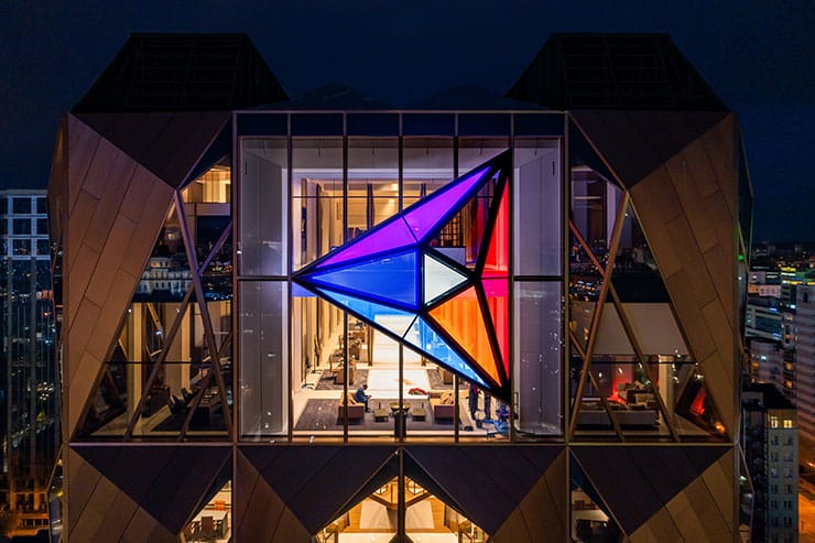
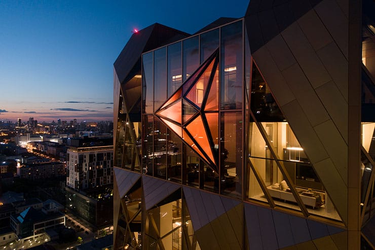
The Russian Copper Company logo, located on the top of the main facade of the building. It is a specific element of image which is fully compliant with the company’s brand book. It was rather hard to find light tones to fully correspond the company’s corporate style. We have always wanted to combine the very idea of using copper textures and a certain colour of the facade and the activities of the Russian Copper Company to stress and reveal their interconnection. So, we were certain that various combinations and blends of light textures, a play of copper shades were appropriate in this context.
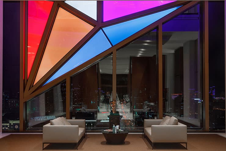
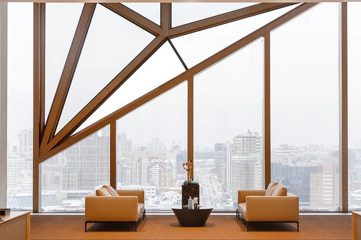
We managed to find a technology that makes it possible to achieve absolute transparency during the daytime. In the dark, all the fragments begin to work as a full-fledged light art installation. Every segment can be operated individually. The 10-metre structure has about 1000 independent points. A certain challenge for us was to find a solution for the black segment of the logo. The technical aesthetics of the project, which is revealed in the context of everything, is extremely important to us.
Engineering aesthetics of all interior elements is part of the whole system.
And now we have a complete illuminated art installation. We prepare a series of scenarios for the project. The scenarios will also be a kind of play of light, play that reflects the philosophy of the project. The main thing we managed to achieve is the feeling of comfort. When one gets certain emotion, they never search for the source that makes feel so good. Perhaps, that was the most important thing, i.e., creation of a special atmosphere of comfort.
