- ABOUT
- JUDGING
- ATTEND THE EVENT
- CONTACT
- MORE
- 2024 Entries
- Installations 2024
- Past Winners
- Subscribe
- [d]arc directory
- arc magazine
- darc magazine
Blanchardstown Shopping Centre, Ireland
ProjectBlanchardstown Shopping CentreLocationDublin, IrelandLighting DesignWillie Duggan Lighting, IrelandArchitectLafferty Architects, IrelandAdditional DesignEhtos EngineeringClientFalcon FMLighting SuppliersProlicht, LightgraphixPhotographyJamie Hackett
Blanchardstown is Irelands largest and busiest shopping centre, with over 16.5 million annual shoppers. In approach to its renovation lighting was seen as key element in improving the overall “feel” and intuitive navigation of the centre.
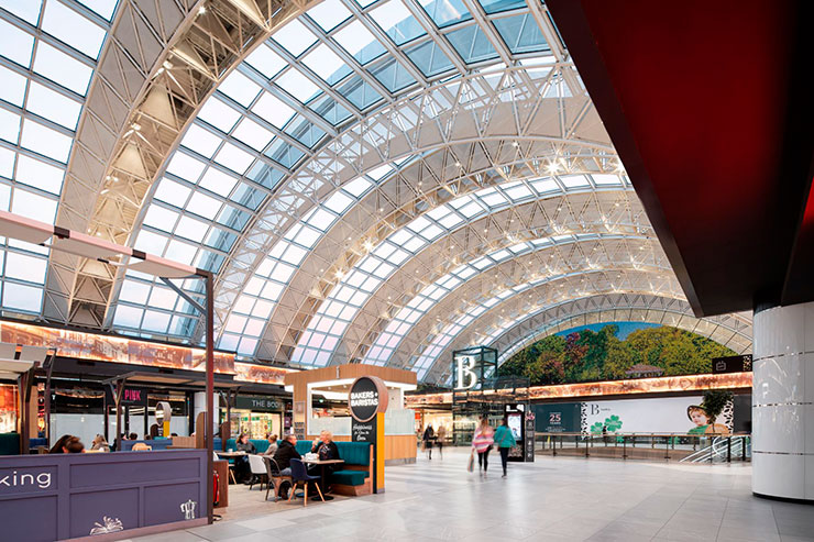
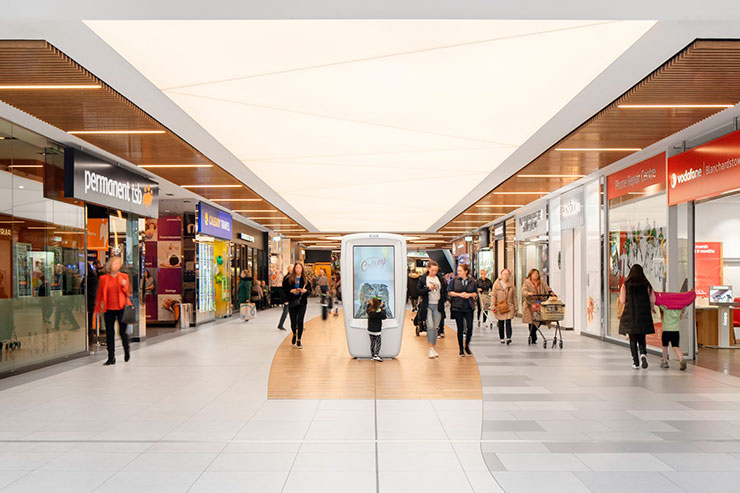
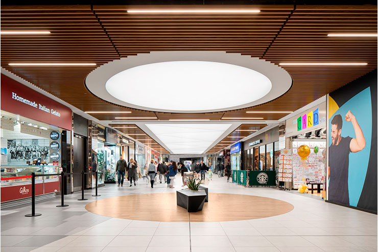
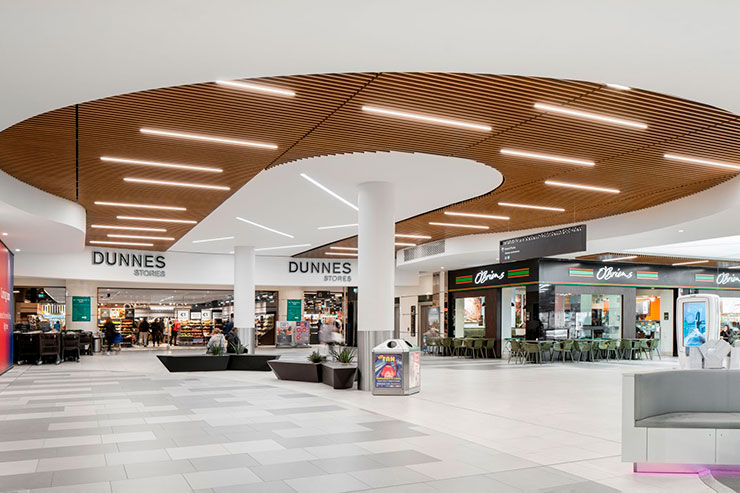
A key element of the concept was to create an inviting atmosphere, particularly in the non-day lit areas, which struggled to achieve the airy atmosphere as the other daylit spaces in the centre. Colour temperature and playing with colour temperatures was a central lighting technique used in the concept. A unique character was given to different areas of the shopping centre depending on the configuration and amount of daylight available. Cooler colour temperatures were utilised in daylit spaces while warmer colour temperature was used to create a warm feel in the timber batten “non daylit” areas. The concept with these non daylight areas was to embrace the different atmosphere here and create a warmer cosier feel.
To connect the different areas within the shopping experience, transition areas were introduced using backlit barrisol ceilings. These were designed to high light levels leading to a gradual lowering of light levels as you entered further into the timber batten areas.. The movement from cooler to warmer light and variation in light levels, adds a subtle moving dynamic to the customer experience of the shopping centre. and the barrisol areas provide seamless transition between these, leading to a coherent shopping “journey”.
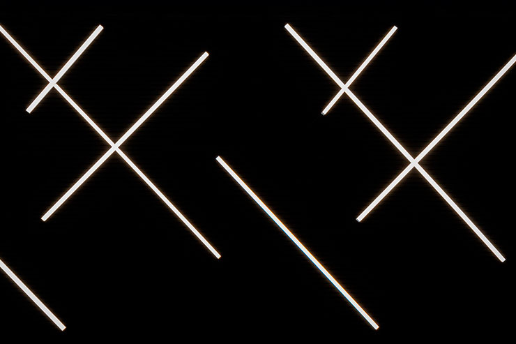
Long perspectives were maximised though use of a rhythmic criss-cross arrangement of suspended linear fittings against dark ceilings, creating drama and interest. These fittings were manufactured in bespoke lengths of 2, 4 and 6m to ensure stability when hung at angles. The linear clusters provide a centrepiece for the shopping centre and as viewed from multiple different angles (over two floors), leads an additional dynamic element. They also helped to aid intuitive navigation, by leading the shoppers towards the centre of the shopping centre.
The advertising hoardings framing much of the shopping centre were lit using a warm 3000K hidden lighting, to compliment the gold finish, and provide a rich, warm framing and contrasting intentionally with the cooler lighting features along the centre of the main shopping thoroughfares.
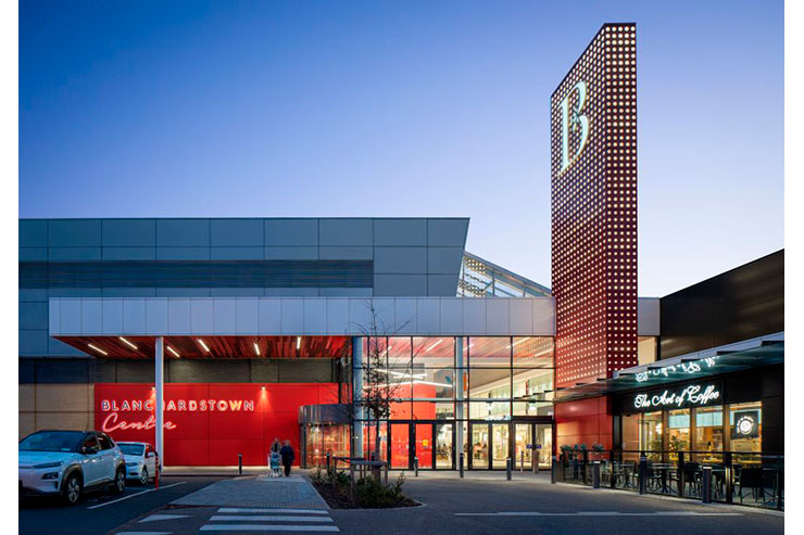
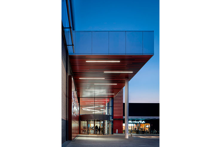
Bespoke “totem” lighting features were created at each of the entrances create a stylish first impression, as well as a memorable beacon, colour coded to providing guided orientation to each of the different entrances. These were mocked up prior to finalising of detailed design to get the details right (which was the same process used for both the barrisol and advertising hoarding details also).
The use and mixture of mindful selected colour temperatures and light levels combing with the careful design of bespoke feature elements and luminaires give a real dynamism , coherence and atmosphere to the new shopping experience at Blanchardstown Shopping Centre.
