- ABOUT
- JUDGING
- ATTEND THE EVENT
- CONTACT
- MORE
- 2024 Entries
- Installations 2024
- Past Winners
- Subscribe
- [d]arc directory
- arc magazine
- darc magazine
151 Macquarie Street, Australia
Project151 Macquarie StreetLocationSydney, AustraliaLighting DesignSteensen Varming, AustraliaArchitectPike Withers, AustraliaClientCorval PartnersLighting SuppliersUndisclosed
The refurbishment of the underutilised lobby revitalises the building street identity with a timeless and elegant design reflecting the building’ high quality boutique office offering and exclusive corporate location.
Consisting of a number of areas with disparate uses, lighting connects the refurbished spaces and creates a cohesive journey and visual experience through the application of a consistent lighting language: Clean minimalistic lighting channels follow the architecture along ceilings and walls and create a strong definition of the contemporary spaces and form elegant and integrated guide-lines throughout the space.
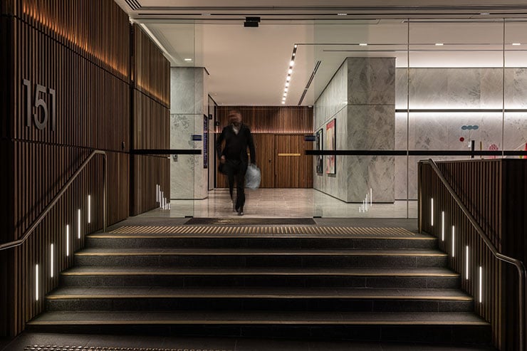
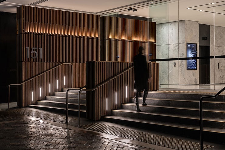
Akin to a subtle wayfinding strategy, the user journey begins at the exterior, following the softly lit timber screen into the lobby. Integrated into the architectural form, the timber screen lighting creates a subtle entry statement and visual identity connecting external and internal. This connection is strengthened with the lighting treatment reflected at the rear of the space providing a warm backdrop.
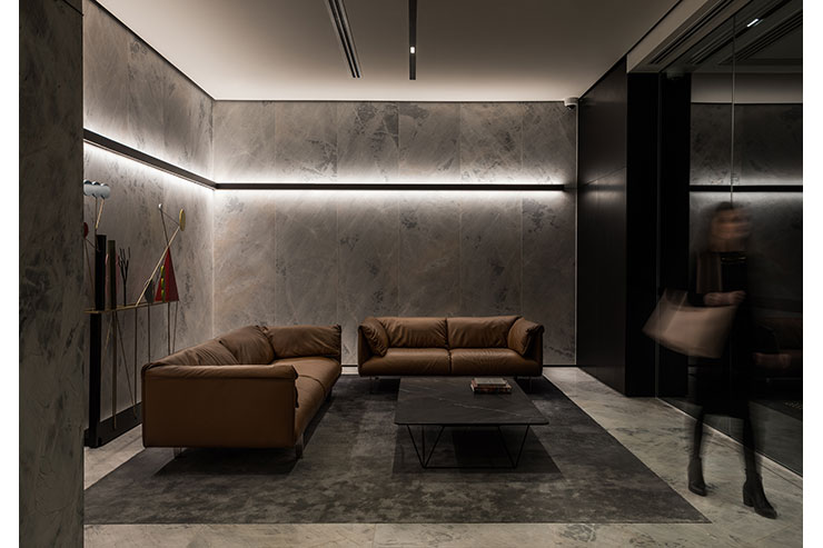
Upon entry to the lobby, a dark light slot wraps into a high-end client meeting space creating a strong visual identity. The lines transform to a wall channel wrapping around and cocooning the lobby sitting area in warm light to distinguish this space from the circulation zones.
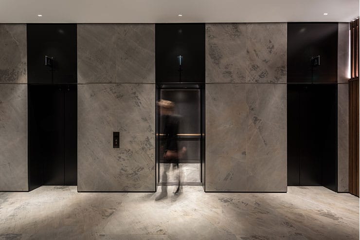
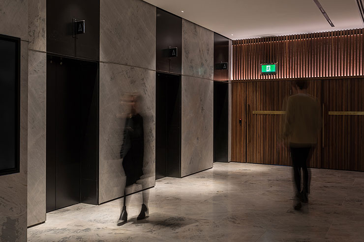
Light and shade and the expression of the light lines provide direction and wayfinding and draw people further into the space to the lift lobby area. The prominent lines in the ceiling become vertical elements in the lifts, continuing the lighting language in a different form, creating coherence along the journey through the building.
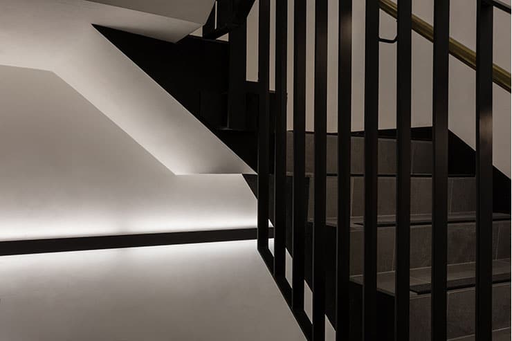
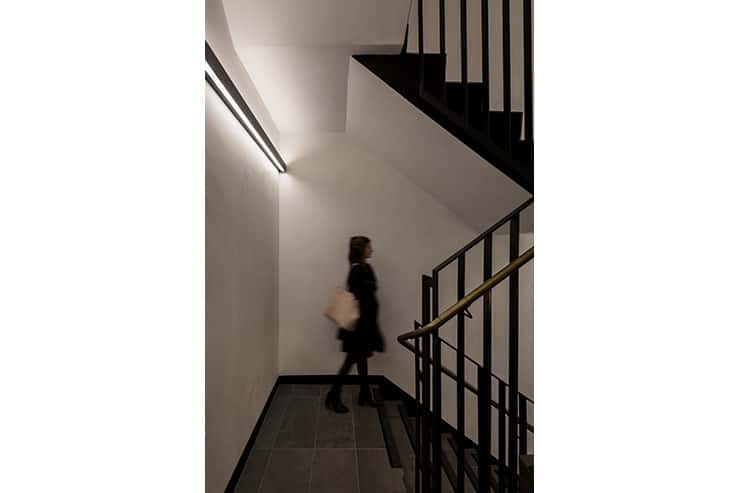
Transforming the simple fire stair into a front-of-house space, the lighting language continues with dark wall channels wrapping around the staircase.
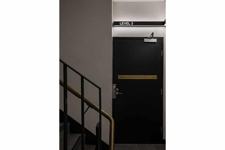
The lighting language and concept is carried through the internal corridors and staircases, leading to the amenities. Black ceiling slots in the lobby area transform into black lighting channels on the walls of the staircase transforming the simple fire stair into a front-of-house space. The black lighting channels, supplemented through handrail integrated lighting, enhance access and direction. With letters cut into the channels, lighting becomes an integrated wayfinding and signage tool that matches the nature of the staircase whilst providing an elegant visual identity, carrying the overall strategy coherently into all spaces.

