- ABOUT
- JUDGING
- CONTACT
- MORE
- 2024 Entries
- Installations 2024
- Past Winners
- Subscribe
- [d]arc directory
- arc magazine
- darc magazine
Ginza Station, Tokyo Metro, Japan
ProjectGinza Station, Tokyo Metro, JapanLocationGinza, TokyoLighting DesignMiki Matsushita Lighting Design, JapanArchitectNikken Sekkei, JapanClientTokyo Metro Lighting SuppliersColor Kinetics, yamagiwa, ModuleXPhotographyNacása & Partners
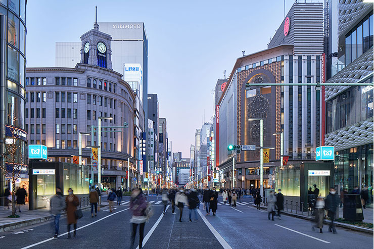
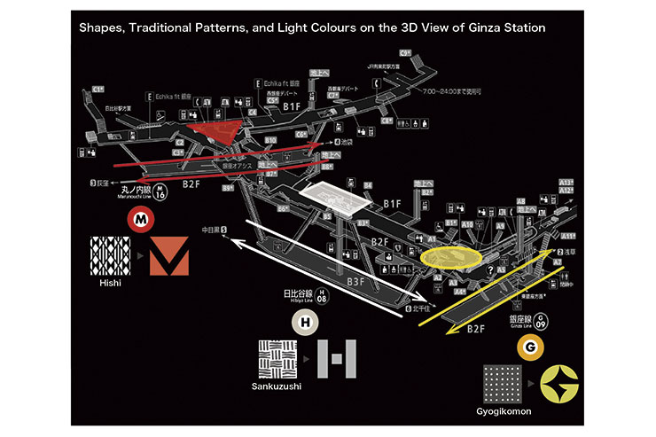
As the very first Tokyo Metro line to open back in 1927, the Ginza line is uniquely significant to both the history of the city, and also to its inhabitants. The Ginza area is one of the busiest city centres in Tokyo and is a prime destination for tourists as well. Ginza Station itself opened in 1934, and is now a hub connecting three lines in total; the Ginza, Hibiya and Marunouchi lines. Over the years the construction of these new lines, as well as many rounds of refurbishment, had turned the original, elegant 1934 building into a complete labyrinth. Hence, our plan is to renovate the vast station in a way which allows people to perceive directions and layout, by using lighting.
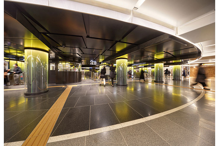
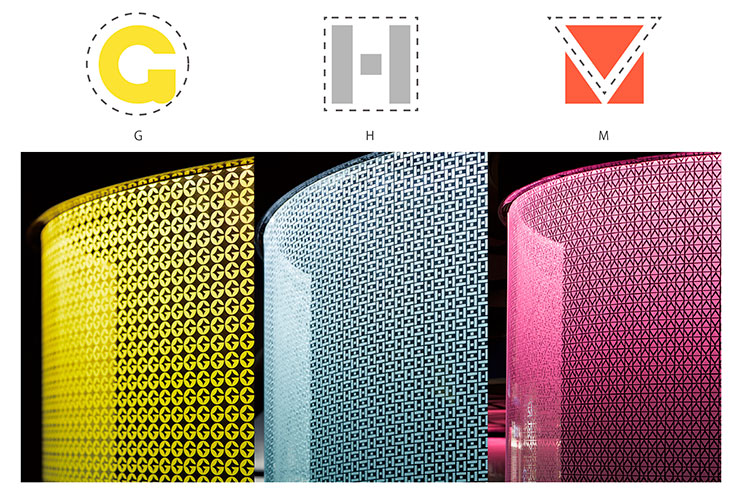
To achieve our goal, we combined three things; simple shapes, traditional patterns, and original light colours.
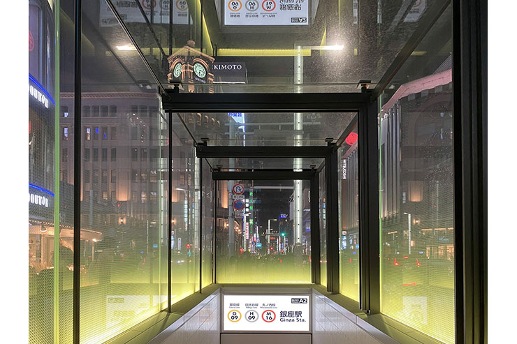
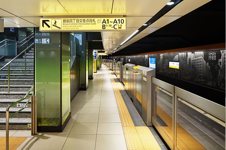
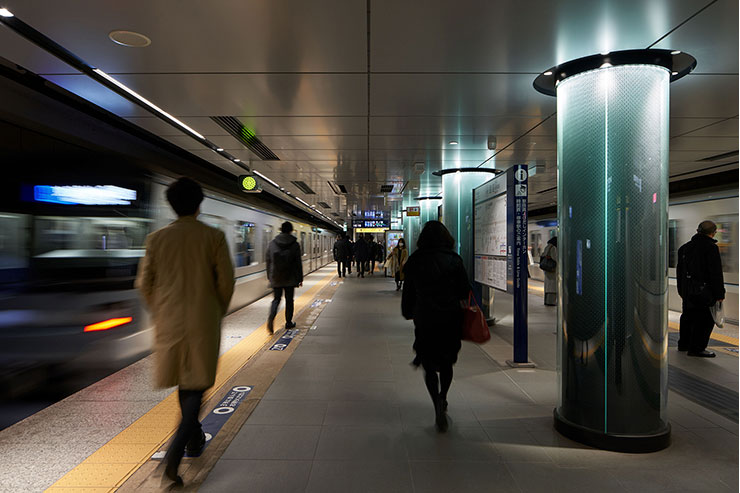
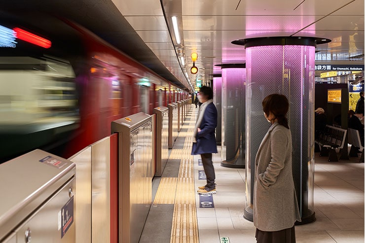
Firstly, we decided on simple shapes which were inspired by the first letters of each line’s name. A circle indicates the Ginza line’s G, a square represents the Hibiya line’s H and a triangle implies the Marunouchi line’s M. Secondly, based on these simple shapes we added traditional Japanese patterns to create the new stylized letters of G, H, M. Lastly, we used colours. Usually, people recognize the Metro lines by their logos’ colours. The logo of the Ginza line is yellow, the Hibiya line gray, and the Marunouchi line red. We created original light colours by spectrum control. Eventually, Lemon Yellow, White Silver, and Cherry Red colour were applied for the Ginza, Hibiya and Marunouchi lines respectively.
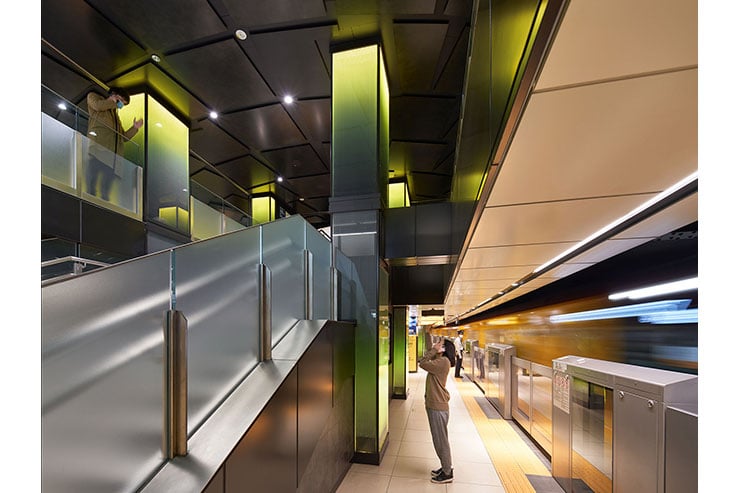
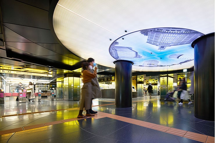
This idea was adapted to encompass each line’s entire area. We made light pillars and transparent entrance/exits recognisable by using these unique combinations of light and stylized letter patterns. We also made orientation signs by using these combinations of shapes and light. They are useful guides to show people the location of real buildings as well as the sky above basement level, allowing them to find the correct exit they require. The lighting of the sky even changes over time; you are underground and yet still you can get information from the surface.
It is a public space, so we are also concerned about safety. The average illuminance of whole area is 200lx, by dimmable, 3000K-5000K fixtures. In particular, we made the platform space brighter, up to 300lx, and used contrast to ensure that visually impaired people can easily notice where the doors will be. All lighting fixtures are given a non-combustible treatment.
There were several realistic obstacles to overcome to achieve this vision. Firstly, construction will only be possible after the last train has departed for the day, and must finish before the first train arrives next morning. Secondly, the ceilings are extremely low due to the age of the station. Lots of people use this station, and so we considered safety first during construction. However, our goal is to create another era for Ginza station; one where beautiful gradient lights lead passengers from the underground world to the surface above.
