- ABOUT
- JUDGING
- ATTEND THE EVENT
- CONTACT
- MORE
- 2024 Entries
- Installations 2024
- Past Winners
- Subscribe
- [d]arc directory
- arc magazine
- darc magazine
Taiyuan Haitang Pavilion Sales Gallery, China
ProjectTaiyuan Haitang Pavilion Sales GalleryLocationShanxi, TaiyuanLighting DesignGlint Lighting Design, SingaporeArchitectFormwerkz Architects, SingaporeInterior DesignStudio iF, SingaporeAdditional DesignAfternautClientSeedland Real Estate DevelopmentLighting SuppliersConfidentialPhotographySeedland Real Estate Development, Here Space Photography
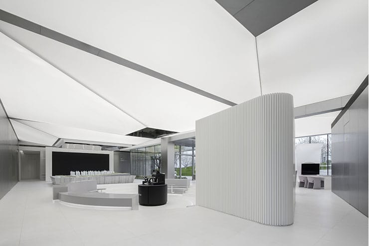
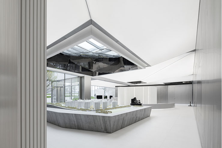
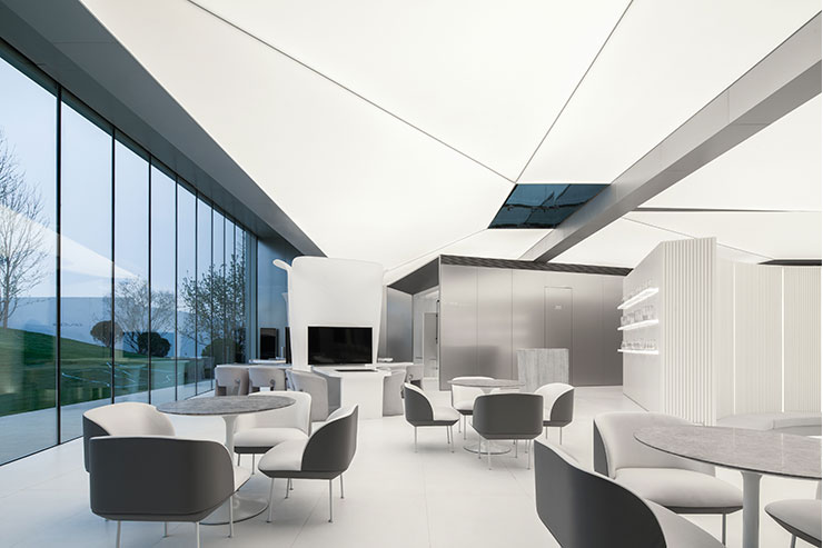
Designed for a developer promoting high-tech living, Taiyuan Pavilion Sales Gallery evokes a mannered peacefulness throughout its spaces. With an emphasis on hi-tech elements, the overall feel of the space is sleek and clean. The lighting design amplifies this, where every detail is seamlessly integrated. To accentuate a sense of stillness, the interiors adopt a monotone palette. The lighting design continues the language of purity, creating a calm environment that contrasts with dynamic LED displays.
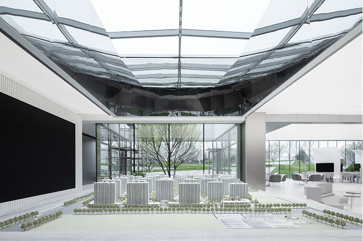
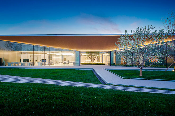
An origami-like geometry is found in the architecture, and this is celebrated by extensive luminous stretch membrane ceilings which dip and fold over zones. Interior views frame the outdoor landscaping with bold and graphical forms. The use of large-scale luminous surfaces makes the small gallery space feel larger than it is and extends the impression of diffused daylighting indoors.
A key challenge lay in ensuring the uniform lighting appearance of the ceiling membrane and calibrating the luminaires’ performance to meet lux level requirements. As there is abundant daylight coming from the façade glazing and skylights, we had to find a balance between achieving good contrast ratio while keeping the power consumption within local regulations. Due to structure and M&E services, it was not possible for the construction team to provide a uniform cavity above the stretch membrane, a crucial factor for achieving uniform illumination. To cope with these constraints, we carefully adjusted luminaire spacings and dimming circuitry to respond to different conditions.
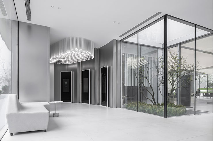
Upon arrival, visitors can easily navigate themselves into the self-registration area that is demarcated by a constellation-like light feature, which creates a memorable first impression. Downlights are used sparingly and kept small, with snoots that not only control glare but also convey a space-age nuance. The light feature, digital displays and glass-enclosed gardens are allowed to stand out against this minimalist palette.
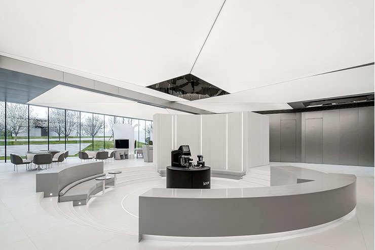
The development’s model display is positioned under a skylight and illuminated with subtle linear downlights integrated into the skylight framing. Visitors can appreciate the model under changing natural light, further supplemented by discreet, high-performance luminaires, thus departing from conventional model displays typically illuminated with strong lighting. Likewise, to accentuate a bar counter and a robot barista, spotlights are integrated into deep skylights such that they are well concealed from view.
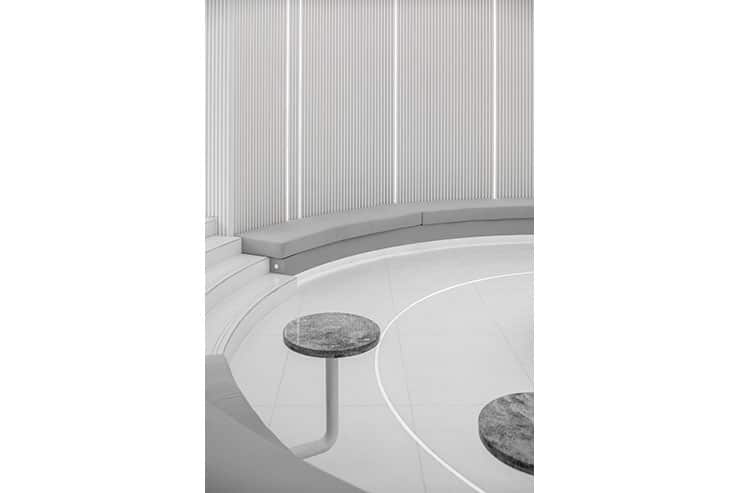
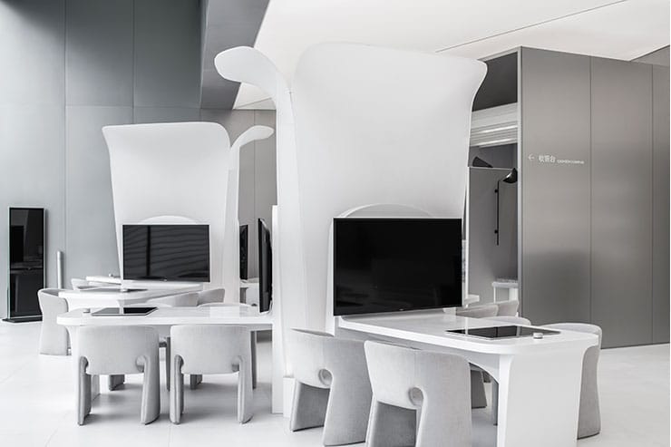
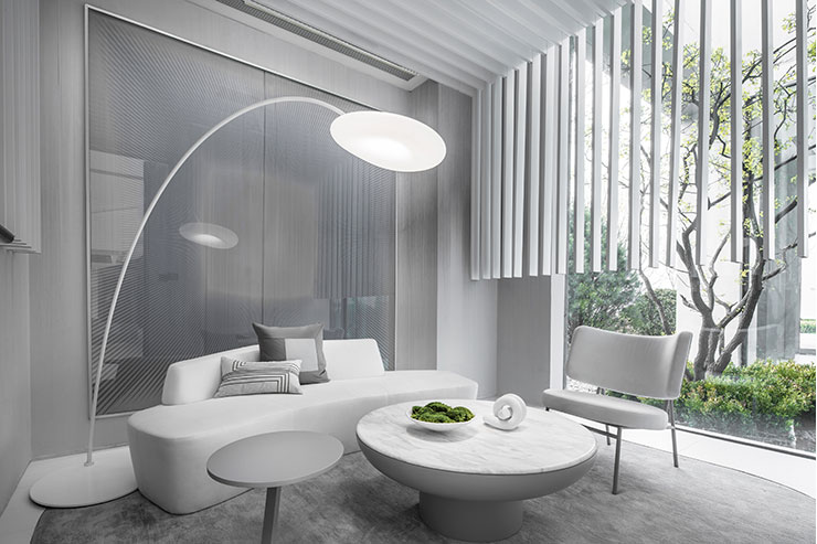
As a counterpoint to the angular ceilings, low-level lighting elements are designed to be curvy and sensuous. Curved linear details delineate the seating area encircling the robot barista. Expressing the same language, small rings of lights serve to illuminate steps. Translucent ‘sculptures’ with concealed uplighting act as soft privacy screens to customers at the contract signing zone. A bespoke floor lamp at the VIP room comes with an arched stand and a pillowy, diffused lampshade.
In terms of the colour temperature strategy, 4000K was specified for luminous surfaces and graphic details, to enhance the clean, high-tech feel. Downlighting comes in 3500K to add warmth and to complement the warm tones of the façade.
Designed and built over 8 months, all luminaires were locally sourced to meet the timeline and budget.
