- ABOUT
- JUDGING
- CONTACT
- MORE
- 2024 Entries
- Installations 2024
- Past Winners
- Subscribe
- [d]arc directory
- arc magazine
- darc magazine
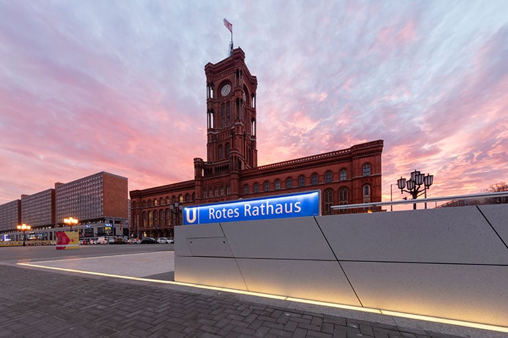
Rotes Rathaus - Subway Station Line 5, Germany
ProjectRotes Rathaus - Subway Station Line 5LocationBerlin, GermanyLighting DesignLicht Kunst Licht, GermanyArchitectCollignon Architektur und Design, GermanyClientBerliner Verkehrsbetriebe (BVG)Lighting SuppliersWe-efPhotographyFrieder Blickle
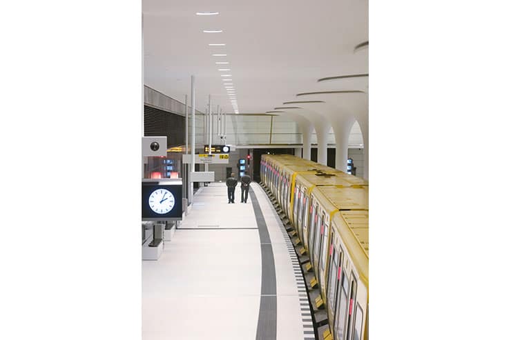
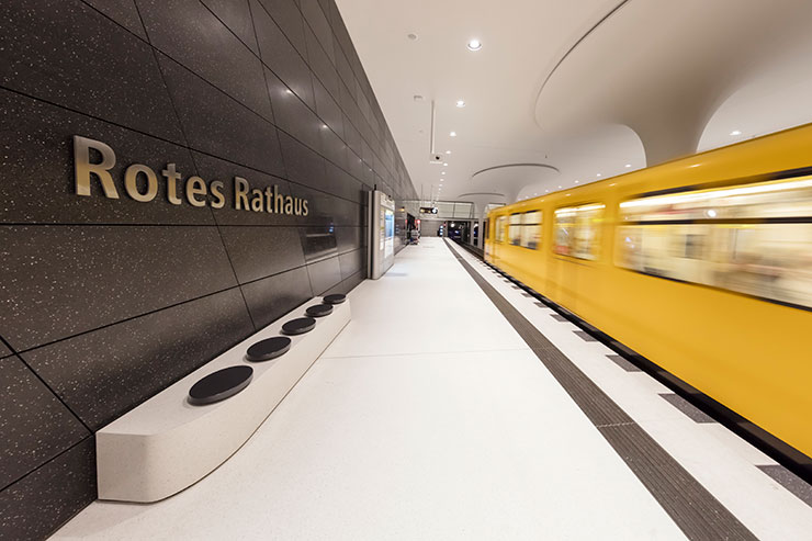
In 2010, the underground remains of the gothic styled town hall was discovered. To conserve it, it was then decided to preserve and incorporate the same into the architectural design. After multiple revisions, the design ultimately led to the development of a mushroom-shaped column structure mimicking the original ceiling vault.
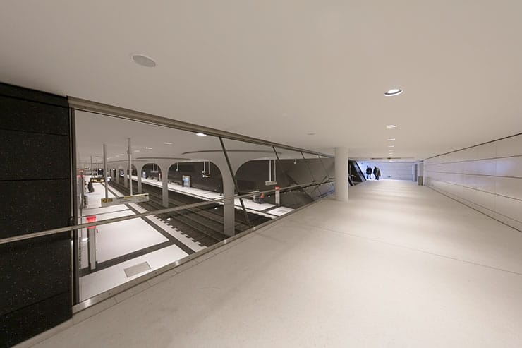
The new station was designed in simple black and white colours, while polished terrazzo tiles provide an elegant appearance. The staircases are kept in dark colours to create a certain drama, which results in a radiant reception flooded with light when entering the 140-meter-long station hall. The combination of light and dark elements conveys an aesthetic impression, keeping it functional. The glazed gallery connecting the two subway tracks further creates an open and bustling appearance of the station.
The initial considerations of integrating lighting into the joints between the mushroom columns and the ceiling did not prove effective thereafter resulting in the minimal concept of functional downlighting, since the directional light onto the bright floor allowed a higher amount of reflection and uniformity. Thus, by implementing a colour temperature of 3,000 K, not only do the ceiling and walls appear bright and radiant, but also add a certain degree of brilliance and elegance that is unusual for transportation buildings.
This concept extends further to adjoining areas, such as the connecting gallery between the tracks. From there, passers-by can enjoy an unusual perspective across the station. The wide-angle perspective creates an open, clear impression of the surroundings, specially due to the underground nature of the station. Only in the stairway areas, handrail illumination was adopted instead of downlights to give passers-by a sense of orientation and safety in the underground space.
A fantastic synergy of space and light, created by a simple concept, gives the project that certain something. The uncompromising implementation of visual stringency ultimately ensures that there is no doubt about its pure intention. All in all, the subway station has not only gained great importance for the capital in terms of transportation, but also represents an exemplary design in the cityscape’s aesthetics.
Instagram – @lichtkunstlicht
twitter – @lichtkunstlicht
Facebook – @lichtkunstlicht
LinkedIn – Licht Kunst Licht AG // LKL Design Hub BCN
