- ABOUT
- JUDGING
- ATTEND THE EVENT
- CONTACT
- MORE
- 2024 Entries
- Installations 2024
- Past Winners
- Subscribe
- [d]arc directory
- arc magazine
- darc magazine
Restaurant A, Israel
ProjectRestaurant ALocationTel Aviv, IsraelLighting DesignOrly Avron Alkabes, IsraelArchitectBaranowitz & Goldberg Architects, Israel (in collaboration with Pitsou Kedem Architects)ClientYuval Ben NeriahLighting SuppliersDori Kimhi Lighting, D-LEDPhotographyAmit Geron
A is a Japonesque Chef Restaurant located on the second floor of a new commercial tower in Tel Aviv.
The restaurant’s chef, Yuval Ben-Neriah, envisioned it as a culinary institute. His idea to fuse Japanese and Western cultures into a slick lively elegance drove the architects to draw upon classic architectural idioms in these two cultures and re-sculpt them to create a clam yet assertive space and experience.
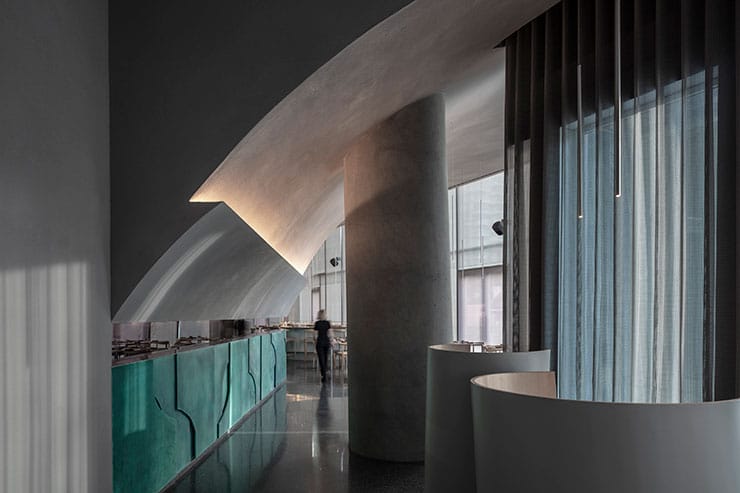
The entrance is constructed with the idea in mind of Japanese ceremonies and the experience of discovery. A curving wall greets A’s guests and gently directs them to the door located at the end of an elongated vestibule.
Upon the passing of the threshold the story of A begins to unfold.
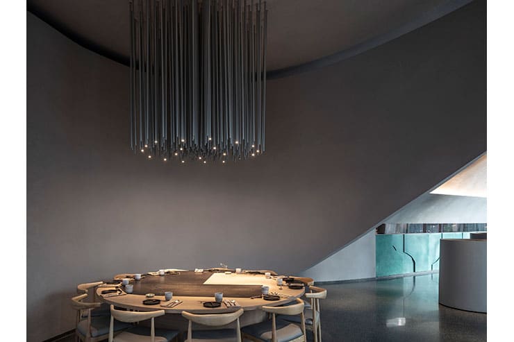
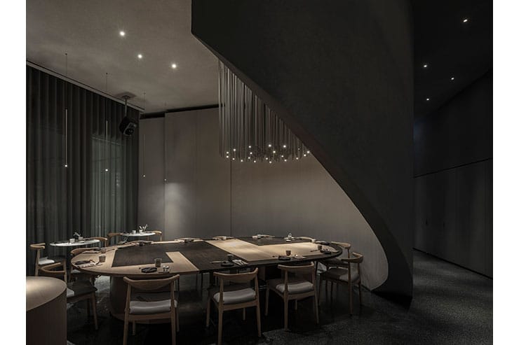
The curving wall is joined by a straight perpendicular wall and together the two lead the guests inwards. At this point the curving wall is detached from the ground and turns to encircle the private seating space, while the visitor is directed to the main dining space where the view opens, and the totality of the architectural gesture is revealed in its fullest.
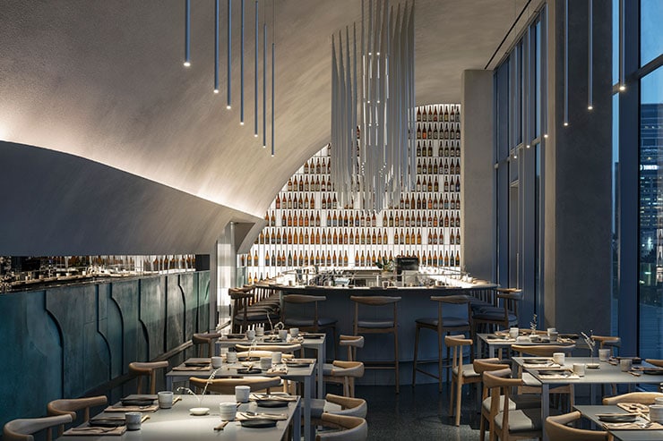
The curved wall becomes the main architectural feature and assumes the role of defining and sculpting the main dining hall. It is the partition separating the kitchen from the restaurant and it stretches all along the main hall. It is the base of the halved arch that governs the entire space with one single brush stroke.
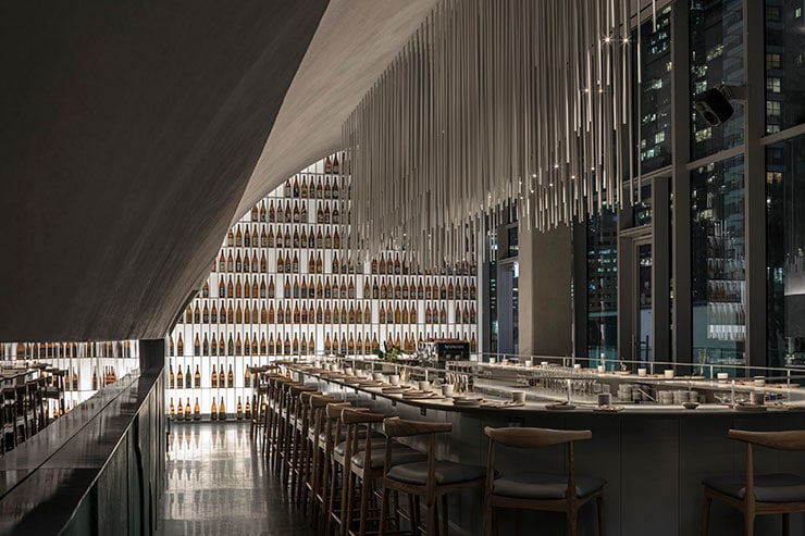
The end of the architectural view culminates in the Sake display library, constructed of brushed aluminium which defines the end of the space.
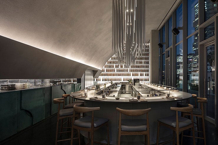
The lighting of the space is mainly indirect and washes the arch from below, while above the bar and the private space the lighting becomes visible. It is a modernized version of a chandelier, made of thin aluminium pipes, some of which incorporate light, governing the dining in these areas.
These chandeliers then deconstruct into single pipes suspended accurately above each table, creating a soft pool of light, accenting the beautiful table ware and amazing food.
A custom made fitting, also made of aluminium, is mounted to the counter and follows the elongated ellipse bar in a carefully examined height so it doesn’t disrupt the service and still distributes the light well, creating a super comfortable dining experience.
The Sake display library is detached from the back wall to house grazers at the bottom. The silhouette and colour of the bottles is highlighted and the whole wall acts as a lit vertical surface and functions as the backdrop to the central bar and essentially the whole space.
