- ABOUT
- JUDGING
- ATTEND THE EVENT
- CONTACT
- MORE
- 2024 Entries
- Installations 2024
- Past Winners
- Subscribe
- [d]arc directory
- arc magazine
- darc magazine
Manchester Airport T2 Walk Through, UK
ProjectManchester Airport T2 Walk ThroughLocationManchester, UKLighting DesignJPLD, UKInterior DesignThe Design Solution, UKAdditional DesignInterior Architect: The Design Solution, Main Contractor: Rediger, Electrical Contractor: PMS ElectricalClientDufryLighting SuppliersAreti, DGA, iGuzzini, Pulsar, Tom Dixon, Vexica, Wever Ducre, XAL, Pharos Architectural Controls
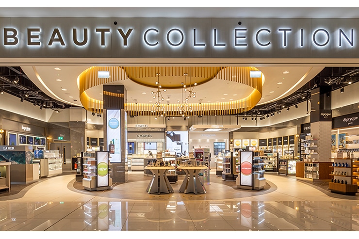
We were approached by our client Dufry to create a scheme celebrating the eclectic and vibrant atmosphere of Manchester. Flowing throughout the fabric of the city, Manchester’s energy and creative expression can be felt 24 hours a day and this formed the inspiration the entire store concept.
Working closely with the retail designers and architects we developed a scheme which encompasses the many facets of Manchester’s identity, bringing these elements together to inspire a series of installations and worlds creating an exciting Duty-Free store experience with a strong attitude and unique personality, befitting of a gateway to this exciting and energetic city.
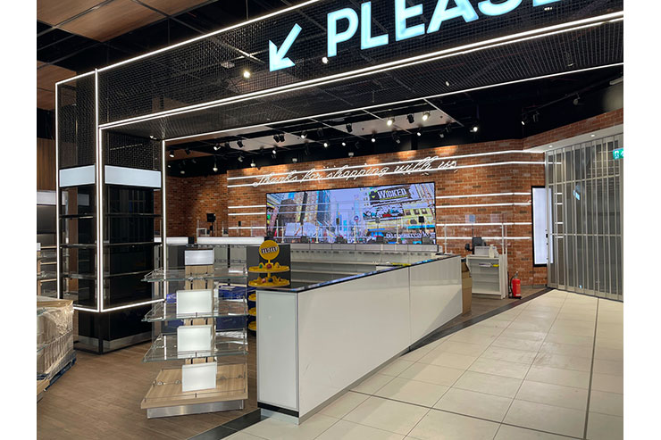
The integration of digital technology is a strong feature, a series of ‘digital echoes’ were strategically placed in keys areas, these are able to communicate messages at certain points in the customer journey. These ‘echoes’ are carried through into elements of the lighting to emphasise the message as well as bringing cohesion between the digital and lighting elements.
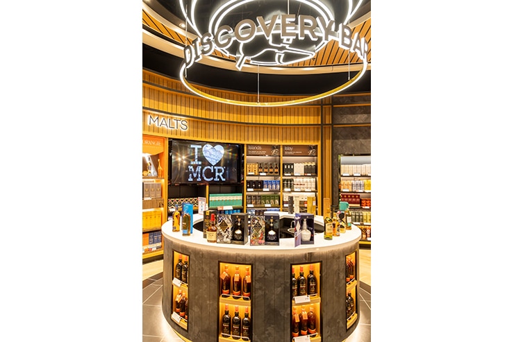
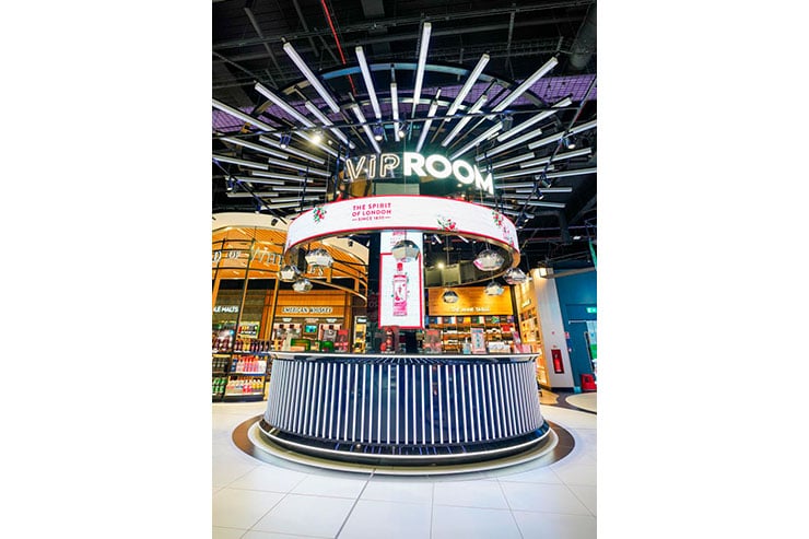
Some of the elements are more subtle and almost subliminal such as the large pendant hoops over the Gin zone or the thin trim around the wall bays. However, the central VIP zone is where it all happens with a lighting installation to rival some of the most glamourous night-time venues which Manchester is renowned for.
The circular DJ bar has an array of linear luminaires mounted vertically around the base which then seem to cascade upwards and outwards across the ceiling structure. These RGBW fittings take the same video feed as the digital media feature screens and transform the advertising and imagery into a complimentary abstract light show.
Tom Dixon pendant fittings populate the area over the bar counter with track mounted spotlights hidden up amongst the ceiling structure punching down through adding further drama and contrast to the space.
Continuing the journey we arrive at the Magic Garden area of the Perfume and cosmetic zone which celebrates the softer side of Manchester with natural tones, softer lighting with warmer colour temperatures (unusual for a P&C area) and considered lighting highlighting the change in materiality.
Key features in the magic garden emphasising the more natural aspect include, the green backdrops, illuminated with subtle up-lighting, oversized flowers and giant iconic “worker bee” completing the theme highlighted with concealed narrow-beam luminaires like a performer on a concert stage.
The dramatic circular central area is the fulcrum of the magic garden and is complimented with concentric lighting details in the ceiling and a highlighted gold curtain feature incorporating a concealed lighting detail to emphasise the materiality of the curtain. Plastered in downlights are employed in the GRG ceiling raft underlining the “softer” nature of the space.
In the Sunglasses, Jewellery and watches zones we drew inspiration from the industrial personality of Manchester. Originally home to the manufacturing industry of the last century, the city now has many contemporary structures and buildings that reflect the extraordinary vision of the city.
We created a clean, crisp, scheme which uses cooler tones and integrated lighting elements including the linear edge details and gantries traversing the space.
All the lighting, ceiling rafts and details had to comply with strict requirements for airports whereby a percentage of the ceilings must be kept “open” for fire reasons and smoke extraction, all fittings of course also incorporated LSZH cabling.


