- ABOUT
- JUDGING
- ATTEND THE EVENT
- CONTACT
- MORE
- 2024 Entries
- Installations 2024
- Past Winners
- Subscribe
- [d]arc directory
- arc magazine
- darc magazine
Lagadere Retail - Adelaide Airport, Australia
ProjectLagadere Retail - Adelaide AirportLocationAdelaide, AustraliaLighting DesignStudio All, AustraliaInterior Designpeckvonhartel, AustraliaClientLagardere AWLPLighting SuppliersLightning Thief
In the realm of contemporary airport design, aesthetics and functionality coexist seamlessly, enriching the passenger experience and shaping memorable journeys.
“Our emphasis rested on understanding not only the merchandise but also the shopper’s journey through the space, recognising that effective lighting is instrumental in enabling customers to engage with and appreciate the products on offer.
“Our lighting design methodology is founded on the analogy of ‘space as a canvas’. We commence with a black-and-white 3D line representation of the area, akin to a blank canvas, upon which we apply layers of light, mirroring the technique of a watercolour artist. These layers accumulate, creating a nuanced interplay of luminance that, conceptually, mirrors the notion of ‘less is more’. Just as a surplus of pigment can obscure the subtleties of a watercolour painting, an excess of light can diminish the spatial contrast and character. Our objective is to achieve a balanced illumination where light and shadow coexist harmoniously, accentuating architectural details and evoking depth.”
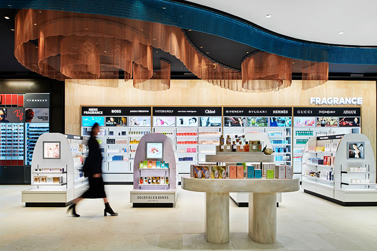
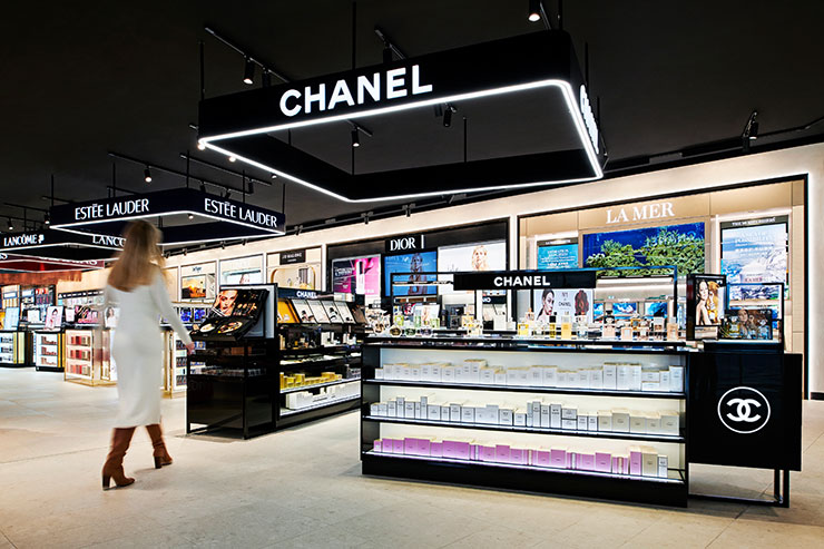
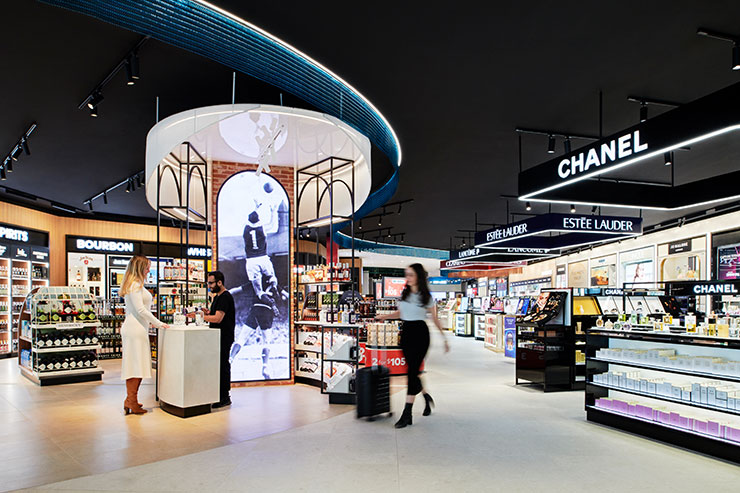
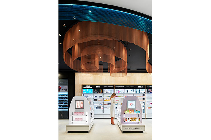
In building up a layered lighting approach, the designers played with a variety of colour temperatures to highlight or accentuate different departments. Starting with a base ambient light level of 3500K, heroes and key products were illuminated at temperatures ranging from 3000K (high-end luggage) to 4500K (make up and perfumes). It was the belief of Studio All that by varying colour temperatures throughout, it not only ensures products are showcased in their best light, but creates areas of contrast and gently breaks the space up.
Petrie-Allbutt explains how, with such variation in colour temperature, an underlying consistency was created: “The process of testing and conceptual development using architectural colour pattern diagramming ensured the variances were subtle, blended and not polarising or at all startling. Mocking up, initially in our studio, to achieve the correct ambience and that all important “feel” of the light and then presenting this to the client to ensure they were happy with this approach and outcome was imperative to the success of the installation. The overall comprehensive approach to the solution was tricky for the client to fully appreciate until they experience the finished product. This required a great trust from the client in our capability to deliver conceptual ideas into the real world.
“To ensure a harmonious and consistent atmosphere within the space despite the significant diversity in colour temperatures, a meticulous approach was adopted. The space featured a range of ceiling treatments, spanning from dark to light, incorporating louvres and finished plaster. Achieving consistency in this context involved a strategic pairing of luminaires in black and white to correspond with the ceiling colours. This consideration was augmented by acknowledging the reduced reflectance associated with darker ceilings.
“The foundational consistency was established by employing a light wash of a wider beam at 3500K, serving as the blended baseline. Over areas where different colour temperatures overlapped, a skilful transition was accomplished by gently feathering in 4000K and 3000K lighting, referred to as “thresholds.” The architectural retail zoning and floor finishes also contributed significantly to this seamless blending of light throughout the space.
“The perimeter wall, which remained a constant element, was uniformly lit at 3500K, serving as the central reference point for cohesion. This choice ensured that the “perceived” colour temperature of the entire space remained consistent, even as the experiential qualities within each zone were thoughtfully tailored and diverse.
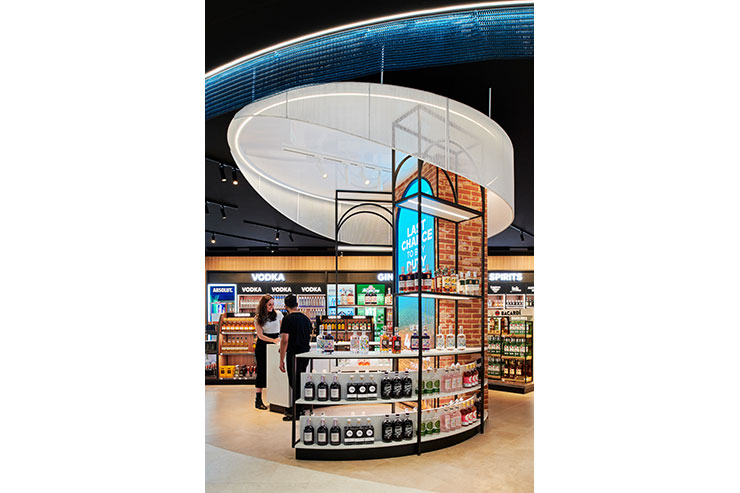
“This foundational layer was then enriched with a more detailed and deliberate approach to lighting. Specialised variable accent downlights or track spotlights were introduced, contingent on factors like the ceiling finish and the adaptability of floor fixtures. These various colour temperatures were strategically paired with specific merchandise types, thereby creating a layered lighting strategy that added depth and nuance to the overall visual experience.”
“In practice, every luminaire, though physically identical in appearance, required meticulous customisation with varying lenses and colour temperature chips. This level of detail and precision was solely achievable through the skilled hands of Trivision and their team of electricians.
“The key to achieving this synergy with the wider airport scheme lies in conducting pre-design site visits. These serve as invaluable opportunities for designers to immerse themselves in the natural daylight and the prevailing lighting conditions of the main terminal. This practice holds particular significance when designers from regions like Melbourne, Tasmania, Gold Coast or Perth are tasked with designing for airports located in diverse climates across the continent.
“For instance, crafting a warm 2700-3000K light ambience may be well-suited for the winter ambience of Melbourne, but this same lighting scheme would translate to an inadequate and uncomfortable experience in sun-soaked, bright environments like Perth or the Gold Coast. Therefore, aligning the colour temperature with the local climate becomes an essential component in ensuring that the user experience harmonises seamlessly with the distinctive character of each airport location. In this manner, the lighting design is conscientiously attuned to the broader airport context, demonstrating the adaptability and finesse of the lighting design in accommodating the diverse conditions of its surroundings.”
“This collaborative effort exemplifies how intelligent lighting can transform a retail space,” he reflects. “By considering passengers’ sightlines and movements through the space, we recognised that travellers are not just shoppers, but also individuals seeking a memorable experience. By seamlessly integrating lighting design and interior retail architecture, we have created an unforgettable journey for passengers, enticing them to explore, engage, and ultimately make a purchase.”
