- ABOUT
- JUDGING
- CONTACT
- MORE
- 2024 Entries
- Installations 2024
- Past Winners
- Subscribe
- [d]arc directory
- arc magazine
- darc magazine
Galeries Lafayette, China
ProjectGaleries LafayetteLocationShenzhen, ChinaLighting DesignNulty, UKInterior DesignCardy Papa, UKAdditional DesignLocal Architect: Archetype GroupClientGaleries LafayetteLighting SuppliersEncapsulite, Fagerhult, Flos, Folio, LEDFlex, LightGraphix, LightLab, Lucent Lighting, O/M Light, Precision Lighting, Reggiani, Viabizzuno, Vibia, Vode
Galeries Lafayette has always captivated the world with its capacity to elevate the world of fashion and beauty to a whole new level. The brand’s new retail destination in the Upper Hills Mall in Shenzhen continues in this tradition. Designed by interior and architecture studio Cardy Papa, the beautifully curated experience adheres to an overriding ‘Breathing Fashion’ theme. The brief for the lighting was to reinforce the playful design narrative and use light to add a strong dose of emotion and character.
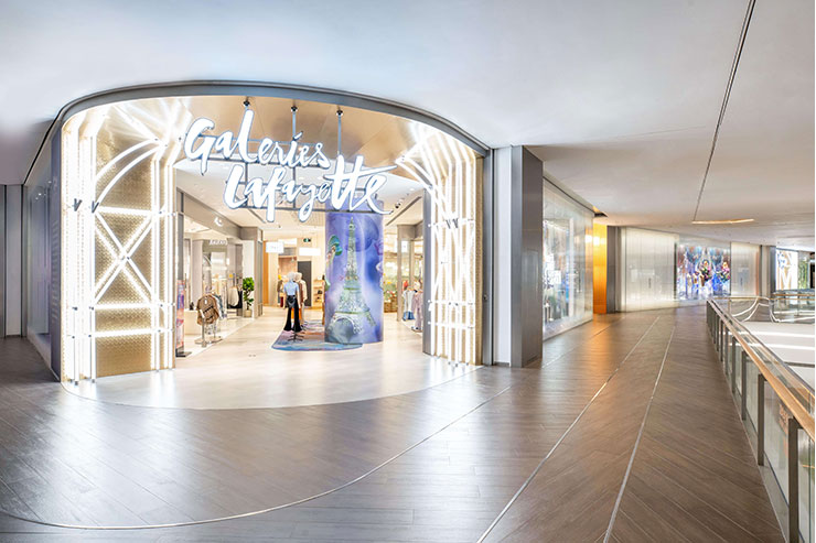
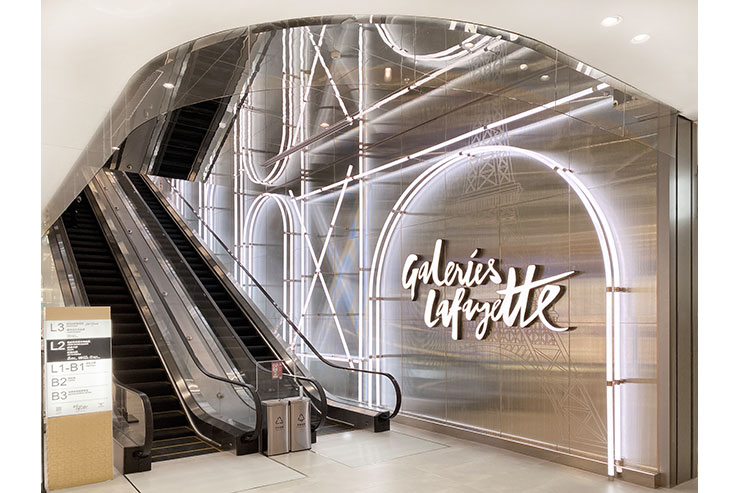
An illuminated archway inspired by the architectural lines of The Eiffel Tower, a symbol of Galeries Lafayette’s Parisian roots, greets shoppers on arrival and is replicated in the circulation areas to form a unifying design language. The intricate arrangement of white tube lights evokes a sense of arrival at the threshold to mark the transition from mall to a Parisian boutique inspired environment. The arch motif appears again in the escalator area, where the effect is magnified as the play of lines of light and mirrored surfaces creates the illusion of a double-height space. The visual trick produces an elegant dwell point and a moment for the brand’s heritage to be expressed.
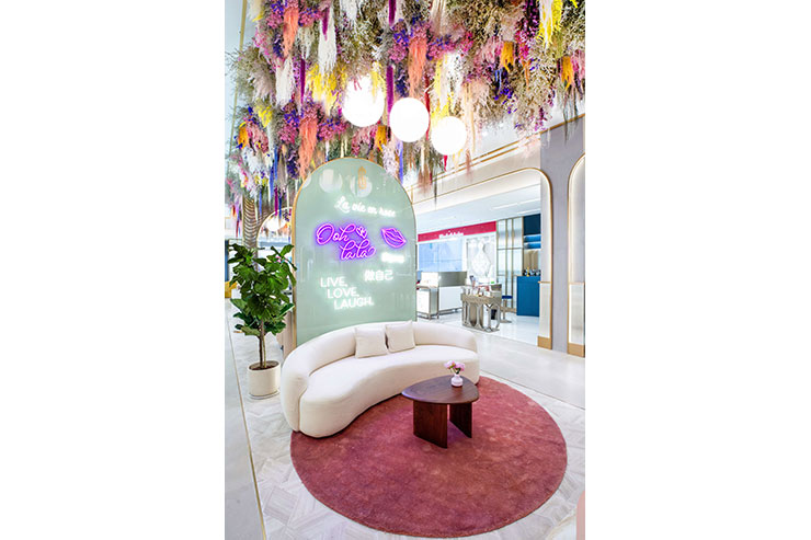
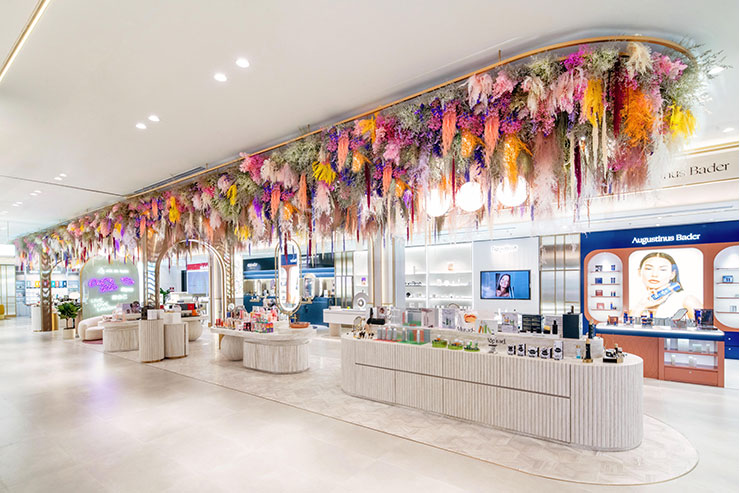
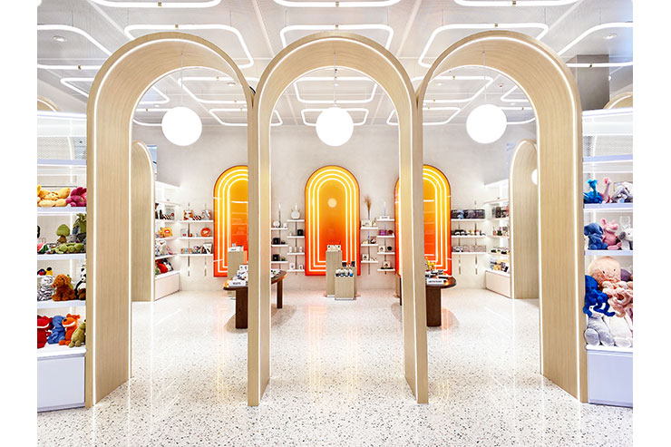
In the Beauty Boulevard, an expansive floral creation featuring suspended globe pendant lights serves to turn the traditional beauty hall concept on its head. Adjustable recessed spotlights illuminate the merchandise at each beauty concession and ensure that the eye is drawn to the graphic lines of light framing each individual display area. The effect helps to make brand touchpoints feel more tailored and considered. Throughout the beauty department, Nulty used an LED beauty module to optimise the lighting and complement different skin tones. The fittings feature a 2:1 ratio of beauty and artistic LED modules, which deliver better colour rendition for sampling makeup.
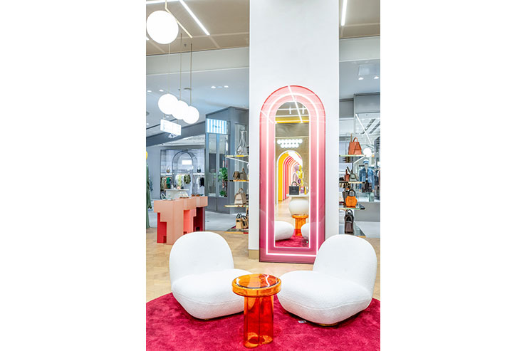
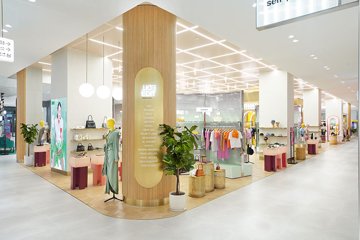
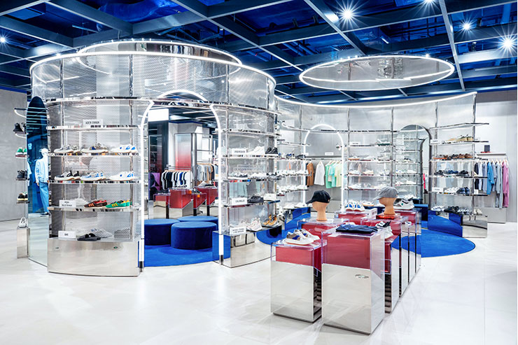
On The Edit fashion floors, the lighting design approach is predominantly consistent, however subtle variations add a distinctive brushstroke to each space. In the men’s section, minimalist spotlights were integrated into an exposed ceiling and teamed with transverse linear arrangements to bring a sense of rhythm to the circulation areas, while dramatic lines of light border the mesh frame display units. In the women’s area, lighting design contributes to a softer ambience. Diffuse lines of light illuminate the architectural grid in the ceiling, clusters of globe pendants highlight key merchandising points, and an illuminated pink mirror turns a simple pause point into a wow moment.
The success of this project lies in the fact that lighting design is intrinsic to the experience and creates a visual impact at every stage of the user journey. Light was integrated into the infrastructure of the store to create a backbone of ambient illumination, then supplemented with decorative details to ensure that every viewpoint and interaction makes the experience memorable and unique.
