- ABOUT
- JUDGING
- CONTACT
- MORE
- 2024 Entries
- Installations 2024
- Past Winners
- Subscribe
- [d]arc directory
- arc magazine
- darc magazine
Beijing Qianmen Street, China
ProjectBeijing Qianmen StreetLocationBeijing, ChinaLighting DesignBeijing Tsinghua Tongheng Planning and Design Institute, ChinaClientBeijing Dongcheng District Urban Management CommitteeLighting SuppliersGuangdong Free Lighting
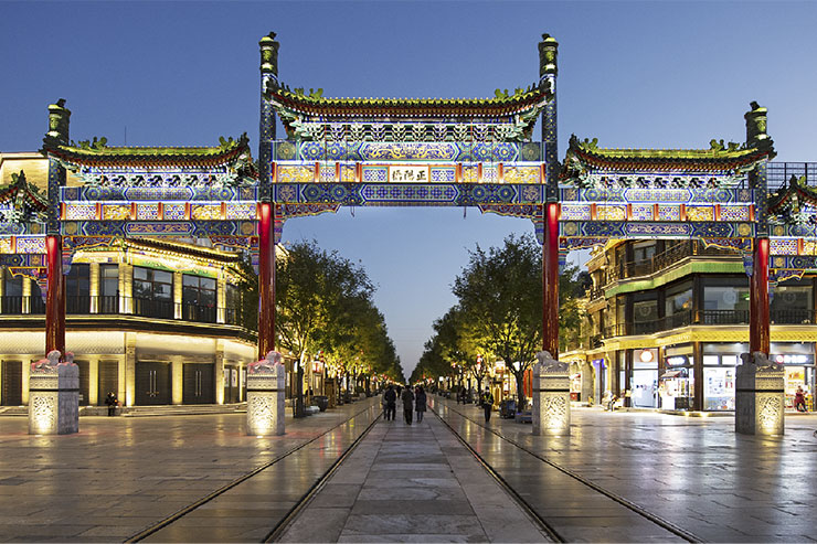
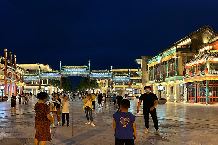
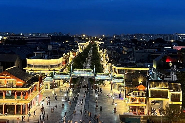
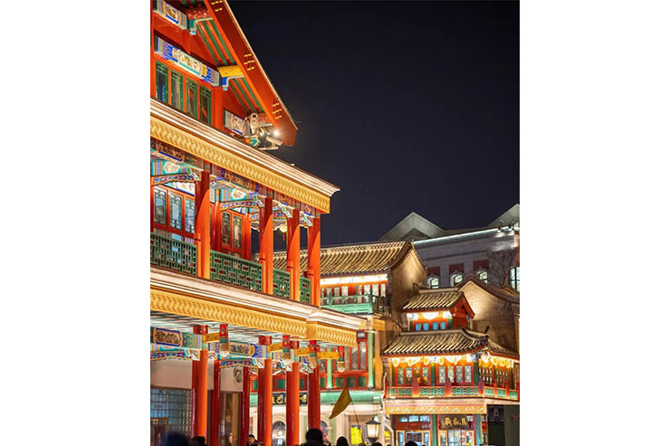
Qianmen Street, an important component of Beijing’s central axis, is about 800 metres long and has a history of 500 years. The architecture is exquisite, and there are many old Beijing national brands in the shops along the street, which is the commercial area with the most Beijing flavour. Before the renovation, the street lighting was cluttered with colours, uncoordinated brightness, and there were problems such as light interference, which resulted in the lighting not being able to show the characteristics of the buildings.
The challenge of the project was to firstly grasp the “moderate” use of light and to control the brightness on a wider scale. Eliminate clutter and glare, dim the ambient light of the surrounding residential areas, and turn off the lighting of the featureless buildings, so as to make the surrounding environment harmonious and comfortable. At the same time, the designers upgraded the brightness level of the plane (landmark Zhengyangmen, five rows of buildings > buildings on both sides > landscape). Secondly, the designer also upgraded the façade level (building roof > shops at the bottom > central area) to highlight the hierarchy of the axis. At the same time, the utilisation efficiency of the roof of the fifth elevation is updated, abrupt facilities are changed, illegal structures and abandoned equipment are removed, historical buildings are protected, traditional features are maintained, and more environmental space is made available to serve people.
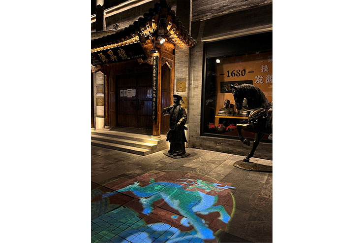
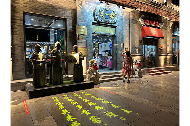
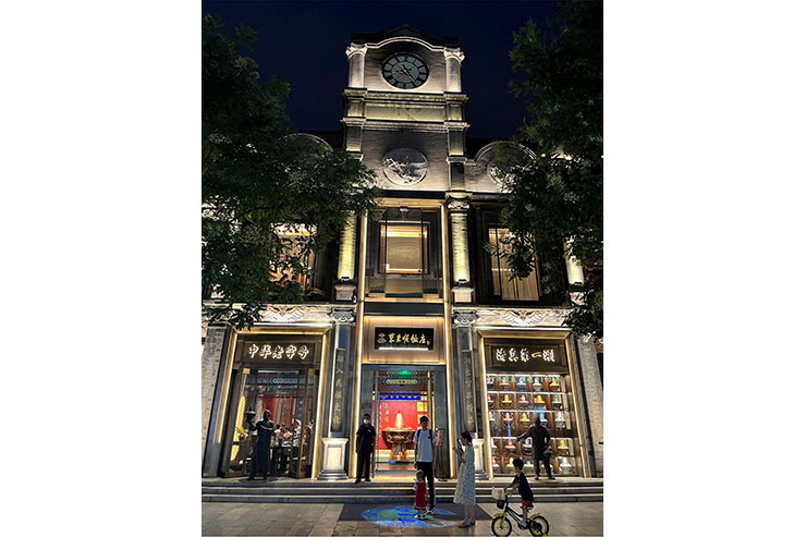
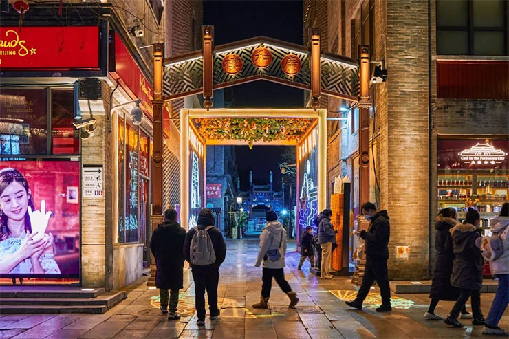
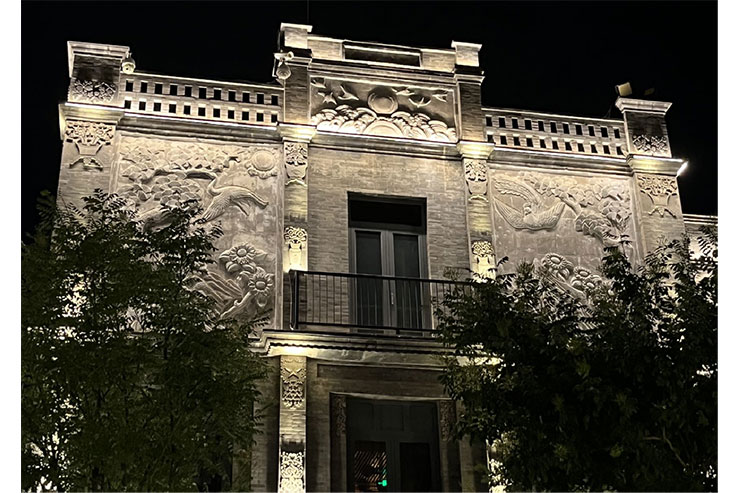
The second challenge is to make the shopping street attractive. Through the transformation of the billboards, the traditional, modern Western style and modern Republican style buildings are purposefully designed and refined through shape, texture, material, colour, lighting and other elements, so as to inherit the old charm without losing the modern vitality. The lighting design combines the characteristic bell carriage with the lights of the buildings along the street, and the mountain flowers and sculptures on the tops of the 18 buildings along the street turn on the colourful light mode at special times. The colours on the tops of the buildings along the street change interactively as the car passes. In addition, the design of street entrances, old entrances, combined with public sculptures, projected image stories, including stories with auspicious symbols such as Fuk Luk Shou, the origins of the old, and so on. In this way, it will create a special focal point and attract visitors to learn about the stories of ancient Beijing.
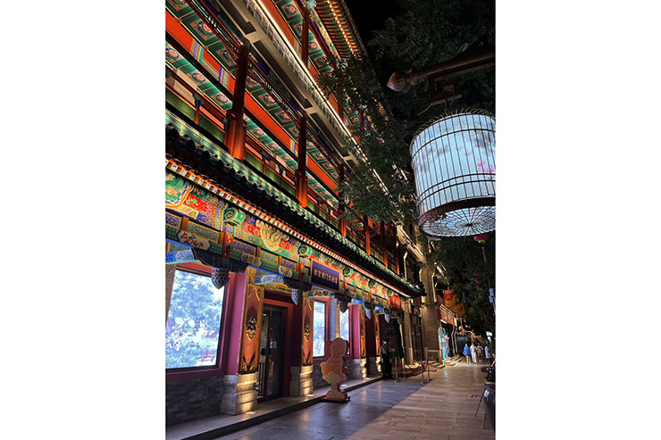
The third challenge is to create ‘sustainable’ light. Using the self-developed virtual simulation system to support the design, we effectively realised digital asset statistics to help the owner with future asset management. In addition, to fully protect the historic buildings, the size of the suspended cornice luminaires is less than two centimetres, which maximises the ability to hide the luminaires and ensures that the daytime appearance of the building is not affected. The design team restored the colours of the old building with custom coloured lighting. Through a special colour coordinate test, the line lights in the painted area of the beam square and arch take on white (4000K) + blue (470nm), the corrugated lights of the glazed green tiles take on white (3000K) + green (530nm) and the red columns take on white (2700K) + red (625nm). The design team through the intelligent control system will be the most accurate light colour presentation, the appropriate colour ratio of luminaires can better highlight the characteristics of architectural art, show the carrier’s colour and shape style. To save energy. The design team carries out quality and safety tests on the old facilities, using the original qualified lighting equipment, pipes, cables, etc., to reduce secondary construction. And choose energy-efficient and low-consumption LEDs. The lighting is divided into modes using a control system to reduce power consumption.
After the completion of Qianmen Street, night traffic increased three times compared to before and was widely praised by tourists. The design team used lighting to create a warm living space. The lighting upgrade further strengthens the brand power of Beijing’s old commercial street and shows the world the unique charm of Beijing’s central axis.
The designers involved in this project are Guo Jing, Cai Changzhen, Bai Xue, Yang Ya Hui, Ma Chao, Xie Cuiqin, Liu Jia, Huang Shufen, Liu Lili and Li Yiwei.
