- ABOUT
- JUDGING
- ATTEND THE EVENT
- CONTACT
- MORE
- 2024 Entries
- Installations 2024
- Past Winners
- Subscribe
- [d]arc directory
- arc magazine
- darc magazine
Tamburins Seongsu Flagship Store, Republic of Korea
ProjectTamburins Seongsu Flagship StoreLocationSeoul, Republic of KoreaLighting DesignEONSLD, Republic of KoreaArchitectTHE SYSTEM LAB, Republic of KoreaClientiicombinedLighting SuppliersSFEEL, KKDC, Dong-Myung, Light&Style, Dayoon Design
Tamburins is solidifying its presence not only through products but also in the realm of space. This aspect distinguishes it from other beauty brands, as it redefines the concept of offline stores to deliver a unique brand experience. For them, a store is a key element in allowing customers to experience the entire brand before being a space to make purchases. Tamburins’ spaces are sufficient in intuitively showcasing the aesthetics they pursue.
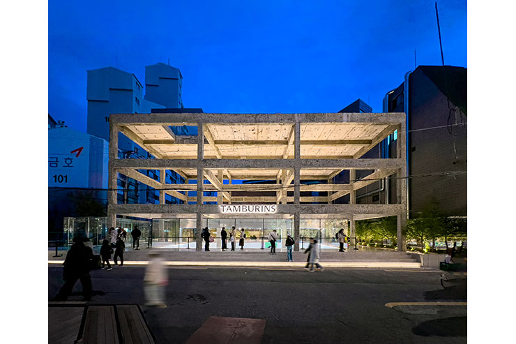
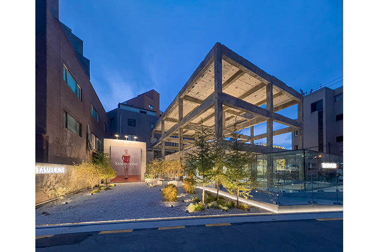
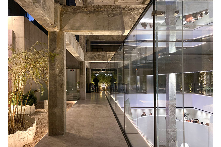
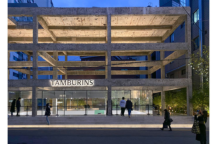
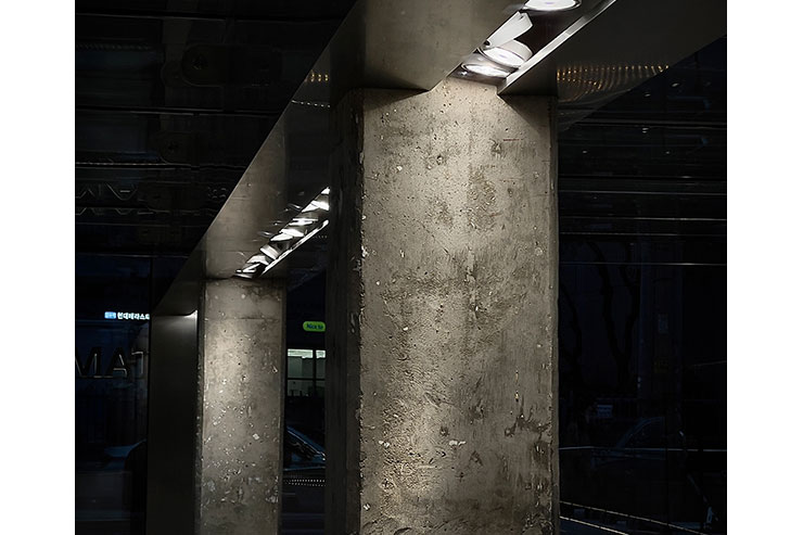
The Seongsu flagship store, opened recently, also successfully captures their intentions. The deconstructive approach, leaving only the underground floor of the existing structure, showcases a robust concrete structure boldly extending with the above-ground levels deliberately left empty. All these elements reveal Tamburins’ strong spirit of challenge, serving as their driving force.
The Tamburins Seongsu flagship store project began as a challenge to align with Tamburins’ consciousness, as described above.
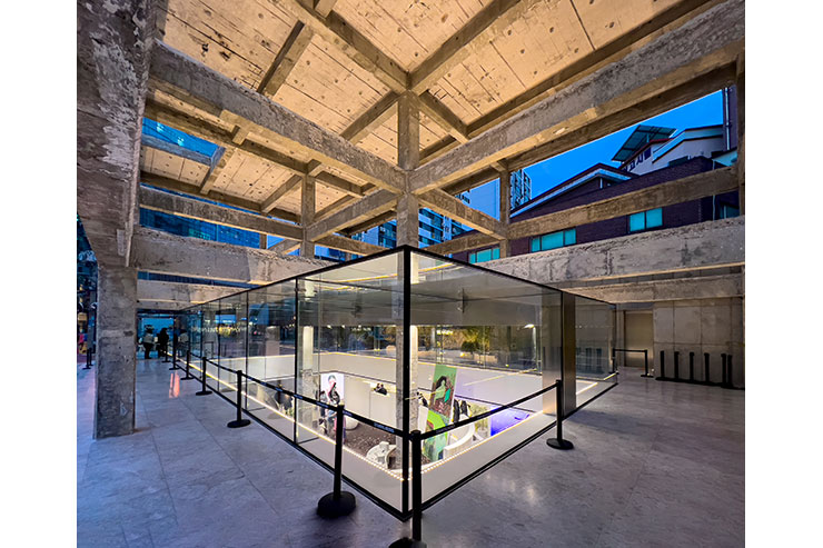
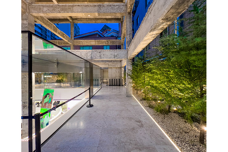
The central emptiness in the landscape may seem incomplete, but, on the other hand, it seems to hold something within. Hence, various experiments were conducted to infuse volume with light into the central area where vertical and horizontal lines extend robustly. There was a challenge in providing enough strength to penetrate the space between the structural frames, reaching a height of three floors, while simultaneously creating a cozy atmosphere. In reality, powerful light needed to be emitted, but it had to appear soft on the surface.
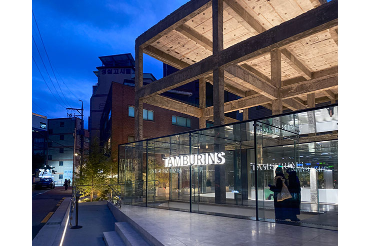
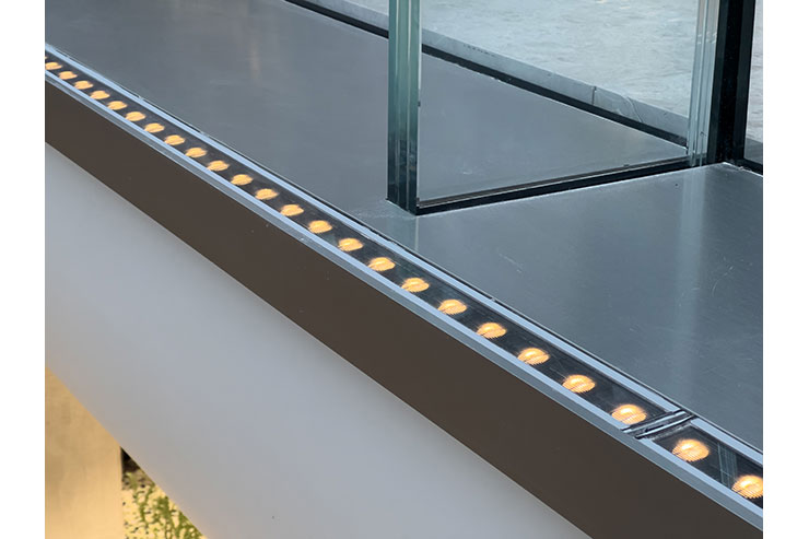
The key was opting for a louver-type profile luminaire, which was purchased near the glass structure illuminate them in an uplighting manner. The installation detail of underground procurement for uplighting was effective in creating a soft sense of space by allowing the light to reach the central part of the landscape between the empty structural frames. Then, after meticulous customization of the trim and profile sizes, they were installed along the bottom edges of the glass structure. The light was directed to sweep up façade of the glass, the transparent properties were emphasized, extending the underground exhibition space to the ground floor.
At the same time, as we installed lighting with strong output and wide illumination by underground installation, there was a need to control unwanted glare directed towards unnecessary areas. The louver-type option was considered to block direct light from the light source to the line of sight. As a result, an environment with a 3000K temperature was created, allowing people to enjoy the warm space for nighttime without causing discomfort while navigating the building.
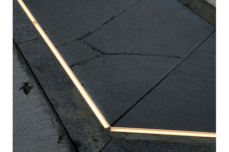
For landscaping, trees were illuminated by small volumes of tree flood lightings, and line-inground lightings were used to sweep up the retaining walls. Landscape lighting, similar to architectural lighting, directed towards the ceiling helped reduce shadow contrast on the ground, contributing to a softer spatial ambiance.
Inside the glass structure, a large beam hides track lights. We modified the installation details to prevent exposure to unnecessary glare from the light source, ensuring it remains inconspicuous in the outdoor environment. Simultaneously, focusing on the properties and silhouette of the glass structure allowed for a concentration on the volume of the landscape without disturbing it, ensuring sufficient illuminance indoors.
In conclusion, by orchestrating light harmoniously with architecture and integrating it with the brand elements, the Tamburins Seongsu flagship store successfully brings to life Tamburins’ robust spirit of challenge, providing a space where their robust spirit is embedded in the architecture for visitors to enjoy.
