- ABOUT
- JUDGING
- ATTEND THE EVENT
- CONTACT
- MORE
- 2024 Entries
- Installations 2024
- Past Winners
- Subscribe
- [d]arc directory
- arc magazine
- darc magazine
Burdock Hotel - Autograph Collection, Turkey
ProjectBurdock Hotel - Autograph CollectionLocationIstanbul, TurkeyLighting DesignLAB.1 Lighting Design & Daylighting, TurkeyArchitectSpace Architects & Designers, TurkeyClientSarsilmaz TourismLighting SuppliersAvolux Lighting, Treluce Lighting
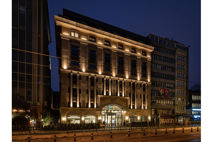
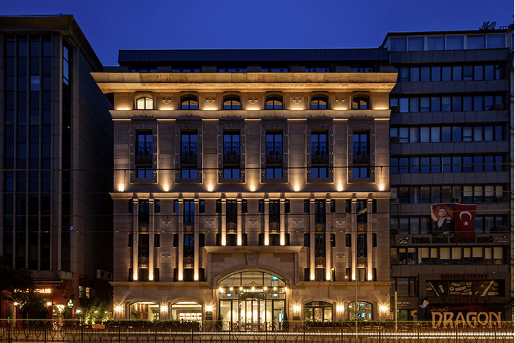
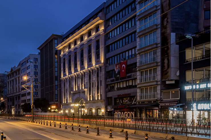
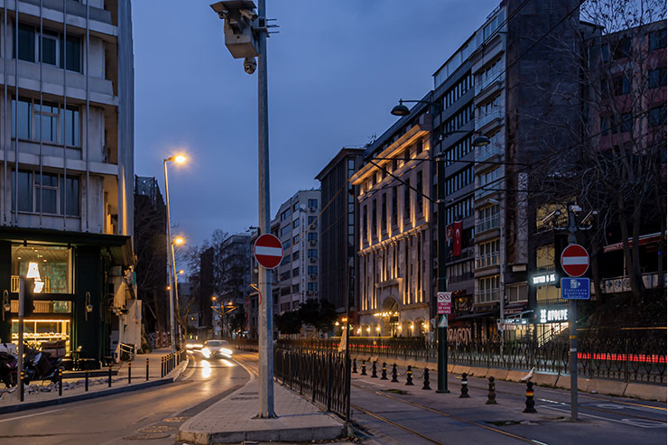
Just like the old days. Just like the old façade lighting designs. Showing the architecture politely. Without trying to be ‘modern’..
In this project, the architectural language of the building and the identity of the brand guided us. Thus, a simple and attractive façade lighting design emerged that we sometimes forget but missed very much.
The hotel is designed as a branch of ‘Autograph Collection’ which is a brand of Marriott Hotels.
_’Burdock Hotel’s character is based on an inspirational look that reflects luxury, exclusivity, and sophisticated accommodation in karma of connection between community, ancient times, themes, and motivations of traveling passions. The Burdock Hotel is located on one of the most popular part of the city; the historical route, surrounded by authentic and contemporary art, design, and artisanal workshop hotspots.’_
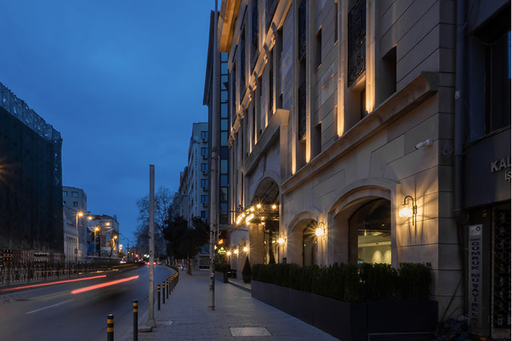
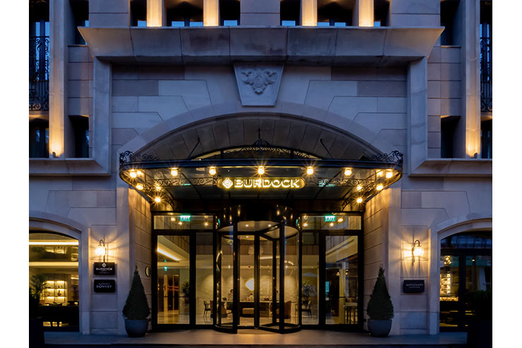
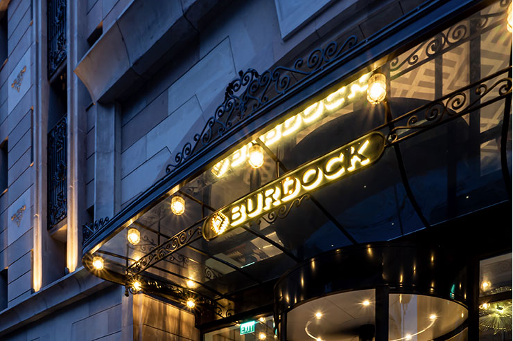
Located on a busy touristic and commercial axis, this hotel structure was made noticeable at street level with the brightness of the decorative wall lamps and decorative lamps mounted on the entrance canopy.
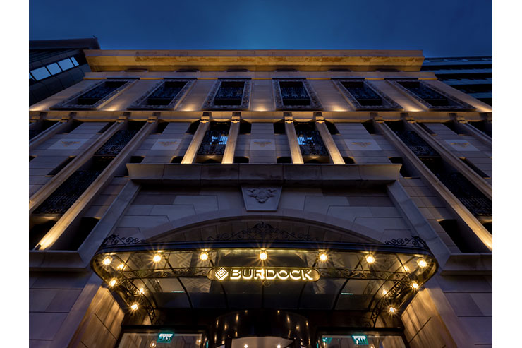
On the upper level, the façade was divided into 3 parts. We showed these parts with small projectors and linear luminaires that we placed between the windows. The first type of projector was used with a 10° light beam and a visor to illuminate only the columns. The second type of projector with a light beam of 20° and a visor was used for the second part of the façade.The linear luminaires at the top were chosen with a wider light beam, allowing the upper boundary of the building to be fully illuminated. By using the details on the facade of the building, we tried to prevent the light from escaping both to inside and outside the building. A color temperature of 2700K was chosen to create an elegant image.
