- ABOUT
- JUDGING
- ATTEND THE EVENT
- CONTACT
- MORE
- 2024 Entries
- Installations 2024
- Past Winners
- Subscribe
- [d]arc directory
- arc magazine
- darc magazine
Ataşehir Acibadem, Turkey
ProjectAtaşehir AcibademLocationIstanbul, TurkeyLighting DesignArup, TurkeyArchitectFacade Concept Design: FX Fowle, USAClientAcibadem Project ManagementLighting SuppliersTraxon, Led Linear, L&L Luce&Light, BegaPhotographyCemal Emden
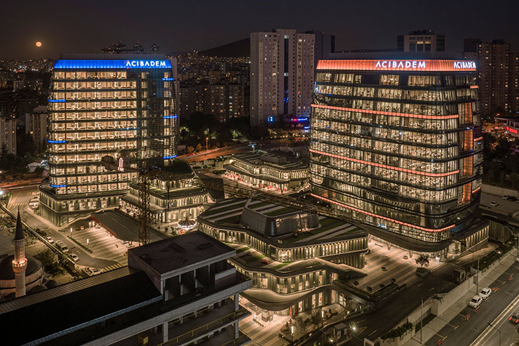
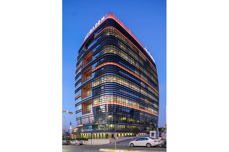
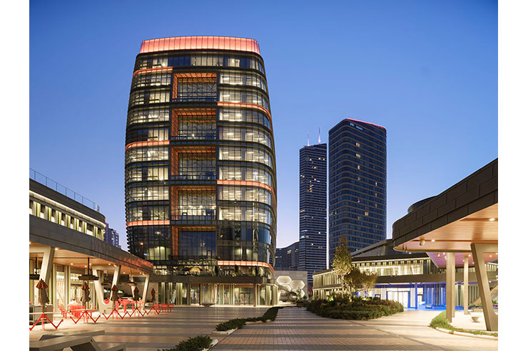
The project is located in an-emerging business area in Istanbul with several high-rise buildings over 50 floors. Acibadem Ataşehir Hospital and Office is a multi-functional complex project, including a hospital and an office building separately in the same area with additional small buildings on the ground level. Having a place near one of the main roads of Istanbul, the project area is visible from a wide perspective with highly illuminated buildings surrounding it.
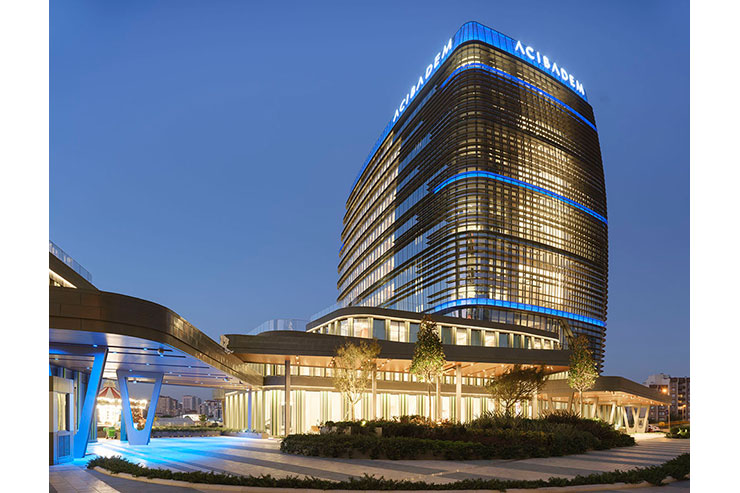
Instead of being a competitor with the surrounded overly lit buildings with higher luminance levels, the project goes directly towards the opposite way to be subtle and integrated. The lighting design concept was developed to define a bold night-time image of these facades in an elegant way, while creating balance and harmony between two architecturally dominant buildings with their bold features and details such as form, extended canopies, integrated landscape design.
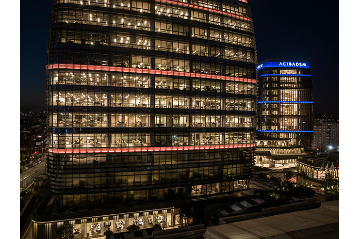
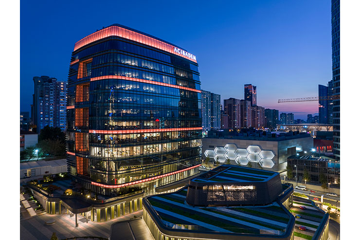
The eye-catching feature of proposed design is coming from the elegance which is what makes the project exceptional: its well-designed architectural details seamlessly integrating lighting as a key element of the architecture. The office building was highlighted with RGBW fixtures hidden behind the u-shaped mesh surrounding the balconies. A special mesh coating was designed as a result of lighting designers’ recommendation to create a hidden lighting effect which is representing the natural effect as the sunlight comes through leaves. The hidden lighting idea is proposed to not to disturb patients while creating a night brand for buildings.
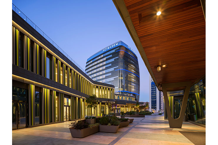
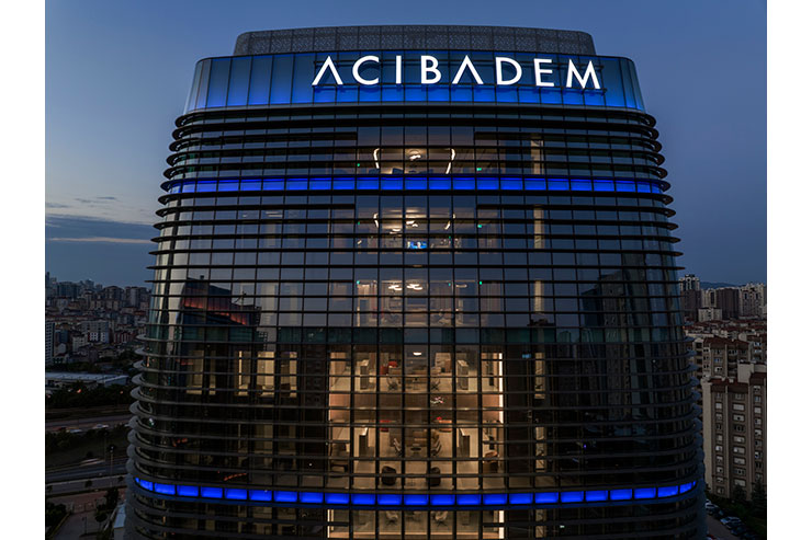
A frit glass with tree branches pattern was used where there is a connection from two-story balconies to the building interior to control the lighting effect coming from the outside. The hospital building was illuminated with RGBW liner fixtures with parabolic light beam placed in shadow boxes and supported with interior lighting as a part of facade lighting. On the entire ground level visual continuity was ensured by the vertical laths illuminated by 3000K linear luminaires hidden inside a niche which is created for lighting after several mockups. In the crown part of the building, 3000K linear products used between double glasses.
The challenge, to maintain the invisibility of the installation details of the façade fixtures which could have been quite visible from the human scale, is achieved with delicate details. Every installation detail was designed as integrated into the façade with unique techniques to hide the light fixtures/ transformers/other related units both from inside and outside. Same intend is also shaped the tower façade both hide the fixtures and to create a controlled light effect to prevent interior spaces from light trespass while emphasizing the three-dimensional structure.
The success of the project comes in consequence of the integration of the lighting designers to the design process from the beginning which not only created the harmony in working with different parties but also outcome of the projects is happened to be almost the same as the first intention showed as 3D renders. Finally the output has created the proud factor not only for us designers, but also for the Client.
