- ABOUT
- JUDGING
- ATTEND THE EVENT
- CONTACT
- MORE
- 2024 Entries
- Installations 2024
- Past Winners
- Subscribe
- [d]arc directory
- arc magazine
- darc magazine
Elizabeth Line: Line Wide Design, UK
ProjectElizabeth Line: Line Wide DesignLocationLondon, UKLighting DesignEquation Lighting Design, UKArchitectGrimshaw, UKAdditional DesignAtkins-SNC-Lavelin, MaynardClientCrossrailLighting SuppliersDesigned Architectural Lighting, Designplan, Future DesignsPhotographyMorley von Sternberg
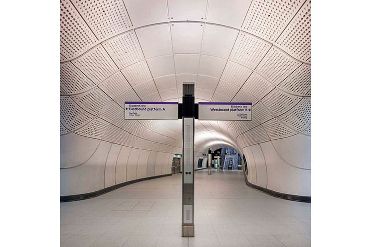
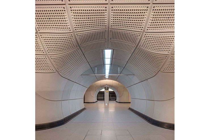
The newly opened Elizabeth Line was the largest new infrastructure project in Europe. It has created six new central London stations designed to be safe, calm, spacious and accessible. Whilst the above-ground stations and their surroundings are designed to respond to the local context, the sub-surface station design is designed to achieve consistency and familiarity from end-to-end of the line.
At the outset, the team drew upon the strength of London Transport’s design heritage for inspiration. In the first half of the 20th Century, London Transport underwent a period of radical change under the stewardship of Frank Pick. Charles Holden’s 1920’s and 1930’s station designs and his motto of “when in doubt, leave it out” informed the development of the sub-surface station architecture.
The lighting design was part of an integrated architectural and services strategy for the sub-surface station environment. The vision for the project was to create a modern, minimal, elegant, and functional transport system that enhances the passenger experience. When the design team developed the initial strategy in 2009, London Underground wanted to stick with tried and tested fluorescent lighting in all stations. Our team took the brave decision to specify only LED-based luminaires and light sources throughout, looking confidently ahead to what would be technically achievable when the railway finally opened in 2022.
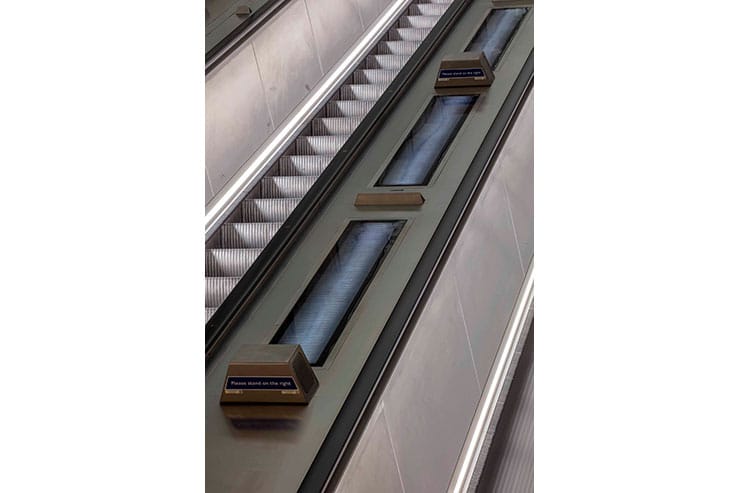
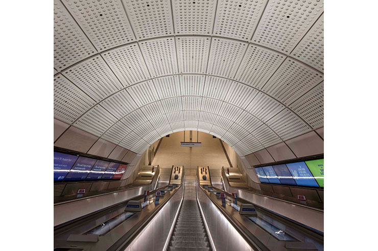
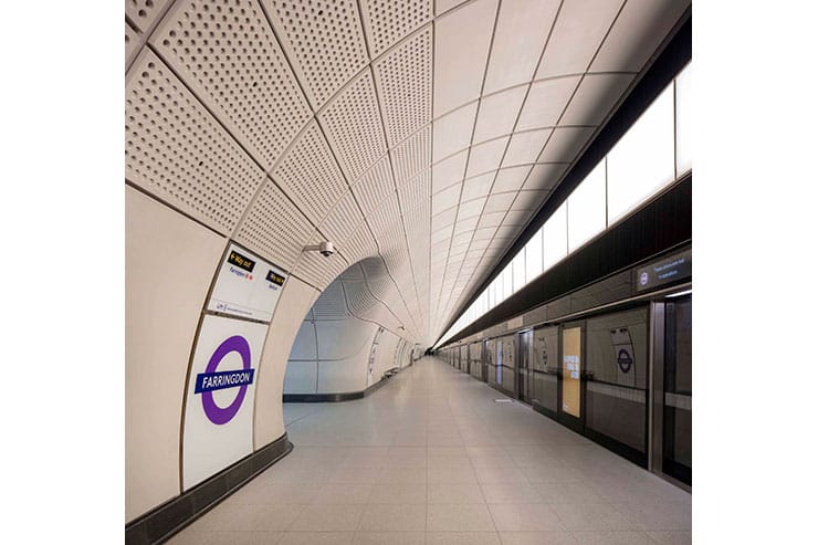
The use of indirect lighting within the concourses, escalator tunnels, and platforms emphasizes the spatial envelope rather than drawing attention to the luminaires.
There is a distinction between the use of ambient and accent lighting.
Intuitive wayfinding is promoted by using differing colour temperatures within adjacent spaces. Cool white (5,000 K) is used for the areas classified as ‘transition spaces’ whilst warm white (3,000 K) is applied within “wayfinding spaces”.
The various luminaire components are carefully integrated into the architectural design. A family of custom-designed products with a similar aesthetic and visual appearance.
The use of indirect lighting and the use of luminaires with diffuse luminous surfaces create a visually comfortable environment with fewer shadows and veiling reflections. This approach also improves the lit environment for visually impaired passengers by minimising visual discomfort and improving the legibility of the space.
Good vertical illuminance has been prioritised in the lighting design in order to improve facial recognition of fellow passengers, and enhance the legibility of the space.
The extended design life of the lighting installation meant that maintainability, continuous refurbishment of luminaire housings and component recovery principles were embedded in the design of luminaires and systems.
The integrated line-wide design for the Elizabeth Line has created a well-tempered and legible environment that is accessible to all users. The spaces are legible and easy to navigate. Carefully considered lighting assists passenger wayfinding and celebrates the architecture of the stations.
