- ABOUT
- JUDGING
- CONTACT
- MORE
- 2024 Entries
- Installations 2024
- Past Winners
- Subscribe
- [d]arc directory
- arc magazine
- darc magazine
AstraZeneca, UK
ProjectAstraZenecaLocationLondon, UKLighting DesignTreacle Studio & Enigma Lighting, UKInterior DesignEkho Studio, UKClientAstraZeneca UKLighting SuppliersPholc, Vibia, Muuto, Artemide, Lightforms, Design House Stockholm, MenuPhotographyBilly Bolton
AstraZeneca UK’s commercial head office has a new workspace, designed by Ekho Studio, a new interiors agency which has just celebrated its first full year in business.
Spread across two floors and over 21,000 sq ft of number 2 Pancras Square, King’s Cross – currently London’s fastest-growing district – and located between the two great railway stations of King’s Cross and St Pancras International.
The new space is home to staff from AstraZeneca UK, which was previously located in Luton and includes teams across medical, marketing, digital, communications, finance and HR functions, supporting the UK’s biopharmaceutical and oncology business teams.
The move reflects AstraZeneca UK’s renewed ambition to drive collaboration and innovation both internally and externally, with its relocation to London’s new ‘Knowledge Quarter’ bringing them closer to their broad network of healthcare partners to work in ambitious, purpose-led partnerships.
Our client had a vision for a ‘third space’ which, as they conceptualised, was an environment sitting between a typical corporate office space and a boutique hotel. The design scheme reflects the best of the design team’s knowledge and learnings from each end of the sector spectrum, and the bespoke design elements really speak to the aspiration.
The Standard Hotel over the road was a constant reference point, sparking off conversations about possibilities and the desired style, vibe and atmosphere of the new workspace.
The overarching ethos for the new space was to create a healthier, more comfortable and productive workspace, and to balance the needs of a supremely functional workplace, whilst creating a sense of aspiration.
As part of the early visioning process, the team managed to find a precious slot in-between lockdowns and spent a day benchmarking in London. The places visited included boutique hotel lounges and amenity spaces, coworking spaces and high-concept retail experience stores. The idea is to take influences and ideas from each of these sectors of design to weave into the office design brief, with the latter being the most familiar to the project team.
With such a rich body of inspiration to go on, every type of space within the new office, every setting and item had to fight for its place and be there for a reason. No gimmicks allowed.
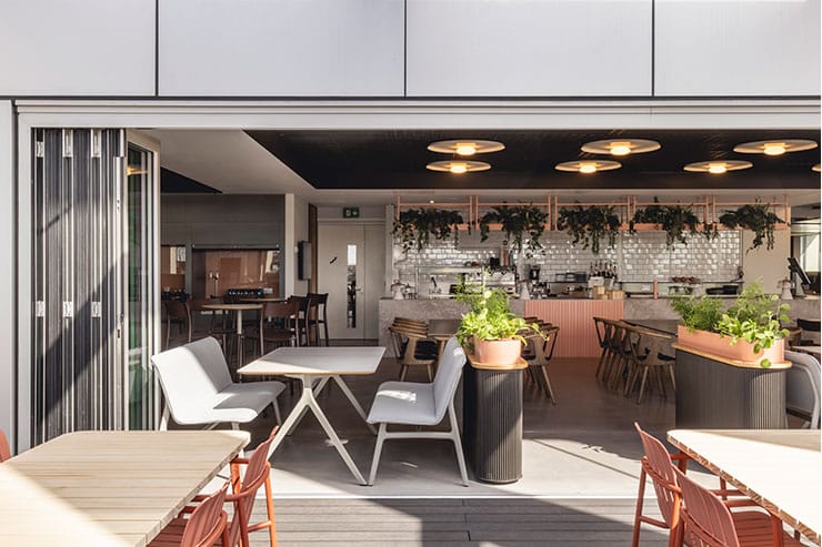
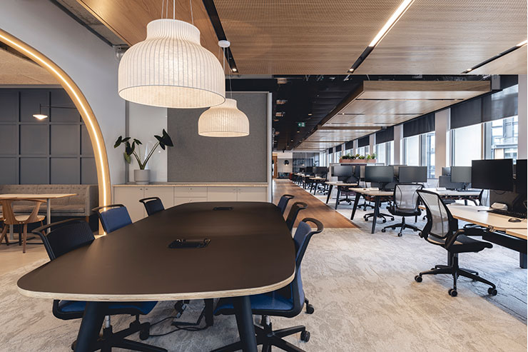
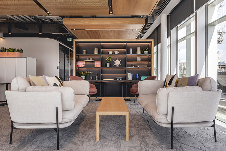
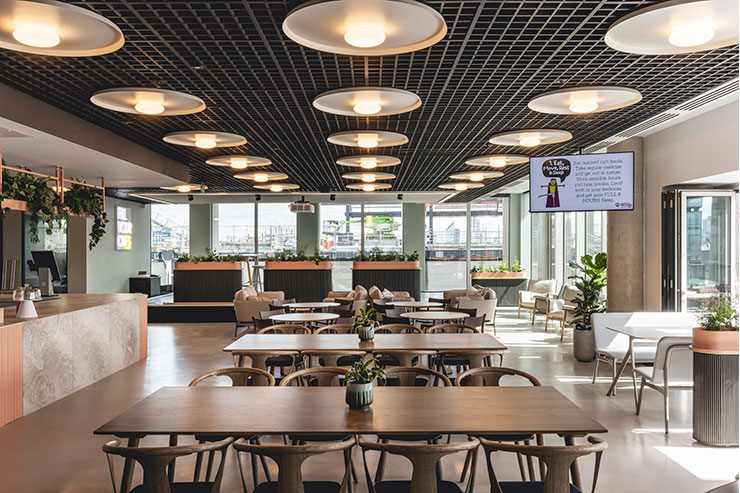
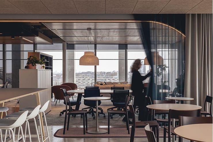
Intimate areas with soft seating are scattered thoughtfully around the more traditional desk spaces, with luxe finishes, soft lighting and warm timbers creating a hospitality feel.
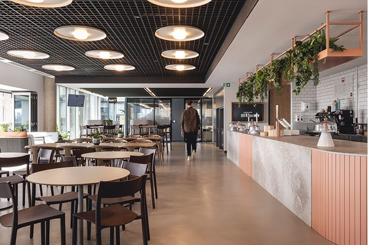
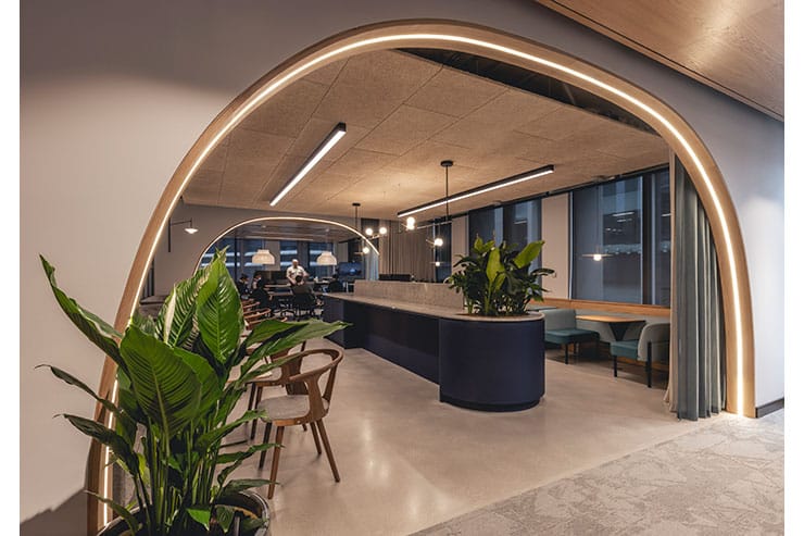
A number of collaboration areas act as a transition between workstations, whilst on each floor, bespoke marble-clad coffee bars each nestle under a curved oak frame that features integrated illumination and a wealth of planting and lush foliage.
Luminaire detailing and warm colour temperatures were the core design element, creating a warm welcoming environment alongside the warm colour palettes and materials selection. The lighting designers focussed on placing the light where it was needed, not wasting energy, and disguising functional luminaires within the well-coordinated ceiling and joinery details so only their lit effect is read.
Key feature luminaires were also curated, with complementary materials and finishes, adding a more domestic & relaxed feel, not only working with the aesthetic of their location but also creating key lit effects for those spaces. Each of the varied work zones is designed for different work types and the lighting design reacts to that.
Lighting control was the third layer of lighting design, another unseen element, but an element intrinsic to creating the “sense” of the space.
The successful integration of lighting together with technology was a major piece of the brief. This is a client who seriously invests in making tech’ work for its people, rather than paying lip service to the latest products and trends. Every single meeting room is VC enabled, whilst the ‘plug and play’ transitional areas all feature Microsoft Surface Hub technology (screens on wheels,) which make these areas properly effective as idea-sharing spaces. In the quiet rooms, tech and lighting controls – so often a barrier to a sophisticated design solution – are integrated discreetly into sideboards, meaning people can relax in a comfy armchair with subtle, soft lighting levels, & still take part in an online meeting.
In the background, the lighting control system works not only with energy monitoring, sensors, and interaction with AV tech, but in the front of house spaces it acts as a reinforcement of the ease of use, flexibility, and creation of atmosphere within each of the spaces.
In summary, the new workplace successfully nurtures an easy and informal atmosphere which will in turn foster chance collaborations – just as the brief requested – redefining how AstraZeneca UK works and engages with the outside world. Optimum energy efficiency was also achieved, with the project receiving a BREEAM ‘Excellent’ rating.
