- ABOUT
- JUDGING
- ATTEND THE EVENT
- CONTACT
- MORE
- 2024 Entries
- Installations 2024
- Past Winners
- Subscribe
- [d]arc directory
- arc magazine
- darc magazine
Tiffany House, China
ProjectTiffany HouseLocationMacau, ChinaLighting DesignLichtvision Design, Hong KongArchitectLWK + Partners, Hong KongInterior DesignArquitectonica, Hong KongClientChina Star EntertainmentLighting SuppliersClear Lighting, Shenzhen LEDMYPhotographyQi Shuoqian
With its distinctive multiple box design, Tiffany House has become the latest, exciting new landmark on the skyline of Macau.
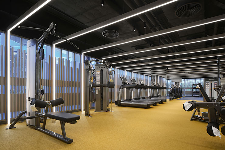
It is a state-of-the-art, high-end, mixed-use development of around 46,000m² GFA. The three-storey podium provides retail at street-level as well as lobbies, residential club house including Spa & GYM, F&B as well as management facilities. The two residential towers at 60m height each feature luxury apartments.
Lichtvision has created a holistic design language for the interiors and exteriors including façade, public interiors, and the lush landscaped areas of the development.
The architectural volume is organized by a series of interlocking elements. Architecturally inspired by stagged jewellery boxes where the drawers are partially open, and the observer has that very moment of anticipation to go and look inside. Façade lighting acts as a frame. Just like a gift, the light wraps around the facet similar to a ribbon around the jewellery box.
By highlighting the frames, emphasis onto the architectural volume is given. The frames turning to the focal points during night-time as opposed to the obvious vertical running fins during the daytime.
The interlocking volumes create landscaped balconies and terraces at various levels, providing wide angled vistas across the city and harbour.
As façade lighting and residents are at close range, the lighting design had to consider the human proximity and daily usage by residents as well as the architectural gesture, the big picture. The challenge for Lichtvision was the split between creating a night-time landmark whilst preserving an uninterrupted view and light nuisance avoidance created by light pollution by any means.
To achieve this, fixtures are recessed at the façade. Light spill is limited while a consistent visual appearance from pedestrian viewpoint and at distance is achieved. Continuous, static and monochromatic linear fixtures of low intensity are flush mounted along the outer edge of the volume to create a seamless effect along the frame, creating this very jewellery box wrapping.
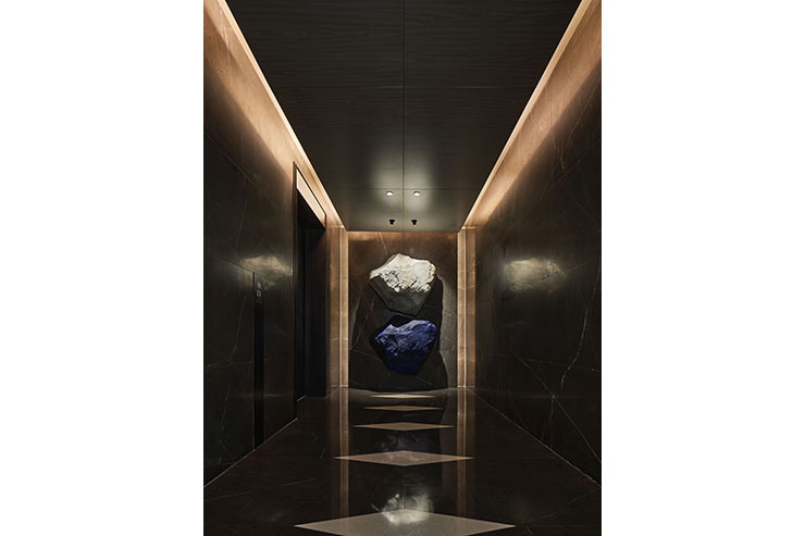
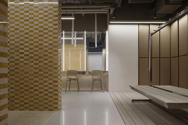
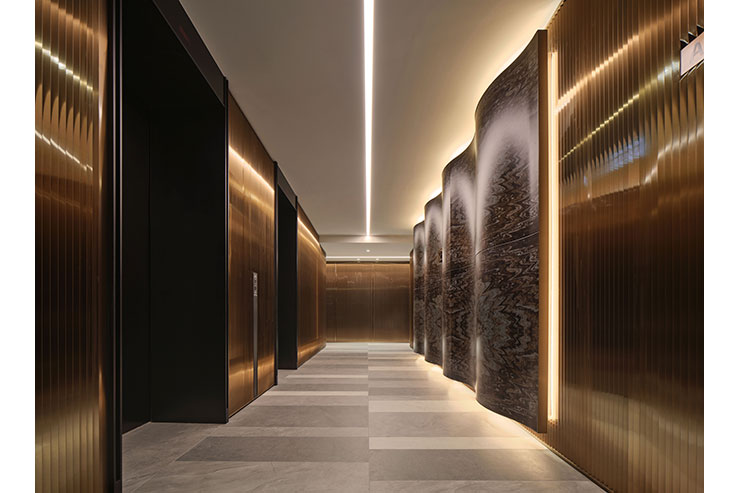
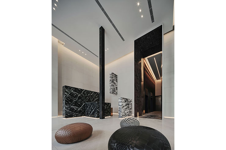
Lichtvision’s concept for the interior spaces of the Tiffany House considered two approaches. Light should complement the interior design by seamlessly integrate into the architectural fabric. At the same time, light should be standing out and celebrate itself as an individual decorative element at eyelevel to the architecture.
Throughout the spaces, a combination of direct and indirect lighting components was applied.
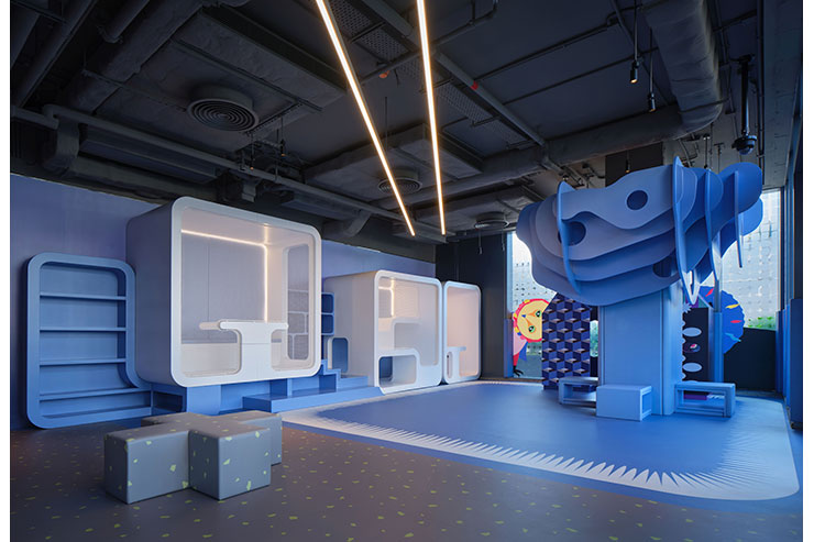
The light line as a strong and reoccurring geometrical element was applied promoting visual direction and guidance as well as to create soft, omnipresent, and vertical illuminance. Linear forms react to the interior elements by aligning or wrapping around them. Or by deliberately crossing them, making itself visually apparent and outstanding.
To add contrast and hierarchy, direct lighting components were precisely placed individually or in cluster.
Especially lounges, F&B and dining facilities, experience a great amount of decorative lighting elements, creating this very living room character of sparkle and cosy atmosphere.
