- ABOUT
- JUDGING
- ATTEND THE EVENT
- CONTACT
- MORE
- 2024 Entries
- Installations 2024
- Past Winners
- Subscribe
- [d]arc directory
- arc magazine
- darc magazine
UK House London, UK
ProjectUK House LondonLocationLondon, UKLighting DesignLichtvision Design, UKArchitectChrist & Gantenbein, SwitzerlandAdditional DesignArchitect / Designer: TP BennettClientBlue Sky BuildingLighting SuppliersLluriaPhotographyThomas Adank
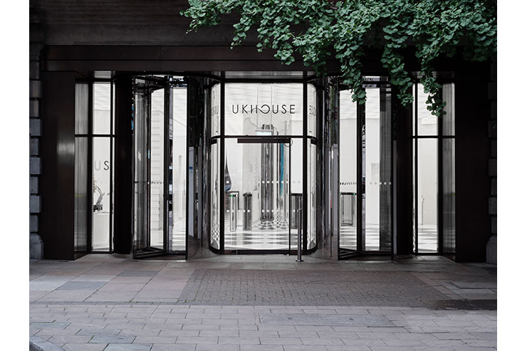
UK House is a mixed-use building located at a prestigious West End address on Oxford Street. The architects worked with the Edwardian scale and grandeur of the historic facades to generate their vision of interior corporate architecture: bold, futuristic, communicative, yet steeped in history.
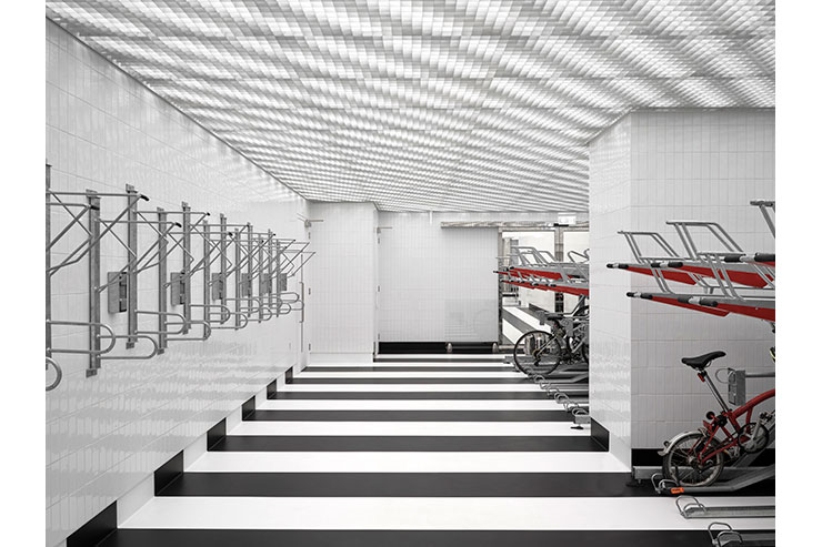
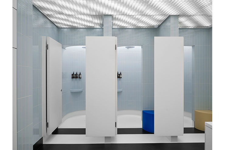
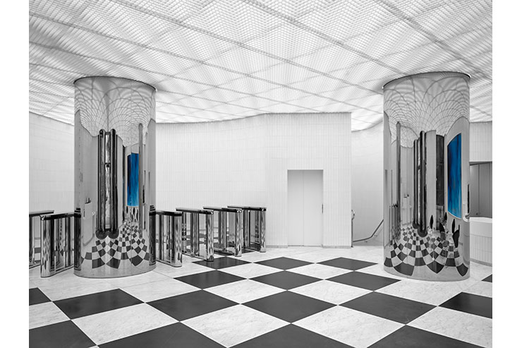
The artificial lighting design for the interior refurbishment includes Ground Floor reception, lift lobbies, a café and seating areas, and continues in the basement with a spa, shower & changing facilities, and bicycle storage. **
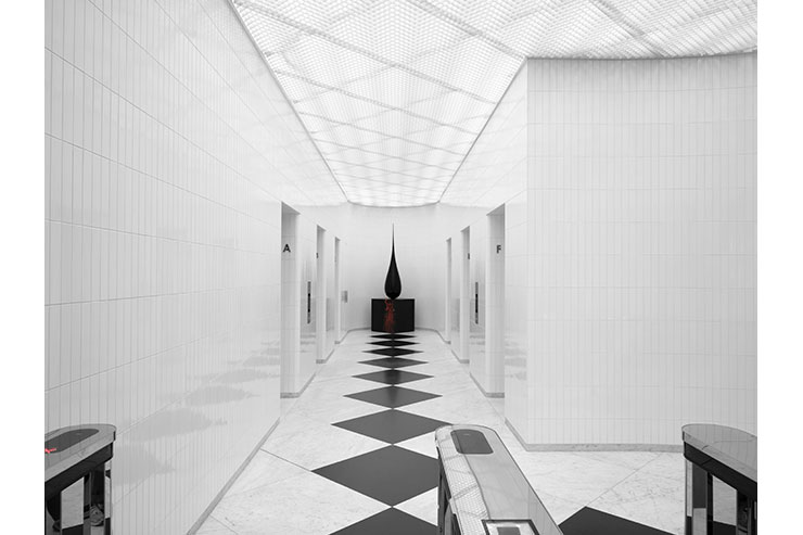
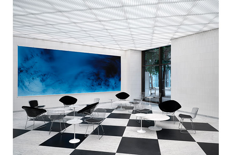
The main and outstanding lighting feature in all spaces is the luminous ceiling. Its minimalist and clutter-free appearance responds directly to the architect’s brief of providing a distinctive backdrop to their spaces featuring ‘a mix of baroque and techno-futuristic elements’.
The ceiling together with the reflective materials and “apse”-like endings of corridors create an illusion of continuous space with dramatic viewpoints.
The carefully curated colour-pop moments in the otherwise mostly monochromatic spaces, like the artwork in the lobby and the colorful objects in the changing areas used as benches and stools, required a very good colour rendering for the lighting.
The colour temperature for both levels was selected according to their use of space and the availability of daylight. Tunable white light in the social & representative entrance space on the ground floor allows for seamless changing of atmosphere and can react to the different daylight situations during daytime. In the basement areas, dimmable warm lighting in 3000K sets a more relaxed mood of a hospitality setting.
A perceived effortlessness and minimalism always come with meticulous detailing, high level of coordination and careful implementation of lighting features.
Mock-ups and calculations showed the ideal direction of the linear lighting to be diagonal, not to give a preference to one side of the individual grid squares. This also avoided casting shadows from the ceiling substructure. The product offsets from both the parallel and the orthogonal walls were specified to avoid unwanted shadows or hotspots.
Vertical distance – A perfect offset between the suspended luminaires and the suspended grid ceiling could not be achieved due to the limited available ceiling space and the amount of MEP services alongside the lighting. As a ‘non-stripey’ ceiling appearance wasn’t attainable, we embraced the graphical approach and aimed at adding an extra dimension to the architectural composition.
Horizontal distance – Carefully coordinated offsets between the linear lighting runs ensure the MEP and lighting can be carried out.
Other features that were included in the linear lighting product specification:
Additional suspension points along the linear segments allowed for flexibility when installing into a space filled with MEP equipment.
An H- Form luminaire section that considered the diffuse downward lighting component, as well as the upper section for drivers, cabling and cable connectors for the disconnection between product segments.
A versatile IP 20 and IP44 product for use in basement changing and near shower areas.
